Visit website
Star Atlas
20 views4mo ago
Concept
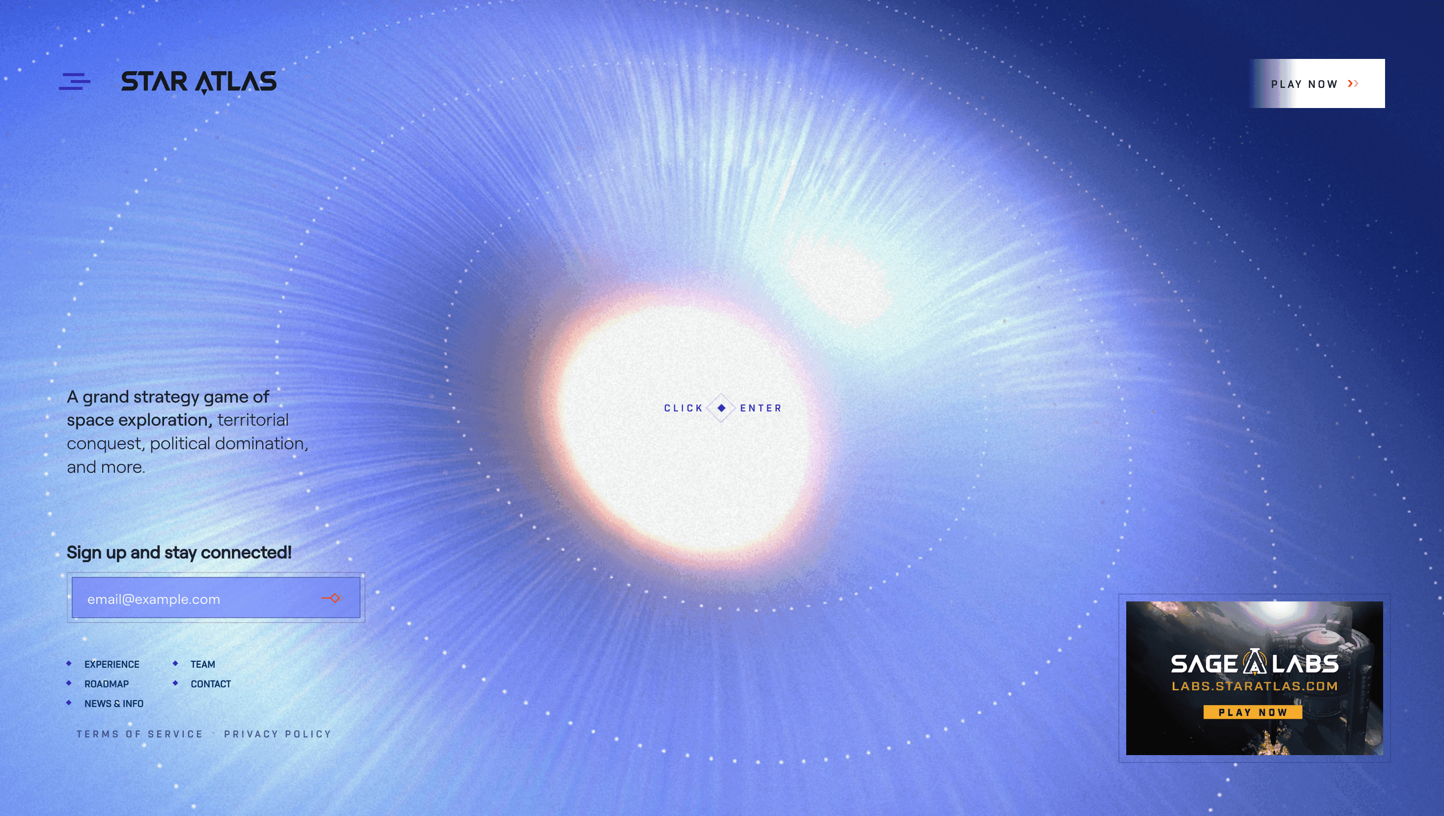
Star Atlas re-casts the home page as a launch bay for an interstellar economy: instead of a static promo, it’s the first playable slice of the game’s space-opera lore. Each section teases a core mechanic exploration, faction war, on-chain commerce so the funnel feels like narrative foreplay, not marketing.
Visual Language & Motion
A cosmos of neon violets and ion-blue gradients breaks from the usual grim sci-fi palette, signalling a “hope-punk” future. Unreal-quality 3D starships orbit in real time via WebGL; scroll inertia tilts planets and drags parallax nebulae so deep you almost sense vacuum. Headlines set in Monument Grotesk stretch edge-to-edge, while body copy floats on translucent cards that mimic HUD glass. Accent flares trigger on hover, echoing thruster bursts, and a low sub-bass riser swells at each waypoint—sound design usually reserved for trailers, now baked into UI.
UX & Performance
Despite heavyweight visuals, the page clocks LCP ≈ 1.4 s desktop / 2.0 s mobile thanks to Draco-compressed meshes, AVIF hero sprites and staged texture streaming. A fixed nav bezel doubles as progress rail; keyboard arrows jump between “chapters” labelled with ARIA landmarks. `prefers-reduced-motion` swaps ship rotations for cross-fade stills, and all colour pairs pass WCAG AA even against the pulsing nebula backdrop.
Takeaway
Star Atlas proves a launch site can behave like a vertical slice of the product: mechanics, mood and tokenised economy all previewed in one scroll. For designers the lesson is clear—sell the experience by letting people experience it, without sacrificing load speed or accessibility.