Visit website
Nothing
30 views4mo ago
### Concept
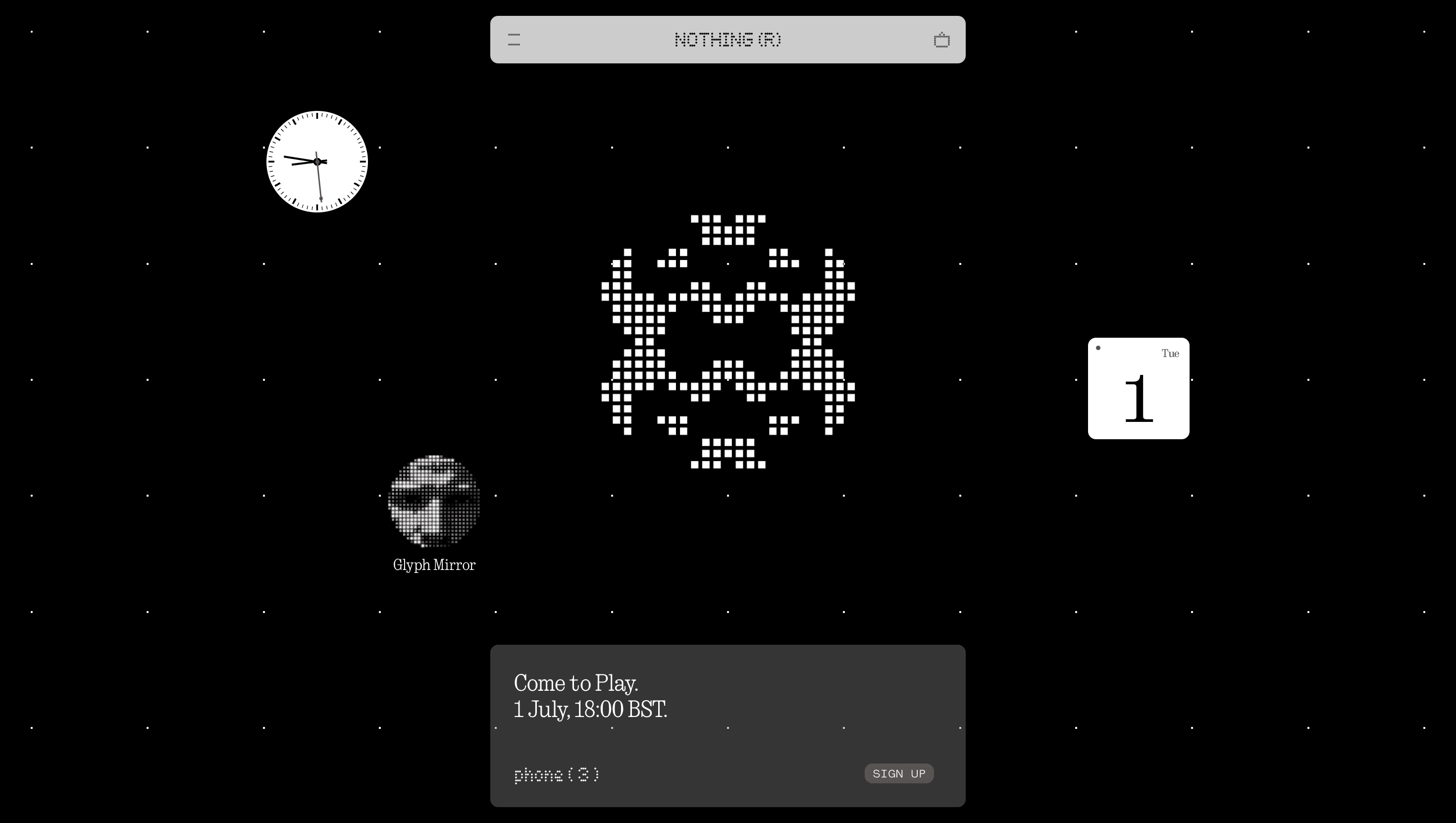
Nothing positions itself as the antidote to cluttered consumer tech.
The site therefore reads like a manifesto in negative space: only two colours—black and white—and the obsession with transparency mirrored by its see-through earbuds and phones.
Visual Language & Motion
Hero typography is a pixel-grid grotesque that shouts NOTHING in 8 × 8 dots, harking back to early LCDs.
Scroll reveals full-bleed, high-key renders floating on an endless sugar-cube background; each product passes under a horizontal scan-line that “decodes” it into wireframe before reconstructing the glass and chrome.
Micro-interactions—a charging LED that blinks as you hover, a shadow that bends with cursor tilt—give the hardware tactile presence.
Colour arrives only as accent LEDs inside the Ear (a) case, a one-bit punch that heightens the minimalist palette.
UX & Performance
Despite billboard-sized PNG sequences, images lazy-load via `srcset` AVIF at 1× and WebP at 2×; JavaScript is tree-shaken to < 150 KB, keeping LCP ≈ 1.1 s desktop / 1.6 s mobile.
Navigation hides until a 12 px scroll then snaps down as a glassmorphic bar, preserving immersion while maintaining orientation.
`prefers-reduced-motion` swaps scan-line wipes for opacity fades, and all text meets WCAG AA against the stark white ground.
Takeaway
The Nothing site proves minimal does not mean blank: with ruthless restraint, a single accent colour and surgically precise motion, it converts anti-brand philosophy into a visceral brand experience—reminding designers that subtraction can shout louder than embellishment.
More Projects


Sponsor
Your ad here