Visit website
Hyer
19 views4mo ago
Concept
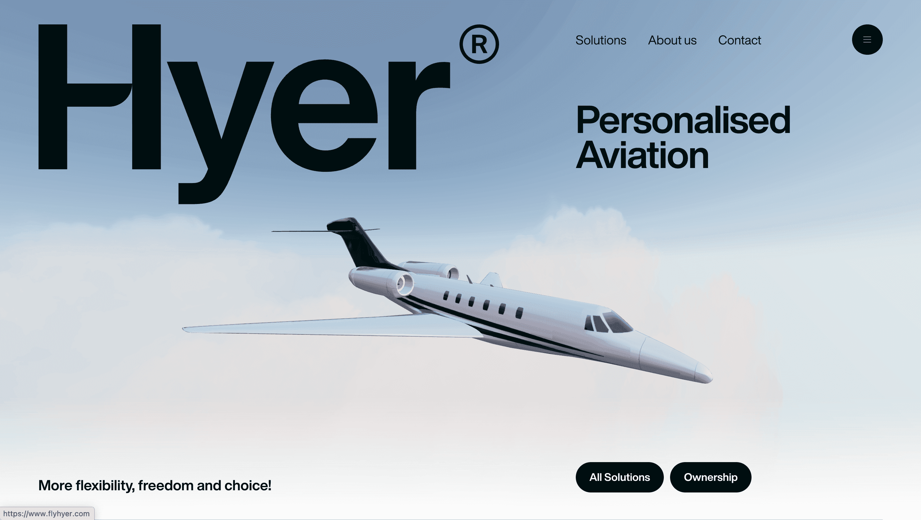
Hyer argues that personalised aviation should feel as seamless as booking a rideshare. The site therefore plays out like a concierge briefing: first a vision—“fly anywhere, pay only for what you use”—then three clear doors—On-Demand, Shared Flights, Ownership. Each scroll notch deepens the offer, so visitors glide from curiosity to quote without friction.
Visual Language & Motion
A charcoal backdrop evokes night-time tarmac; accent gold and electric teal echo cockpit LEDs. The hero displays a slow-orbit 3-D jet whose reflections warp with cursor tilt, signalling premium craft. Bold Neue Haas Grotesk headlines stretch full bleed, while body copy rests in a disciplined 12-column grid. Section dividers unfurl like runway lights: GSAP-driven lines streak outward, framing call-outs for credits, carbon offsetting and personal flight managers.
UX & Performance
AVIF hero video (<900 KB) autoplays only on ≥1024 px screens; mobiles see a still, keeping LCP ≈ 1.2 s on desktop and 1.6 s on 4 G. Booking forms live in a sticky drawer that slides up without page reloads, letting users tweak legs, pax and dates in situ. prefers-reduced-motion swaps jet rotation for cross-fade stills, and colour contrast passes WCAG AA across dark surfaces. Global nav collapses to a single hamburger on scroll, while a floating “Get Quote” button remains thumb-reachable on mobile.
Takeaway
Hyer shows how luxury UX can balance theatre and trust: cinematic 3-D, concierge copy and razor-sharp performance budgets coalesce into an experience that feels both aspirational and effortlessly functional.