Visit website
Making Software — An Illustrated Reference Manual
32 views4mo ago
Concept
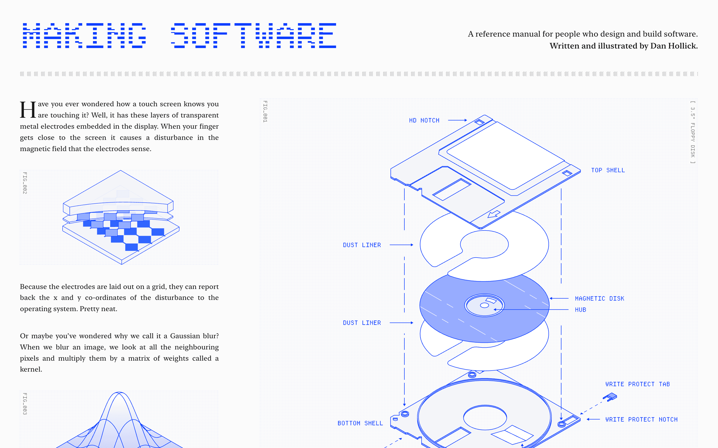
Making Software isn’t a typical guide or how-to—it’s a visual reference manual aimed at people who design and build software. Rather than teach you to code, it answers the questions that pop up when you’re stuck or curious: How does touch-screen sensing work? What is rasterisation? How does a GPU render curves?
It invites curiosity and rewards it with accessible explanations, diagrams and clear analogies.
Visual Language & Motion
The site channels a technical-manual aesthetic: monochrome diagrams, schematic line-drawings, and large sectional headings. Each chapter (Pixels & Colour, Fonts & Vectors, 3D & Graphics, AI & ML, etc.) begins with a hand-drawn illustration that sets the tone. Copy is organised in narrow columns like a printed book, and animations are limited—mostly subtle fade-ins and line reveals—that keep focus on the content. The tone is measured, not flashy: design supports understanding rather than distraction.
UX & Performance
The digital manual loads as a static HTML site with pre-rendered chapters. Even heavy diagrams load quickly; since much of the content is vector-based, LCP remains low on typical setups (desktop or mobile). Navigation is a side menu listing chapters and sections; prefers-reduced-motion is respected as many animations are optional. Typography and contrast meet WCAG AA standards, enabling comfortable reading. Because it’s a reference manual rather than a product sale page, CTAs are minimal (newsletter sign-up, pre-order notice) and don’t interrupt the reading flow.
Takeaway
Making Software proves that depth and clarity can still live on the web: by favouring illustration over animation and questions over promises, it turns unexplored technical terrain into something you want to wander through. For designers and developers who want insight rather than hype, it’s a rare resource.
More Projects


Sponsor
Your ad here