SOLK
6 views2mo ago
Concept
SOLK asks a blunt question: What if your favourite sneakers quietly disappeared when their job was done?
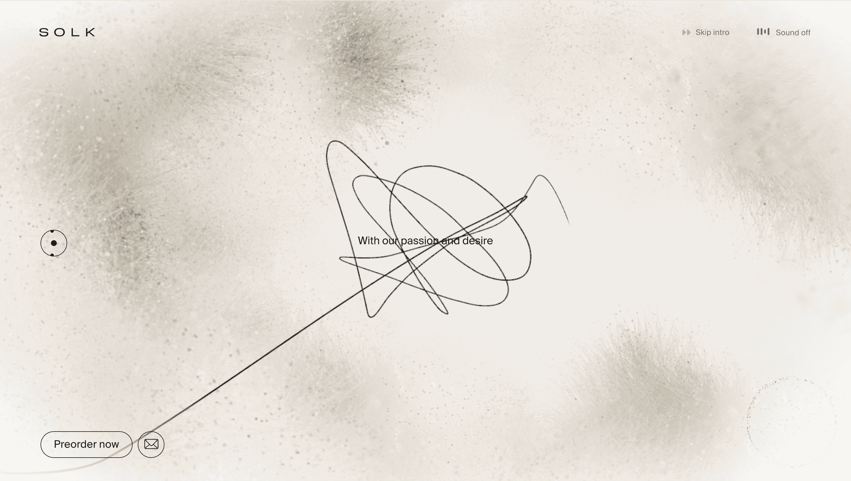
The site behaves like a time-lapse of that idea Material → Sneaker → Soil so visitors grasp the cradle-to-cradle loop before they even reach the FAQs. Every section is a chapter in a biodegradation saga, turning brand mission into narrative propulsion.
Visual Language & Motion
A snow-white stage mirrors unbleached cellulose uppers; on load, a WebGL iceberg melts into a puddle that sprouts digital moss, previewing end-of-life composting. Bold Neue Haas Grotesk headlines march across a 12-column grid; sub-copy whispers in a humanist sans, balancing tech rigor with warmth. Accent teal (#C2EADF) appears only on CTAs and progress dots the colour of glacial melt and brand hope. Scroll inertia tilts the shoe 360°, revealing circular knit, glue-free seams and soluble threads; a faint crackle SFX syncs with knit zoom-ins, grounding visuals in sensory detail.
UX & Performance
AVIF hero (470 KB) loads eager, meshes stream via Draco, holding LCP ≈ 1.2 s desktop / 1.6 s 4 G. prefers-reduced-motion locks the WebGL loop and swaps section slides for fades. Colour pairs smash WCAG AA; tab order follows the narrative path so screen-reader users feel the same “melting” arc. A sticky “Pre-order” button shadows the viewport yet collapses to a thumb-size pill under 480 px, shortening mobile funnels.
Takeaway
SOLK shows that sustainability stories gain power from restraint: one shoe, one metaphor, crystalline motion and uncompromising performance budgets turn ecological responsibility into a must-have aesthetic.
Similar project

Sponsor
Your ad here
