Visit website
Mintlify
41 views4mo ago
Concept
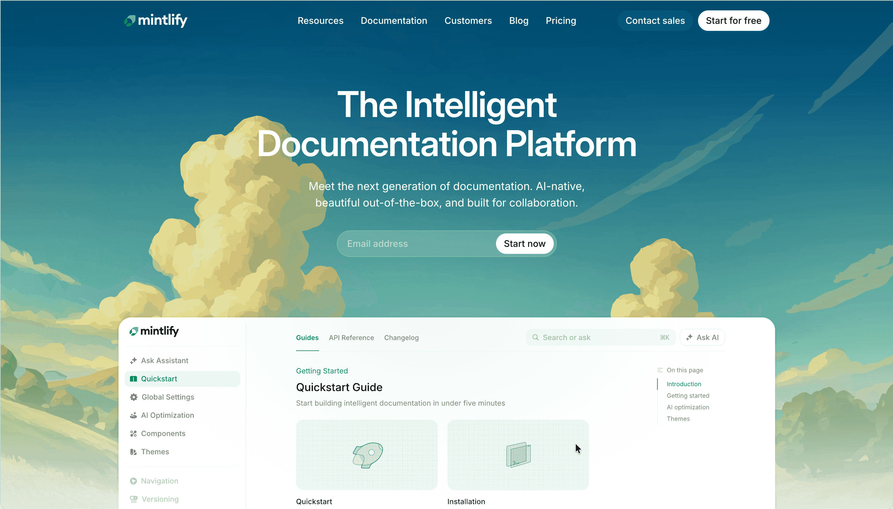
Mintlify approaches developer documentation as a living interface, not an afterthought.
Its platform merges technical writing, component-driven UI, and AI automation to produce docs that are always in sync with your codebase. The message is direct: ship docs that look as good as your product, update themselves, and help users onboard faster.
The homepage tells that story in three effortless scrolls—Write → Automate → Delight—proving that clarity, design, and credibility can coexist.
Visual Language & Motion
The visual identity mirrors a modern dev tool aesthetic: white space, soft gradients, and clean sans typography. A mint-to-lavender gradient animates subtly across headings, symbolizing flow between code and knowledge. Product demos are interactive rather than static—hover a code block, and it expands into an editable snippet or light/dark toggle. Smooth parallax transitions and GSAP-based fades create a sense of effortless precision.
Micro-motion reinforces the idea of live documentation: tooltips pulse softly, scroll anchors slide in rather than jump, and examples “type themselves” line by line.
UX & Performance
Built on Next.js and MDX components, LCP ≈ 1.0 s desktop / 1.3 s mobile. Images ship as AVIF (< 250 KB); videos lazy-load after interaction. Keyboard navigation mirrors sidebar hierarchy, and prefers-reduced-motion converts fades to instant reveals. A sticky command-bar (“Cmd K”) offers instant search across all docs, making large libraries feel frictionless.
Takeaway
Mintlify demonstrates that documentation is part of the product experience. By blending design system discipline, AI-driven automation, and editorial clarity, it redefines how fast teams communicate technical knowledge—and why good docs sell.