Visit website
Spotify.Design
31 views4mo ago
Concept
Spotify Design is not a marketing page; it is a design journal in motion. Articles, case studies, accessibility guidelines and the “UX of Mixes” podcast sit side-by-side, turning corporate craft into an open curriculum. The goal: demystify how Spotify builds experiences for 600 million listeners and invite the wider design community into the conversation.
Visual Language & Motion
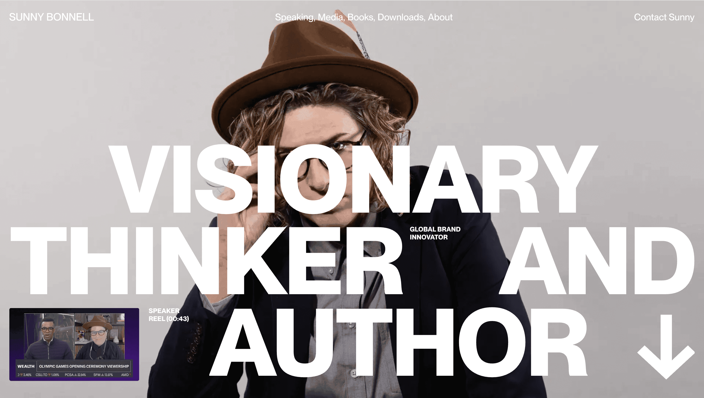
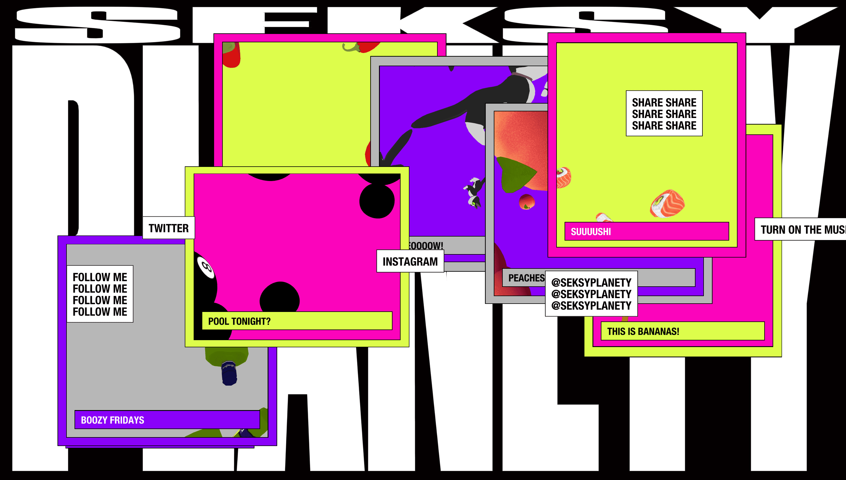
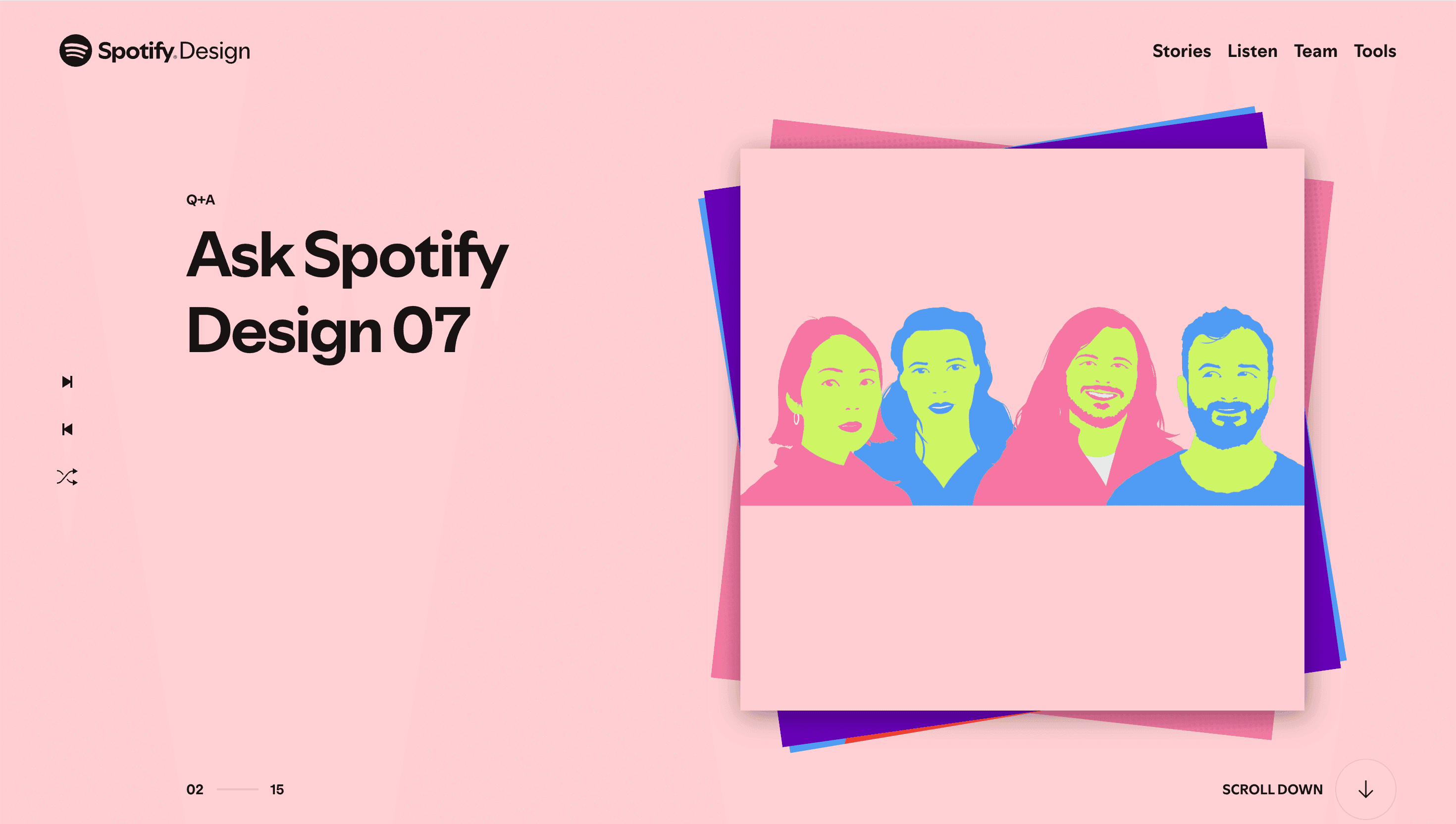
The home hero greets you with an ever-shifting audio-reactive gradient that ripples like a spectral equaliser—brand green blends into electric violet, then phases to pitch-black, mirroring the platform’s dark-UI DNA. Headlines land in Spotify Mix Grotesk, stretched edge-to-edge in 9-column rhythm; sub-copy rests in Circular, creating a typographic duet unique to the brand. Scroll reveals full-bleed portraits of product designers, glitch-loop micro-videos of visual experiments and inset code snippets framed like vinyl liner notes. Hover any card and it lifts with a 4 px shadow, then tilts 1.5°—a subtle nod to album-sleeve browsing.
UX & Performance
SVG gradients animate via requestAnimationFrame only when the hero is above the fold; off-screen they freeze to static, holding LCP ≈ 1.1 s on desktop and 1.6 s on 4 G mobile. Article thumbnails lazy-load, and podcast iframes defer until play, preventing layout shifts. prefers-reduced-motion pins gradients and disables tilt, while all colour pairs pass WCAG AA, including the high-contrast green on near-black.
Takeaway
Spotify Design proves an in-house design blog can feel as immersive as the product it documents: brand-faithful motion, accessible performance budgets and an editorial voice that invites rather than preaches—setting a template for tech teams seeking to share their craft without dulling the sparkle.
More Projects

Sponsor
Your ad here