Visit website
Obys Agency
39 views4mo ago
Concept
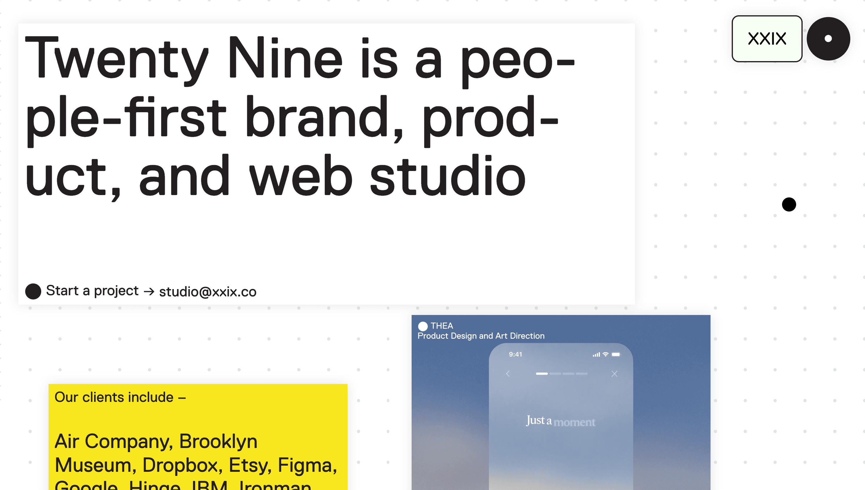
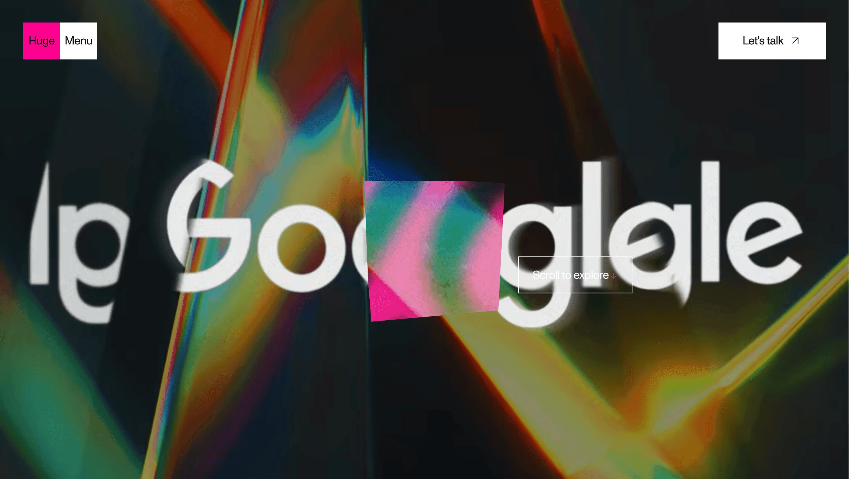
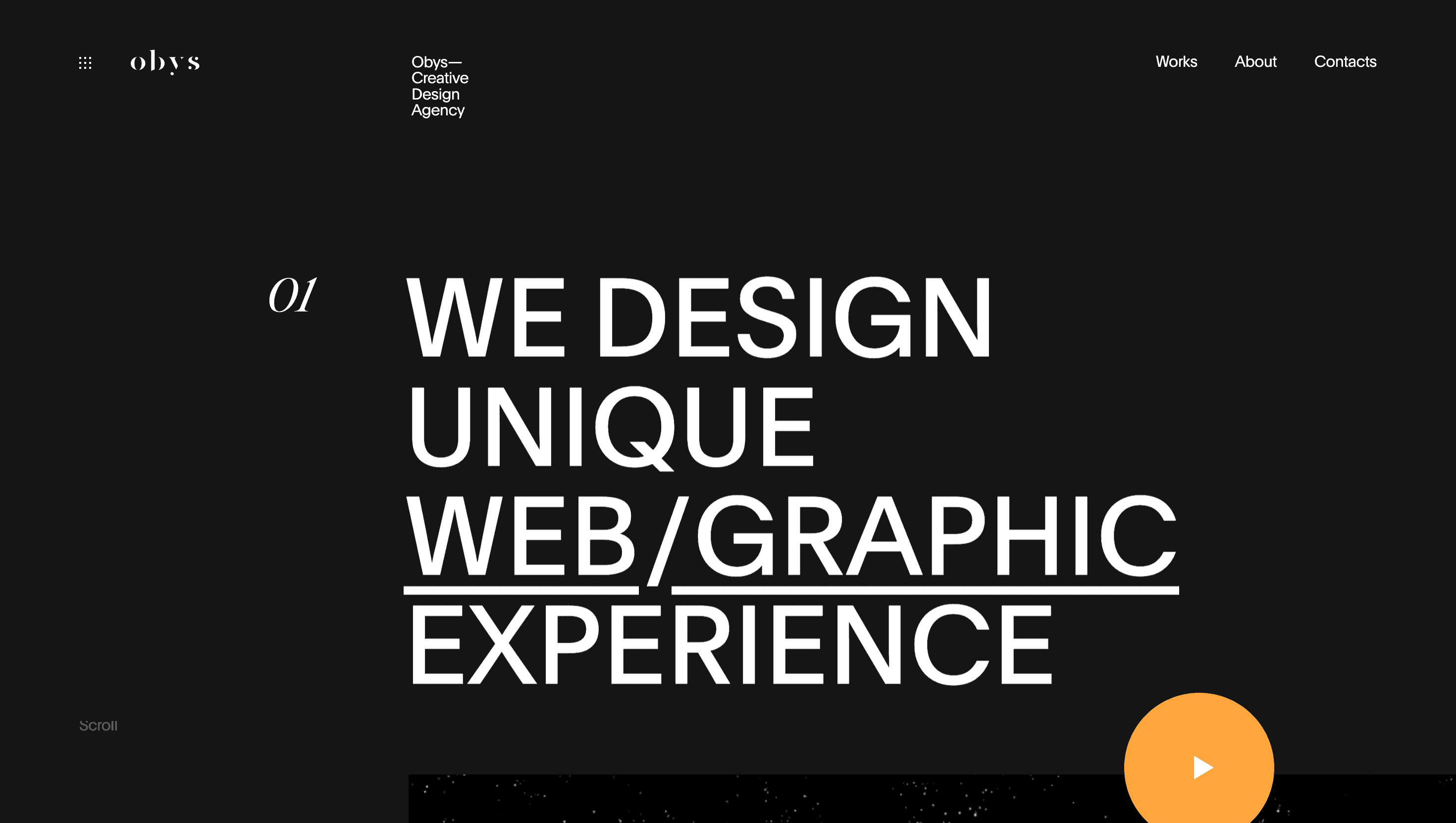
Obys defines itself as a “typography-driven design laboratory.” Instead of a polite portfolio grid, the site behaves like a kinetic poster exhibition each scroll stroke detonates a fresh composition of outsized glyphs, color floods and motion, proving the studio’s mantra: type first, everything else follows.
Visual Language & Motion
The home hero greets visitors with a split canvas: left snow-white void; right oversized PP Neue letters that stretch, squash and shuffle to the rhythm of scroll inertia. A shock-orange accent line snaps in on interaction, guiding the eye while underscoring brand audacity. Case-study tiles hide inside a strict twelve-column grid until hovered, then bloom into full-bleed WebGL video; shadows slide 2 px, echoing handset parallax. Micro-copy whispers in a humane grotesque, balancing the maximalist display fonts.
UX & Performance
Despite heavy type animation, LCP ≈ 1.3 s on desktop and 1.7 s on 4 G: variable fonts load subset first, full axes only after idle; GSAP tweens pause in background tabs. prefers-reduced-motion freezes glyph morphs and swaps slide-ins for fades. All color pairs pass WCAG AA and tab order mirrors visual flow, so screen-reader users get the same narrative beat as sighted guests.
Takeaway
Obys shows how letterforms can power an entire digital experience restraint in palette, rigor in performance and fearless motion turn a portfolio into a living masterclass on typographic storytelling.
More Projects

Sponsor
Your ad here