Visit website
Dia
14 views4mo ago
Concept
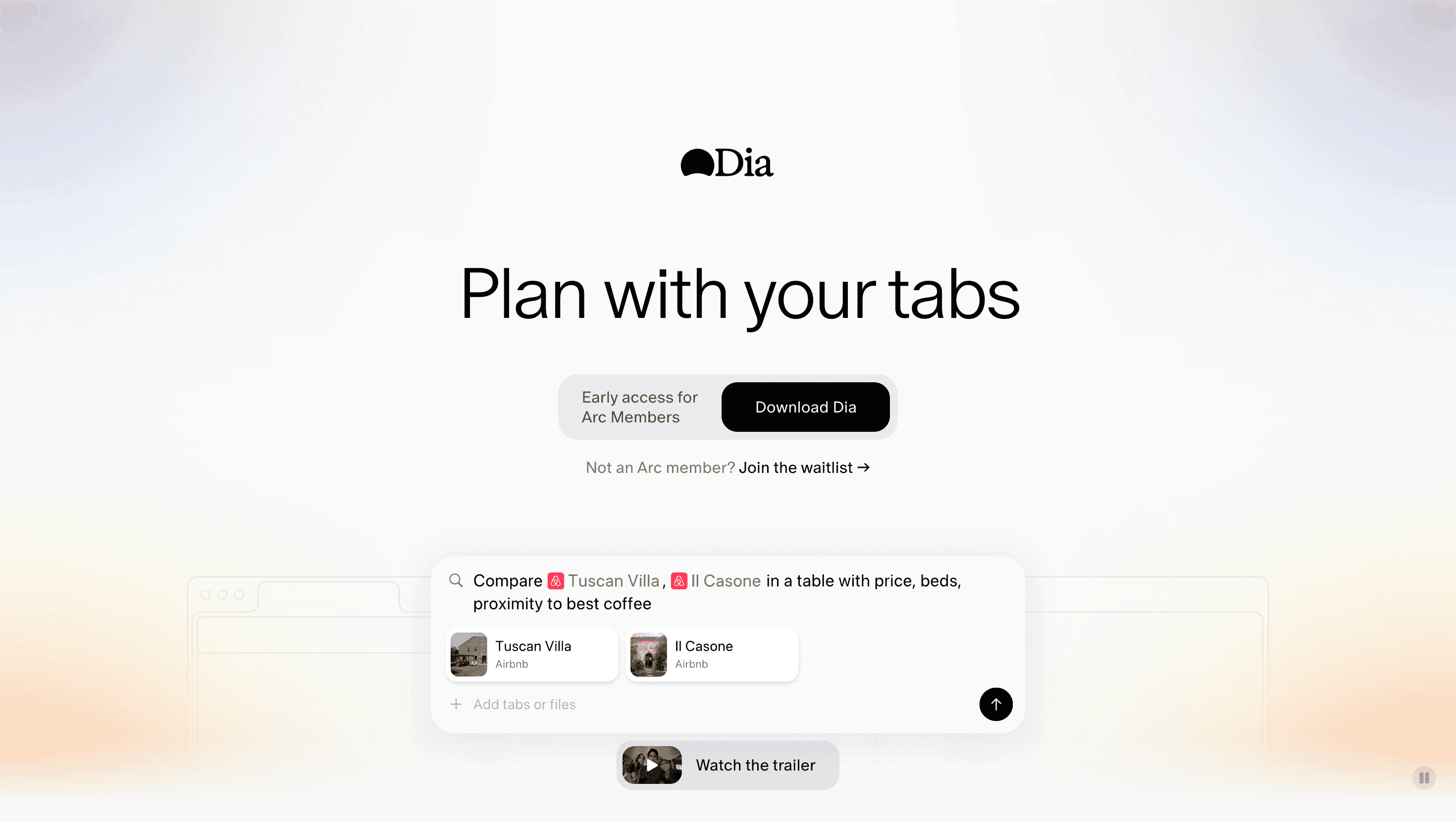
Dia asks a simple question: What if your browser could think alongside you? Built by the team behind Arc, it’s positioned as an AI co-pilot for everyday browsing no extensions, no copy-pasting; whatever lives in your tabs is already context for Dia’s chat pane. Early messaging targets writers, students, shoppers and researchers, pitching the browser as a single place to draft, translate, plan and learn.
Visual Language & Motion
A bright, almost Cupertino-white canvas keeps focus on content, while candy-pastel illustrations nod to Arc’s friendly ethos. Hero copy (“Chat with your tabs”) lands in Monument Sans XL, then eases upward to reveal testimonial cards that slide in on spring timing. Accent lilac buttons prompt Download or Join Waitlist, echoing Arc’s purple brand thread. Micro-animations the waving Dia bot icon, a breathing underline under active nav links add warmth without visual noise.
UX & Performance
The landing page clocks LCP ≈ 1 s on desktop thanks to AVIF hero assets and deferred video loads. Chat demo GIFs lazy-load only when 50 % in view, keeping 4G performance respectable. A sticky top bar collapses on scroll, while prefers-reduced-motion pins hero fades and disables bot wiggles for vestibular comfort. Dia itself ships as a universal macOS app (M1+), local-first indexing tabs so AI prompts stay private.
Takeaway
Dia reframes the browser as a writing partner, tutor and research aide proof that AI can live natively in the chrome rather than as an after-thought plugin. Designers can mine the site for lessons in clarity: tight copy, minimal palette and ruthless performance make a complex pitch (“an AI browser”) feel instantly legible.
More Projects


Sponsor
Your ad here