Visit website
Cosmos
24 views3mo ago
Concept
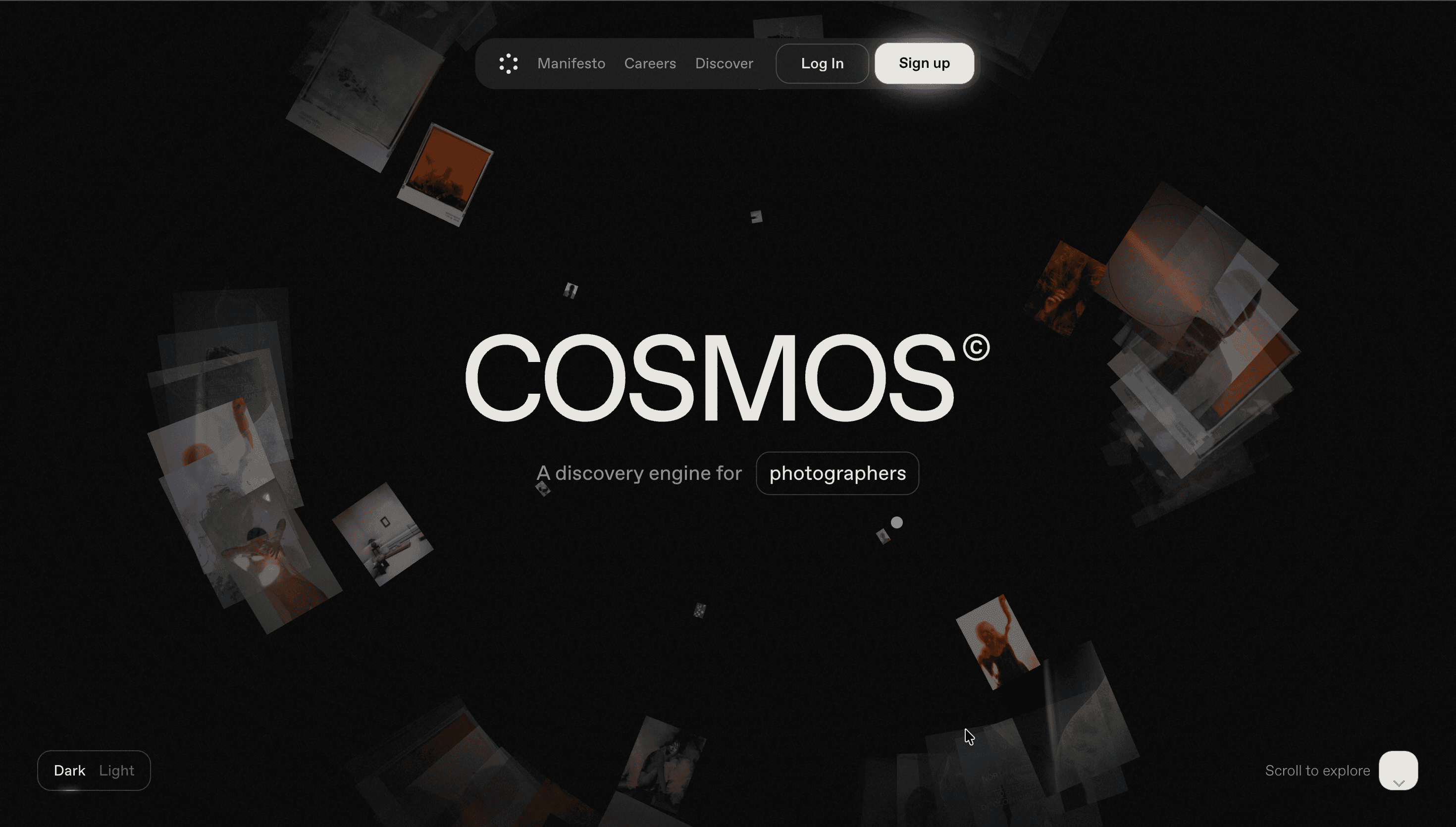
Cosmos reimagines the creative network as a gallery, not a feed.
Built for designers, developers, and digital artists, it offers a slower, more intentional way to share work—no likes, no endless scroll. Each post sits in a grid like a miniature exhibit; every user profile feels like a studio visit. The mission is clear: restore quality, context, and conversation to online creativity.
Visual Language & Motion
A minimalist interface underscores its philosophy: white space, neutral greys, human typography. Hero copy (“The home for digital culture”) fades in gently, followed by screenshots drifting like floating frames. Accent lavender and soft beige hues replace the dopamine-red of social networks. Hovering over a tile lifts it slightly with a soft shadow—an elegant nod to physical gallery walls. Micro-interactions breathe rather than bounce, making navigation feel meditative.
UX & Performance
Built on Next.js with edge caching, LCP ≈ 1.0 s desktop / 1.3 s mobile. Images load as 120 KB AVIF previews, upgrading seamlessly to full resolution. Navigation stays thumb-friendly, with a persistent bottom bar on mobile linking Feed, Collections, and Circles. prefers-reduced-motion disables hover lifts and slide transitions for comfort. WCAG-AA contrast and semantic HTML ensure accessibility throughout.
Takeaway
Cosmos proves a platform can feel like a sanctuary—by removing algorithms, vanity metrics, and noise, it gives creative work the attention it deserves. Every design choice—quiet typography, gentle motion, fast performance—echoes the product’s core idea: slowness as luxury in digital space.