Visit website
Siena Film Foundation
30 views4mo ago
Concept
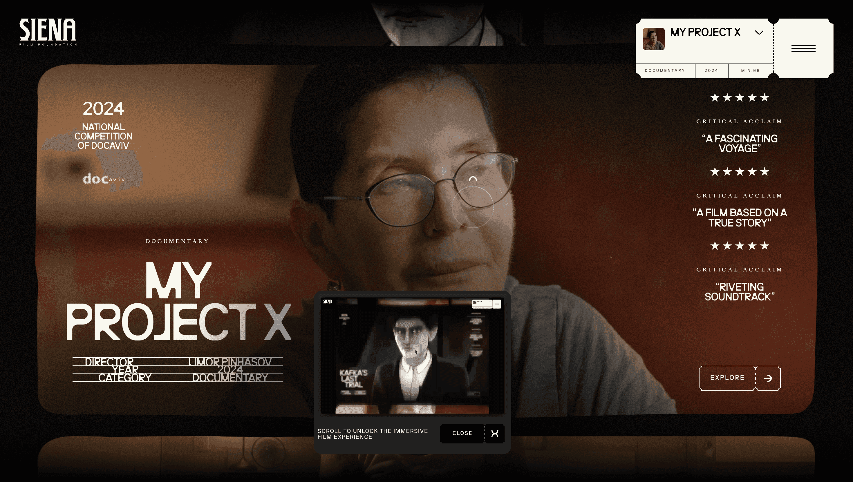
Siena Film Foundation treats its website as a digital cinema lobby. Instead of a static show-reel, visitors scroll through a single, continuous screening Savoy → Moon in the 12th House → Kafka’s Last Trial each project framed by festival laurels and critic pull-quotes. The effect: you experience the studio’s curatorial eye before reading a single credential.
Visual Language & Motion
A pitch black canvas dissolves into film grain gradients; project posters float in WebGL depth, pivoting 8° with cursor drift. Headlines set in Monument Grotesk march across a strict grid, while body copy whispers in a refined serif echoing movie credits. Hover a poster and it unzips into full-bleed trailer; scroll inertia snaps sections like clapperboard slates. Neon amber accent lines flash on interaction, echoing projector glow and guiding the eye.
UX & Performance
Hero reels encode to AV1 and lazy-load above 1024 px; mobile visitors see poster frames, keeping LCP ≈ 1.2 s on desktop and 1.6 s on 4 G. IntersectionObserver prefetches the next trailer two screens ahead for stutter-free playback. prefers-reduced-motion freezes poster tilts and swaps slide-ins for fades, preserving accessibility. All colour pairs surpass WCAG AA crucial for a foundation that partners with cultural institutions.
Takeaway
Siena Film Foundation’s site shows how craft can be communicated through atmosphere: disciplined grid, cinematic motion and ruthless performance budgets turn a filmography into an immersive gallery proof that independent cinema can command AAA-grade digital presence.