Visit website
Igloo Inc
160 views4mo ago
Concept
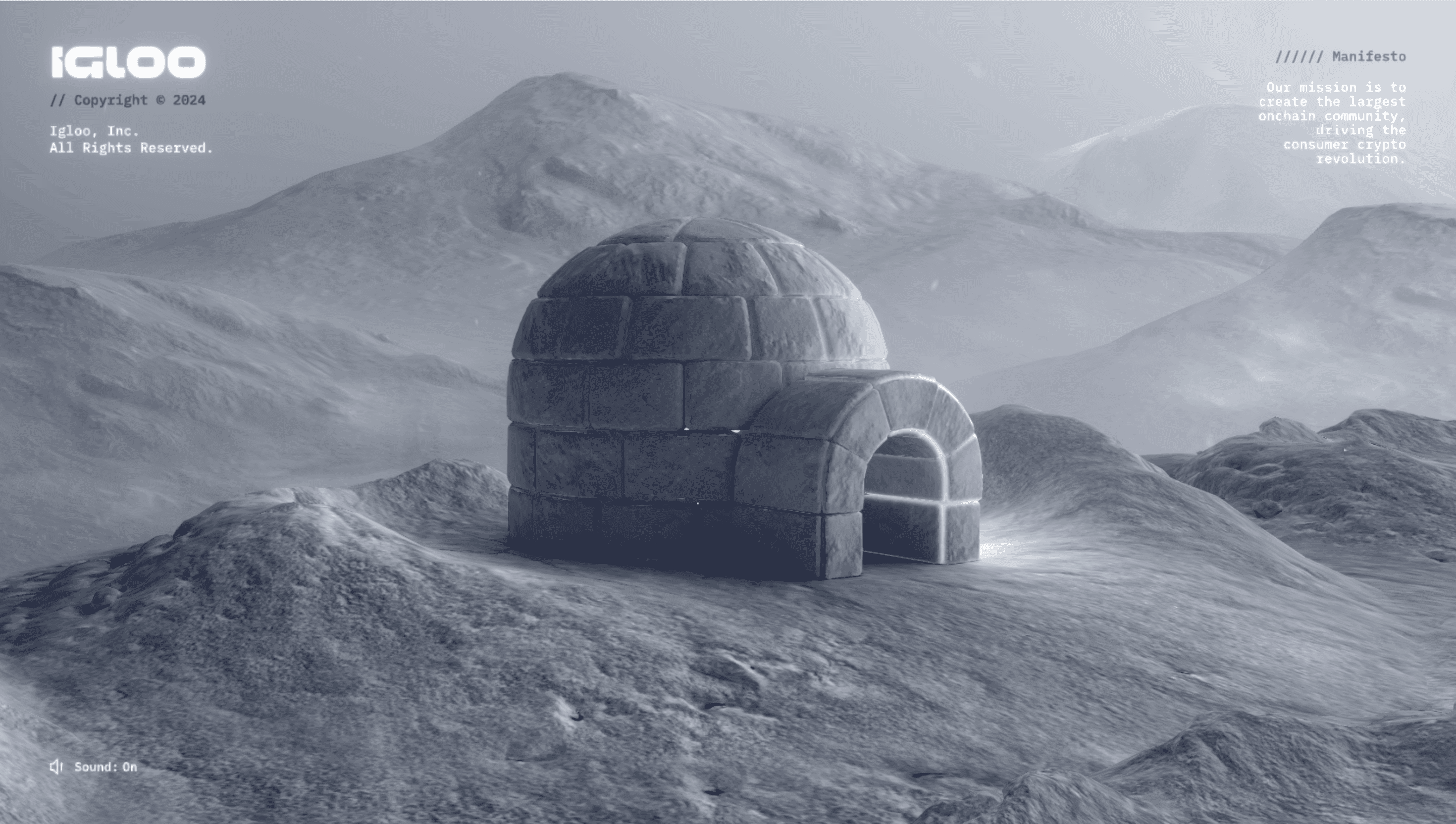
Igloo positions itself as the studio “re-freezing” Web 3 hype into real products. The site uses an iceberg metaphor: one monolithic shard hides many ventures (Pudgy Penguins, OverpassIP) revealed as you descend.
Visual Language & Motion
Visitors spawn inside a matte-black void sliced by iridescent ice. GSAP-eased scroll rotates the shard; WebGL reflections shimmer with HDRI lighting. Razor-thin grotesque caps and arctic gradients keep the palette cold yet readable, while hover halos mimic aurora flares. Subtle synth pads and glassy chimes lock to waypoints for multisensory immersion.
UX & Performance
Despite heavy visuals, compressed KTX2 textures, request-idle observers and `prefers-reduced-motion` fallbacks keep LCP ≈ 1 s on desktop and mobile. A persistent breadcrumb bar and context-aware drawer prevent disorientation inside the single-page narrative. Dark-mode contrast passes WCAG AA.
Takeaway
Igloo Inc proves spectacle can coexist with discipline: bold WebGL theatrics, clear copy hierarchy and hard-nosed optimisation form a blueprint for crypto brands that want wow-factor without sacrificing user respect.