Visit website

Dark – Netflix Guide
55 views4mo ago
Concept
The site positions itself as a “spoiler-safe companion” to the labyrinthine German series.
Rather than a static wiki, it’s a scrollable volume: Timeline → Families → Locations → Glossary. Each chapter reveals just enough context for the episode you’re on, encouraging binge-watchers to navigate the knot without ruining the next twist.
Visual Language & Motion
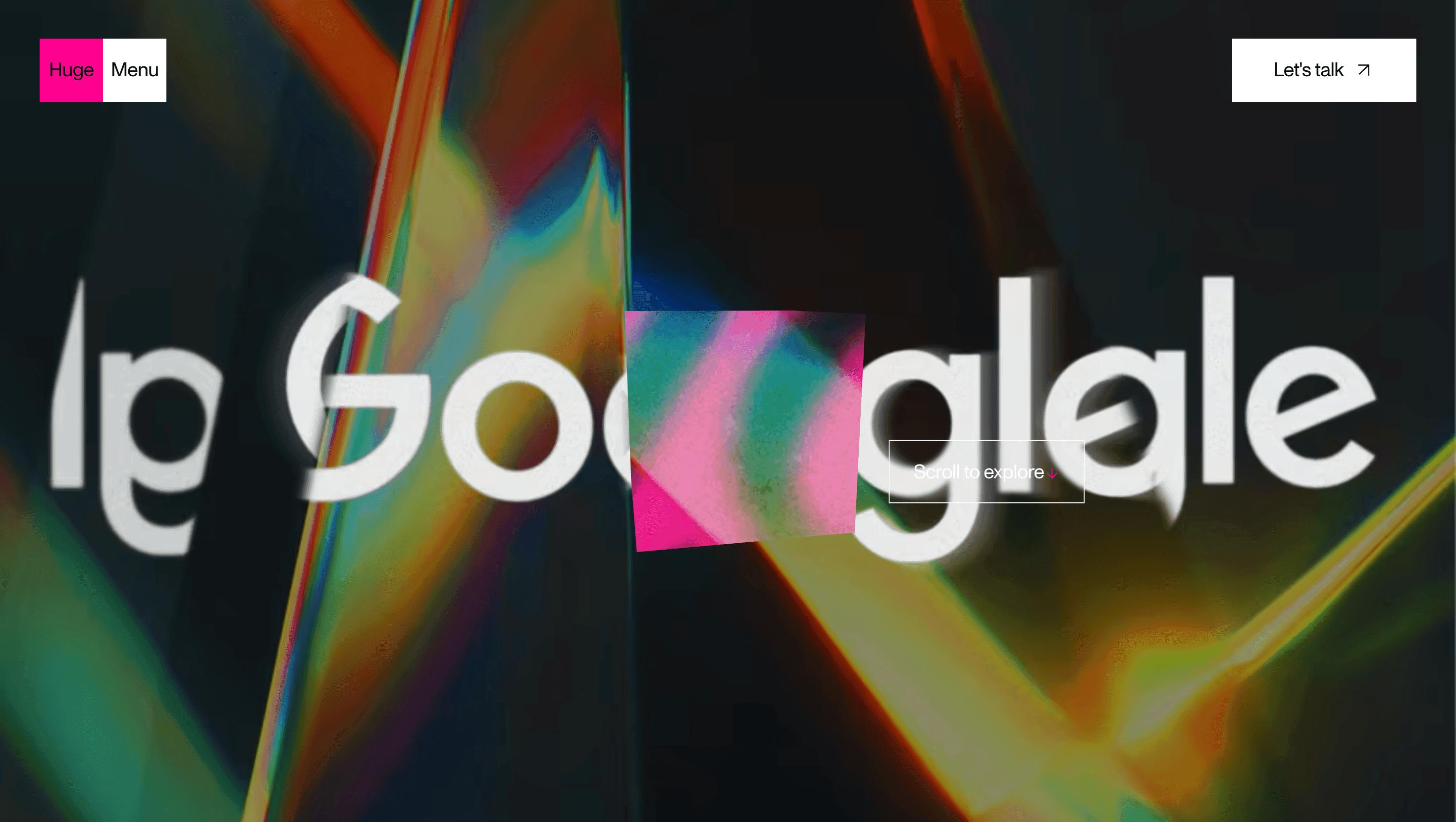
A coal-black canvas echoes “Winden Caves at midnight,” while amber glitch lines flicker like malfunctioning fluorescent tubes. Headlines render in DIN-Inspired grotesk, all caps, mirroring the show’s title card. Scroll and SVG line charts morph into WebGL solar orbits 1953, 1986, 2019 nodes drifting into a triquetra. Portraits desaturate until hovered; then a red-shift overlay highlights lineage and paradox, underscoring the series’ chromatic motif. Subtle VHS grain overlays every panel, evoking time-scarred footage.
UX & Performance
SVG graphs lazy-load as 8 KB gzipped files; heavier WebGL shaders boot only on desktop, keeping LCP ≈ 1.1 s and 1.5 s on 4G. A sticky progress bar glows yellow at points you’ve watched spoiler guard rails by design. prefers-reduced-motion freezes orbit animation, swapping parallax for fades; colour pairs remain WCAG AA even against charcoal (#060606). Keyboard arrows skip node to node for screen-reader parity.
Takeaway
Dark’s guide proves that fandom tools can be as artful as the show itself thoughtful spoiler gating, atmospheric motion and ruthless performance budgets transform a reference page into a living extension of the series’ tone.