Visit website
M&C 4.0
30 views4mo ago
Concept
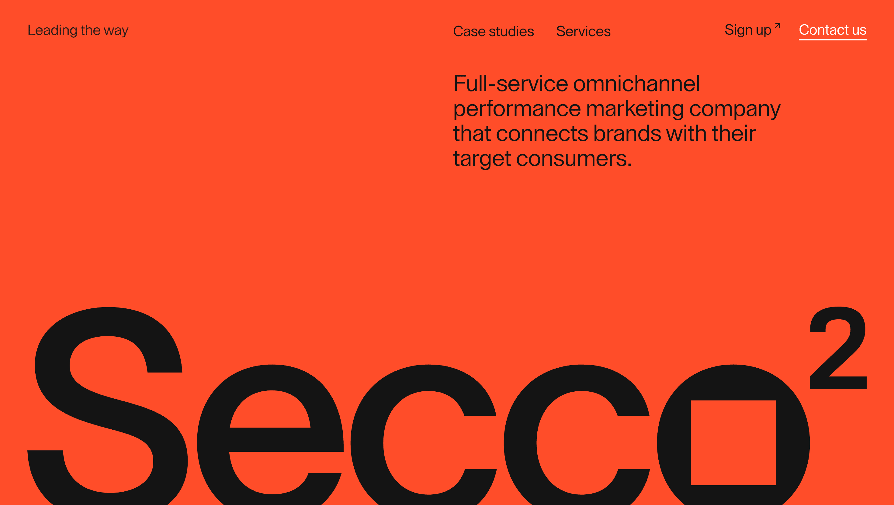
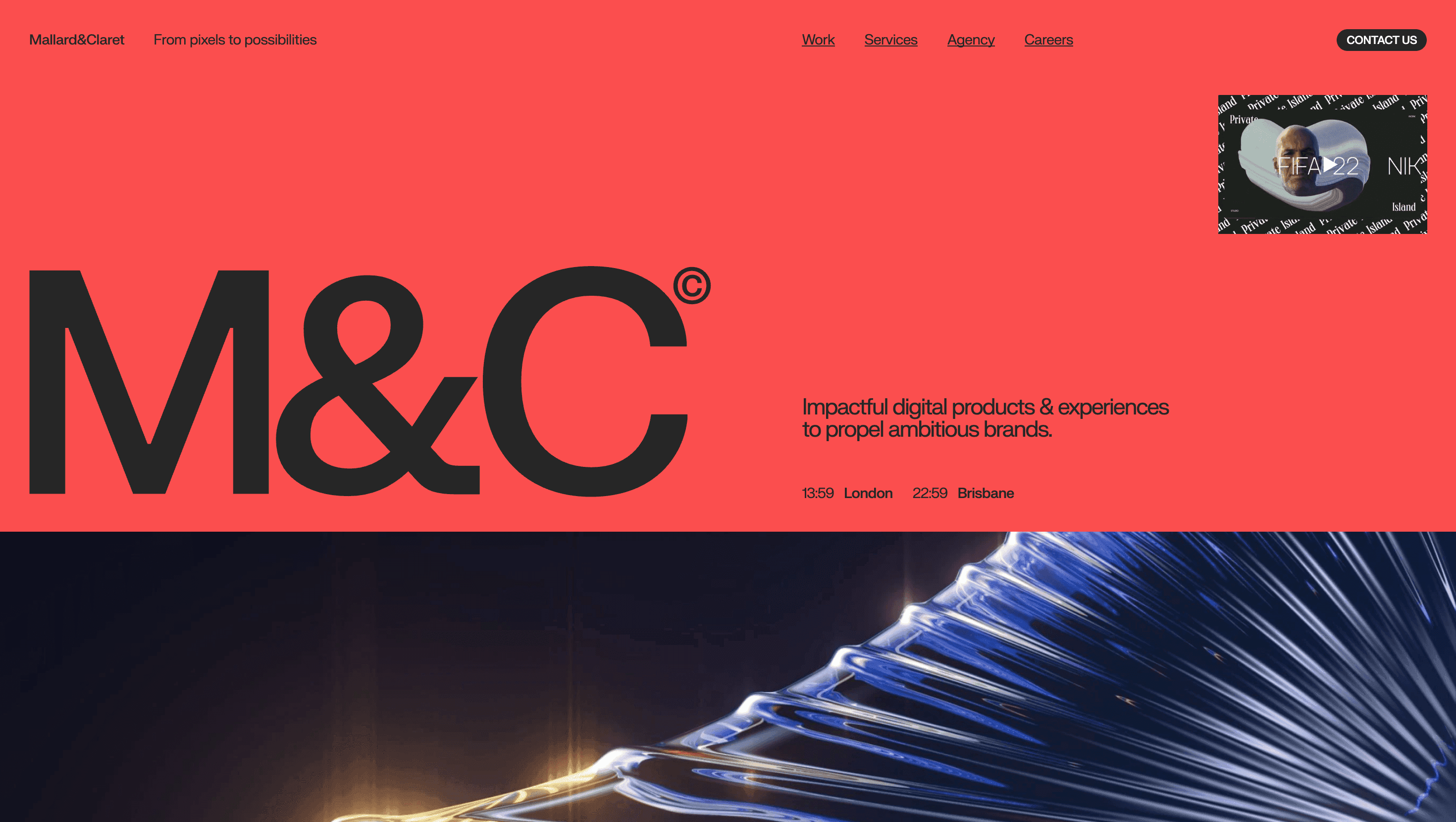
Mallard & Claret presents itself as a “digital craft house”—small enough to obsess over pixels, large enough to deliver platforms for Adidas, British Land and David Beckham. The portfolio scrolls like a live creds deck: philosophy, flagship work and process unfold in one fluid narrative, selling expertise without boring slides.
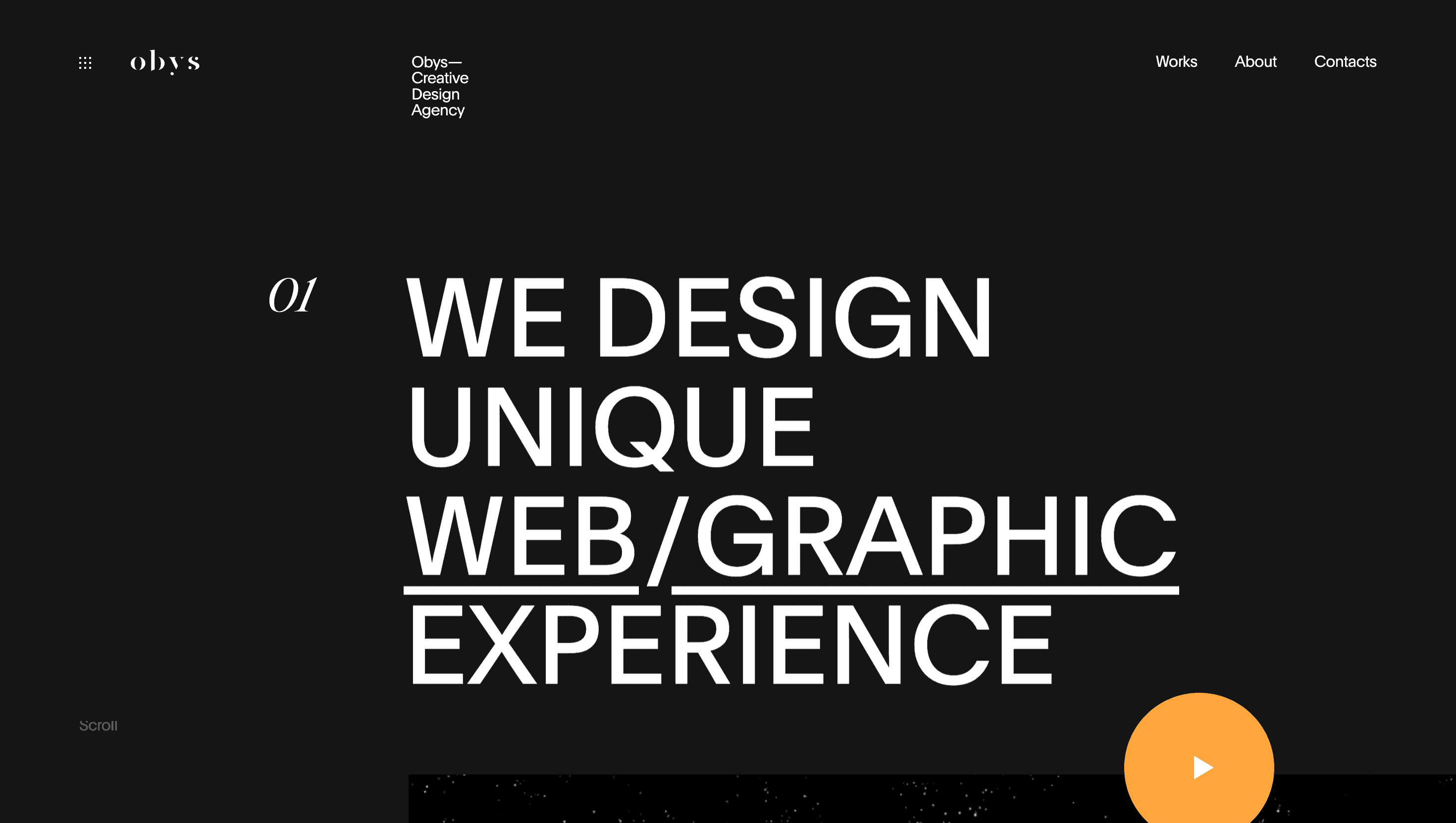
Visual Language & Motion
A deep-ink backdrop sets the stage for full-bleed case-study reels tagged M-01, M-02 … Hover any tile and playback pauses, letting you scrub frames—mini proof of meticulous QA. Headlines in Monument Grotesk stretch the 12-column grid while electric-cyan accent lines flash on interaction. Subtle WebGL particles hover behind video masks, hinting at the studio’s front-end firepower without stealing focus.
UX & Performance
Hero loops ship in AV1 and lazy-load only on ≥ 1024 px, keeping LCP ≈ 1.2 s even on 4 G. IntersectionObserver preloads the next case two screens ahead for jitter-free playback. prefers-reduced-motion locks reels to poster frames, and colour pairs meet WCAG AA. Sticky nav shrinks to a 40 px icon bar after 80 px scroll, giving the stage to work while keeping orientation clear.
Takeaway
Mallard & Claret demonstrates how discipline fuels emotion: a ruthless grid, restrained palette and tight performance budgets create a portfolio that feels as polished as the products it showcases—proof that a studio can sell capability through the very medium it celebrates.
More Projects


Sponsor
Your ad here