AQuest
7 views2mo ago
Concept
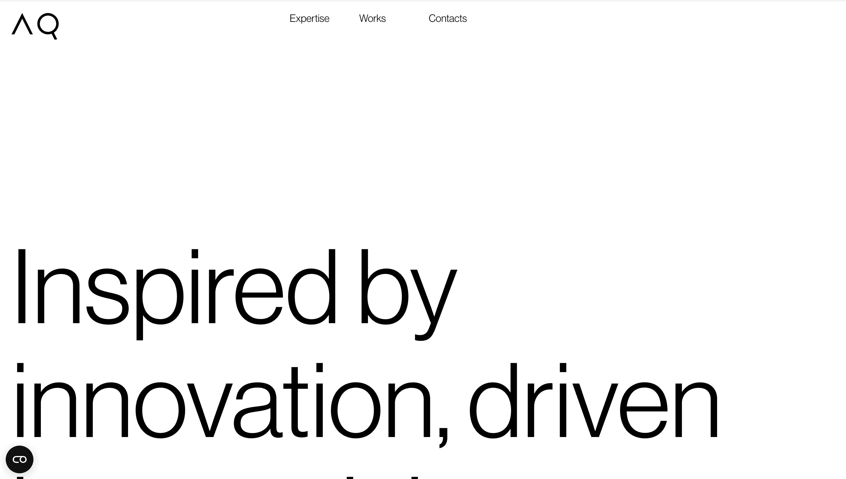
AQuest calls itself a “creative production company for the post-screen era.”
The portfolio behaves like a kinetic credentials deck one uninterrupted scroll reveals philosophy, flagship work and in-house tech, so prospects absorb capability through experience, not slides. The narrative arc is simple: Dream → Design → Build → Impact.
Visual Language & Motion
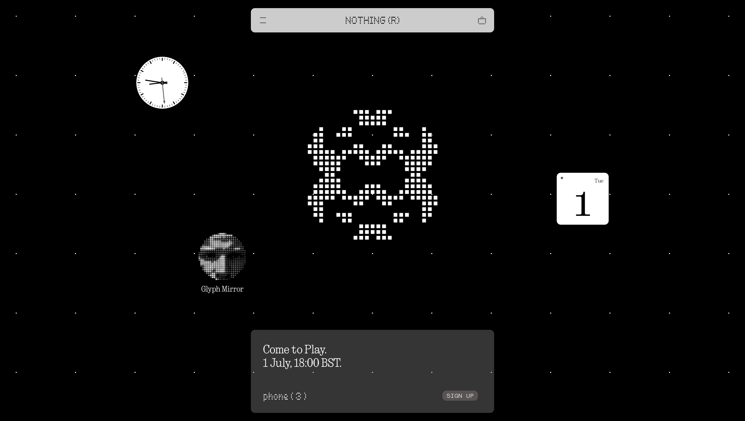
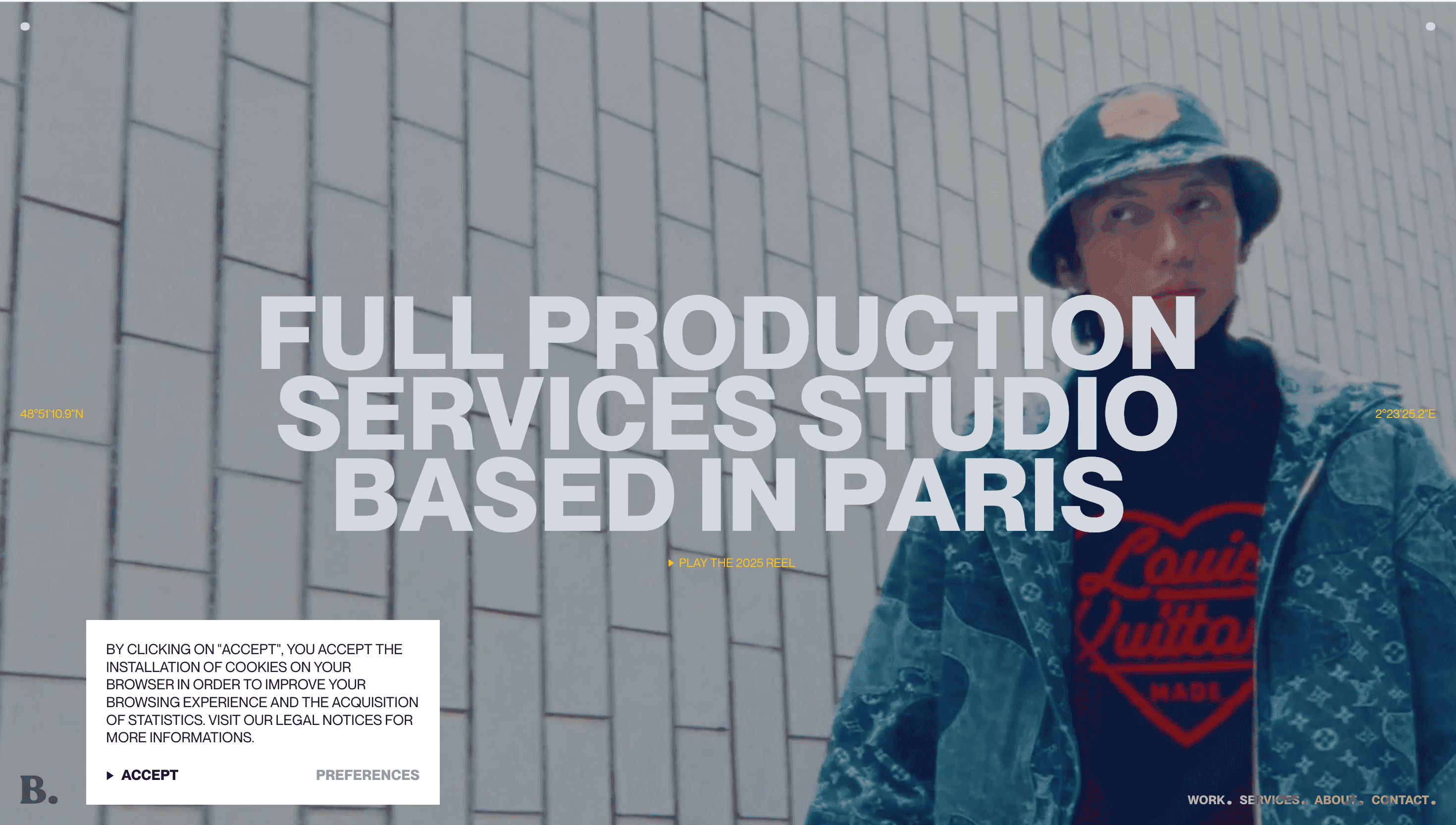
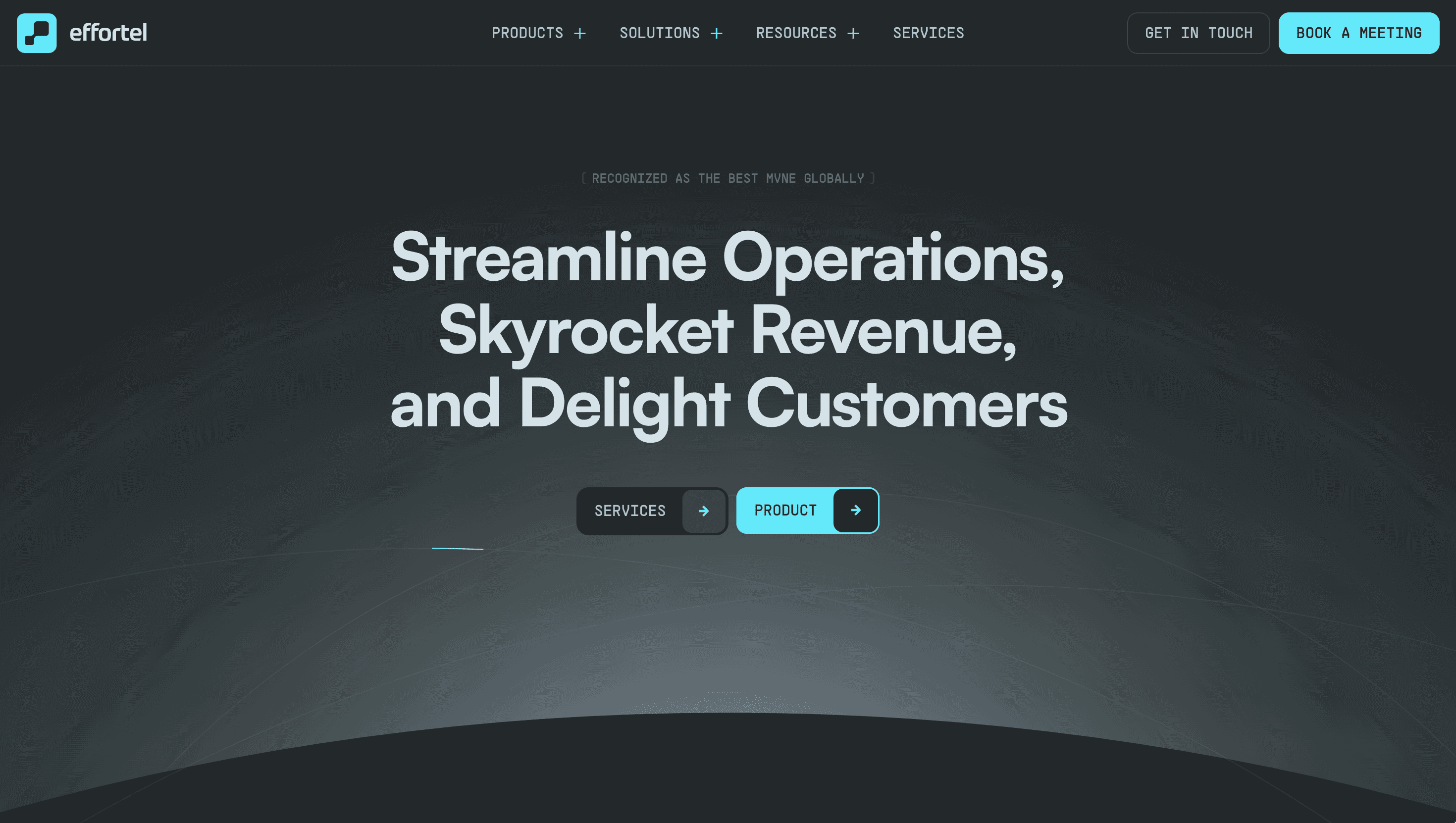
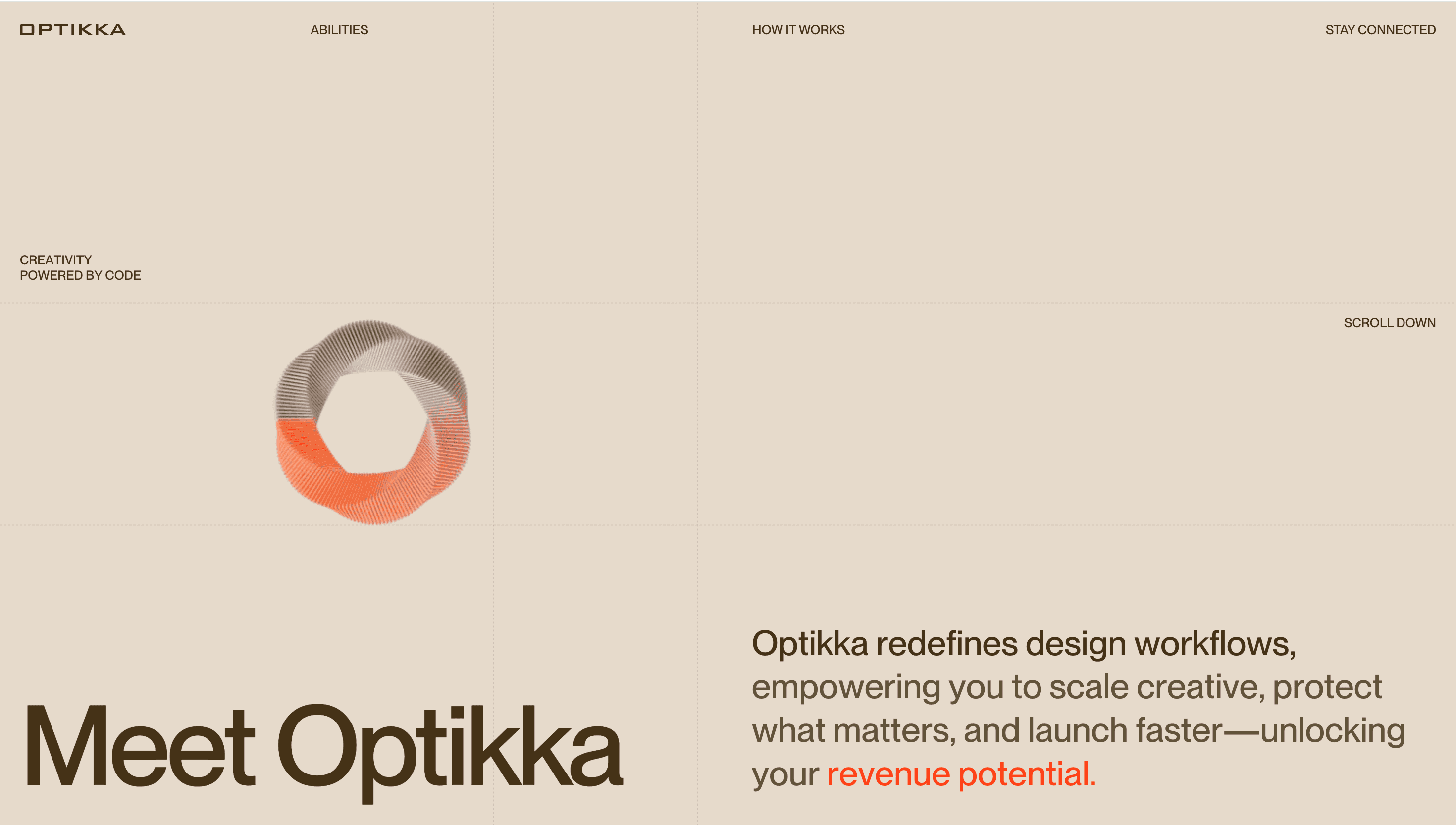
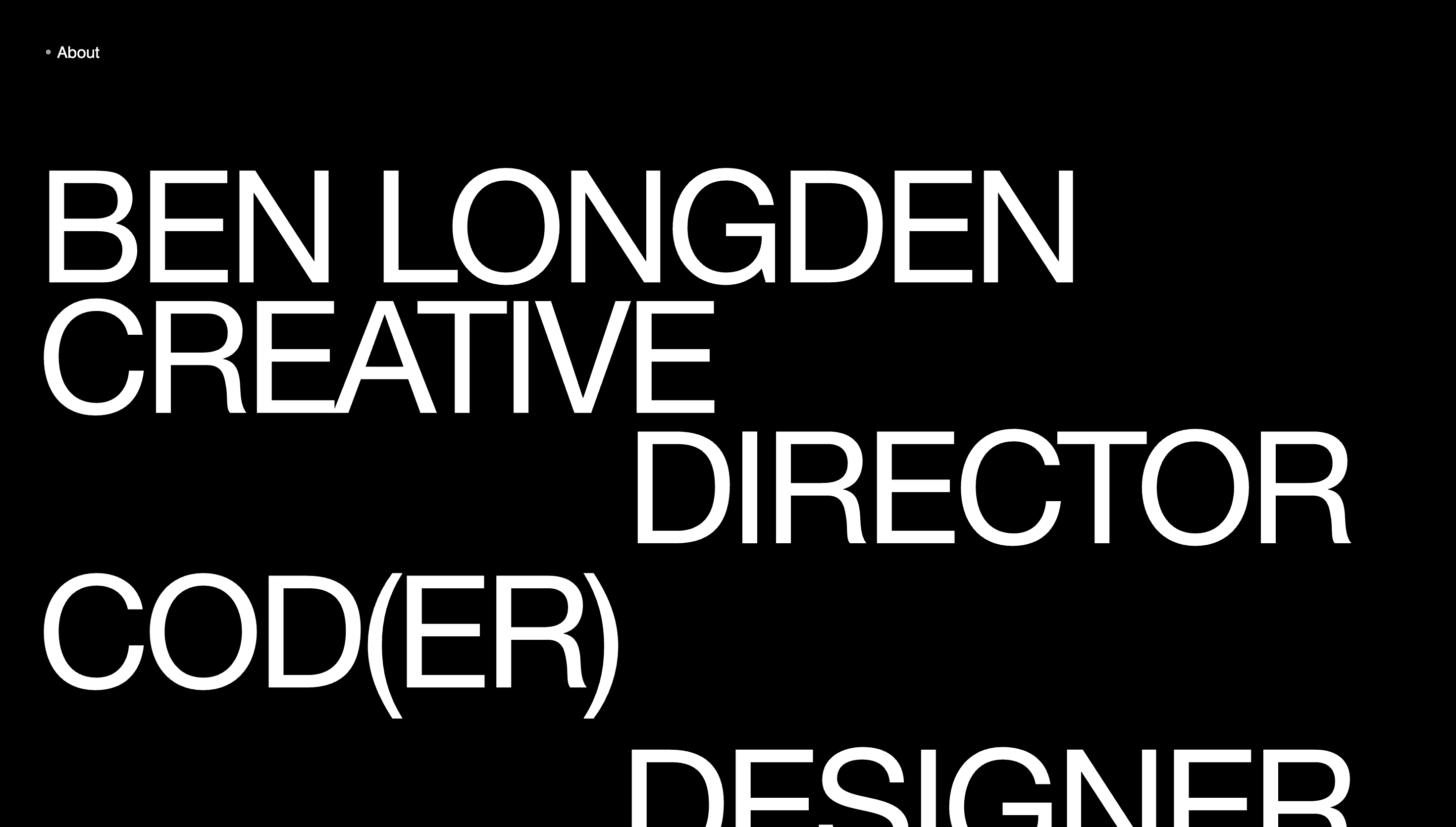
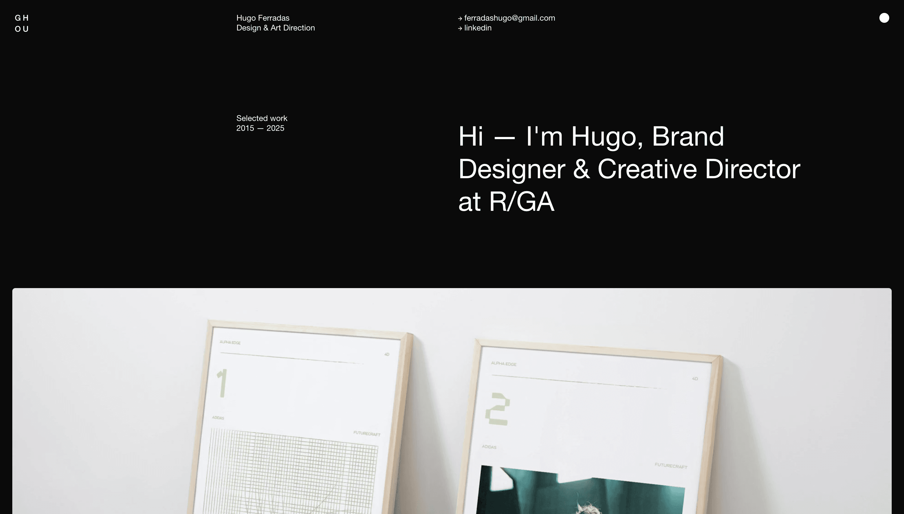
The stage is satin black; colour arrives as project specific bursts Prada cyan, Lamborghini yellow, RaiPlay magenta proving range while keeping the brand neutral. GSAP-driven grids snap, fold and ripple as you scroll, echoing pages turning in a hi-gloss magazine. Case-study thumbnails sit in square masks that bloom into full-bleed WebGL video on hover; a soft after-image trails the cursor, hinting at motion-capture R&D. Headlines set in Monument Grotesk march across a 12-column grid, while micro-icons (▲ ■ ●) map to the studio’s triad of skills: Strategy, Creativity, Technology.
UX & Performance
Hero loops ship as AV1 and lazy-load only on ≥ 1024 px; mobiles receive a still, keeping LCP ≈ 1.2 s even on 4G. IntersectionObserver prefetches the next case two screens ahead, ensuring jitters never surface during reel playback. prefers-reduced-motion freezes grid ripples and swaps shader reveals for opacity fades. Colour pairs pass WCAG AA, and tab order mirrors visual flow, giving screen-reader users the same rhythm as sighted guests.
Takeaway
AQuest shows how a studio can demo its super-power in real time: disciplined grid, cinematic motion, ruthless performance budgets and brand-agnostic colour convert browsing into conviction proof that great digital craft feels inevitable when strategy, design and code move in lockstep.
Similar project


Sponsor
Your ad here
