Visit website
Locomotive®
24 views4mo ago
Concept
Locomotive® frames its portfolio as a rolling train of ideas. Each project is a carriage in an endless track, underscoring the studio’s motto: keep momentum, ship craft.
Visual Language & Motion
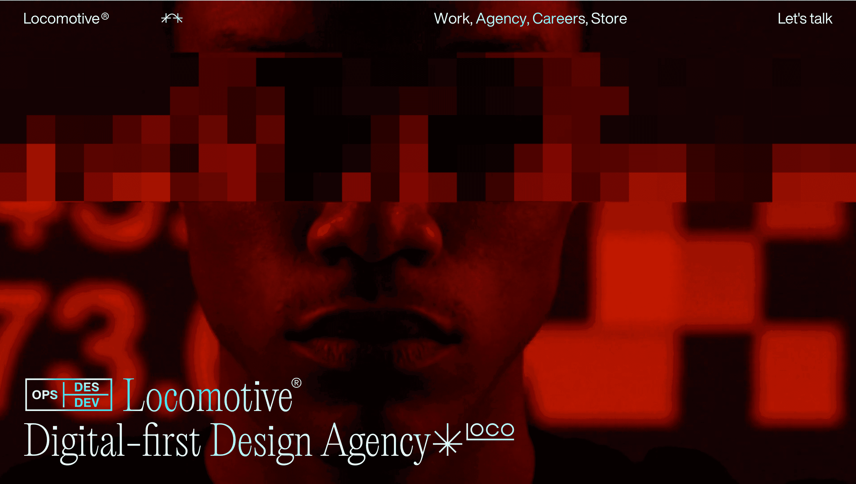
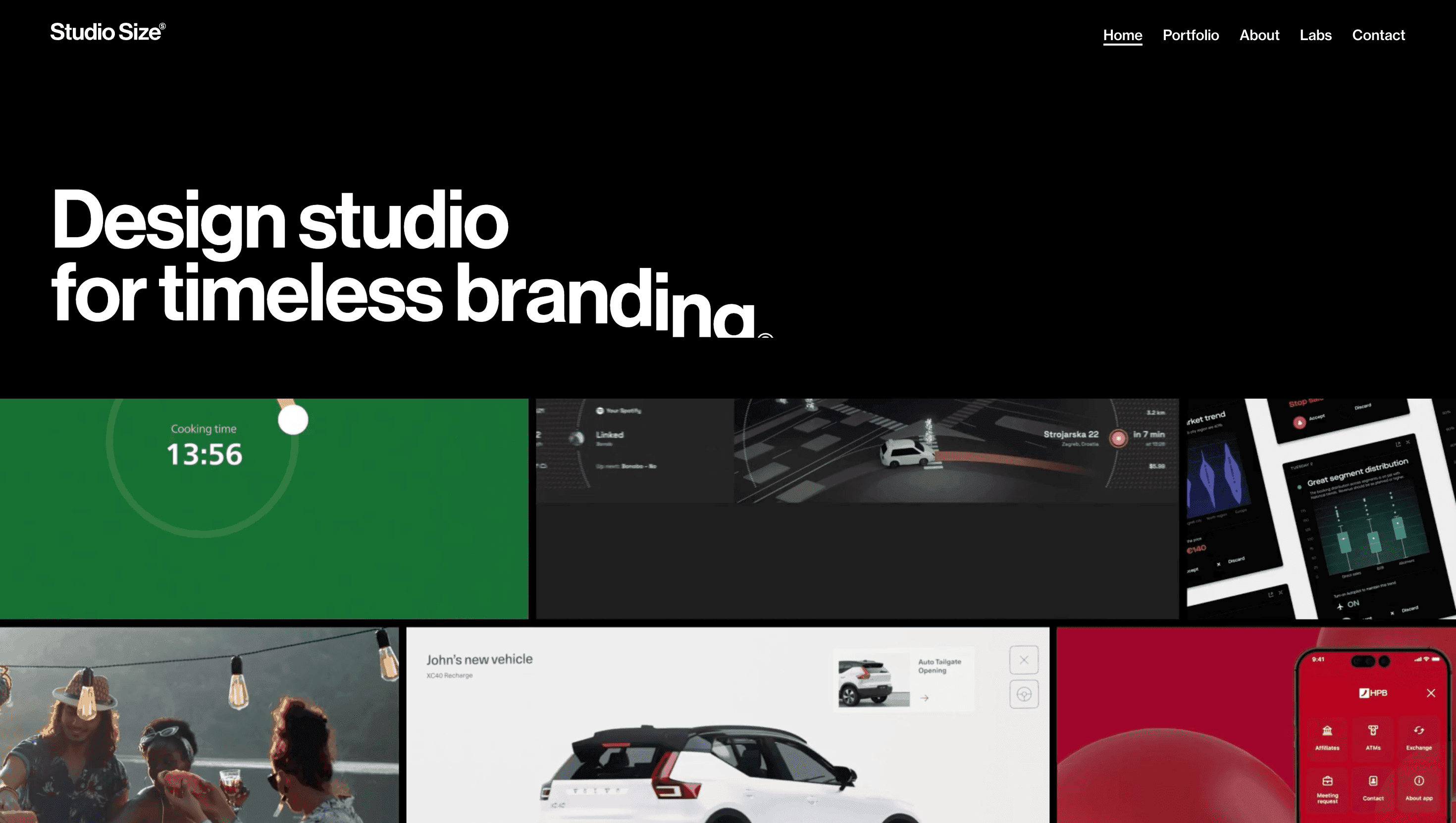
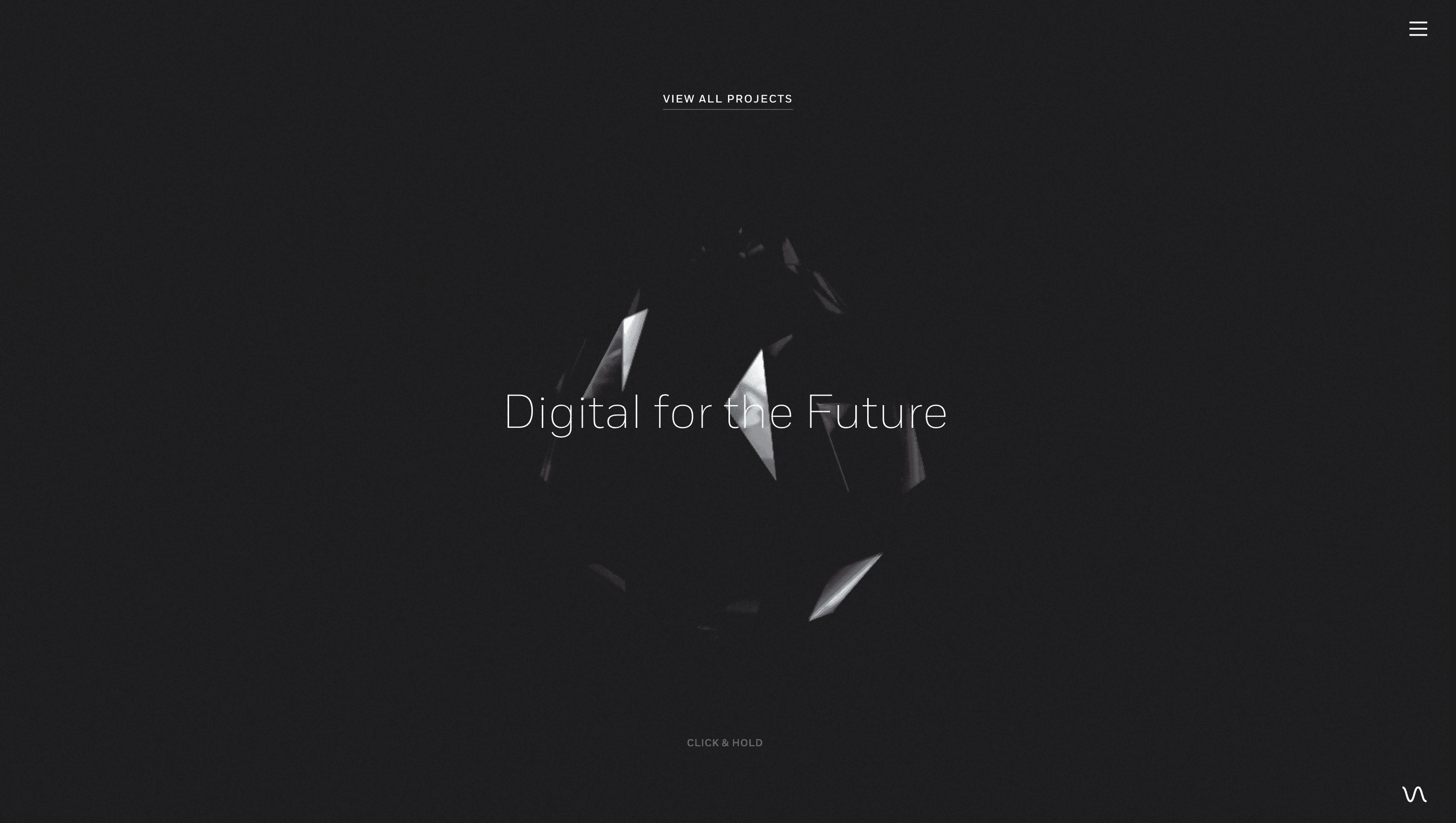
The hero greets you with an ASCII-style LO logotype that splinters into a flurry of points, instantly hinting at code-driven artistry. Scroll and the page “clicks” forward like rail segments: sections snap into view with GSAP-timed easing, revealing full-bleed videos, over-print typography and duotone stills. A muted charcoal palette keeps focus on motion; flashes of acid lime highlight calls to action. Sub-pages inherit the train trope through sticky-column carousels, letting media glide while copy stays pinned.
UX & Performance
Despite heavy video, the site maintains LCP < 1.2 s via `playsinline` MP4 posters, lazy-loaded sources and `prefers-reduced-motion` fallbacks. Keyboard navigation jumps between railcars; skip-links and 3:1 contrast ratios ensure WCAG AA compliance.
Takeaway
Locomotive® distils a decade of award-stage polish into a single, playful narrative: forward motion as a metaphor for progress. Designers can mine it for lessons in thematic cohesion every interaction, layout shift and micro-gesture reinforces the story of perpetual movement.
More Projects

Sponsor
Your ad here