Visit website
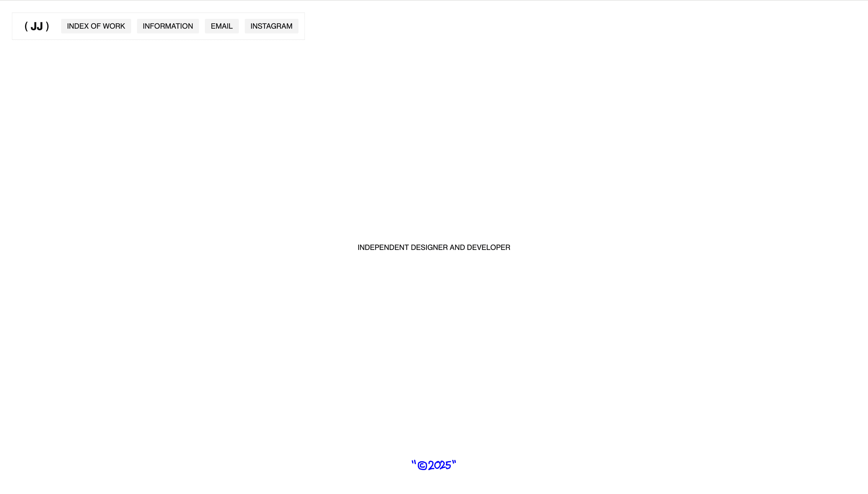
Eduard Bodak — Portfolio
27 views4mo ago
Concept
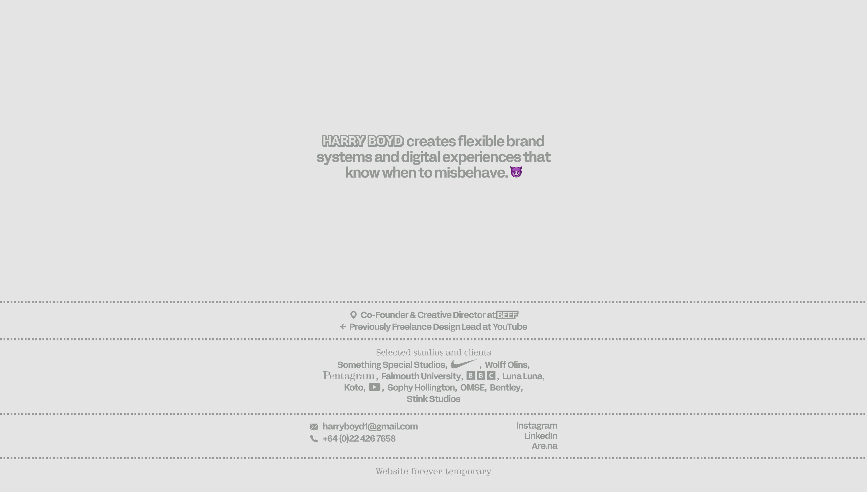
The site works as a playground-résumé: every scroll cue unlocks a new skill WebGL shaders, kinetic typography, real-time audio-reactive visuals so visitors experience Bodak’s craft long before they read a single credential. The message is implicit: code can be design, design can be code.
Visual Language & Motion
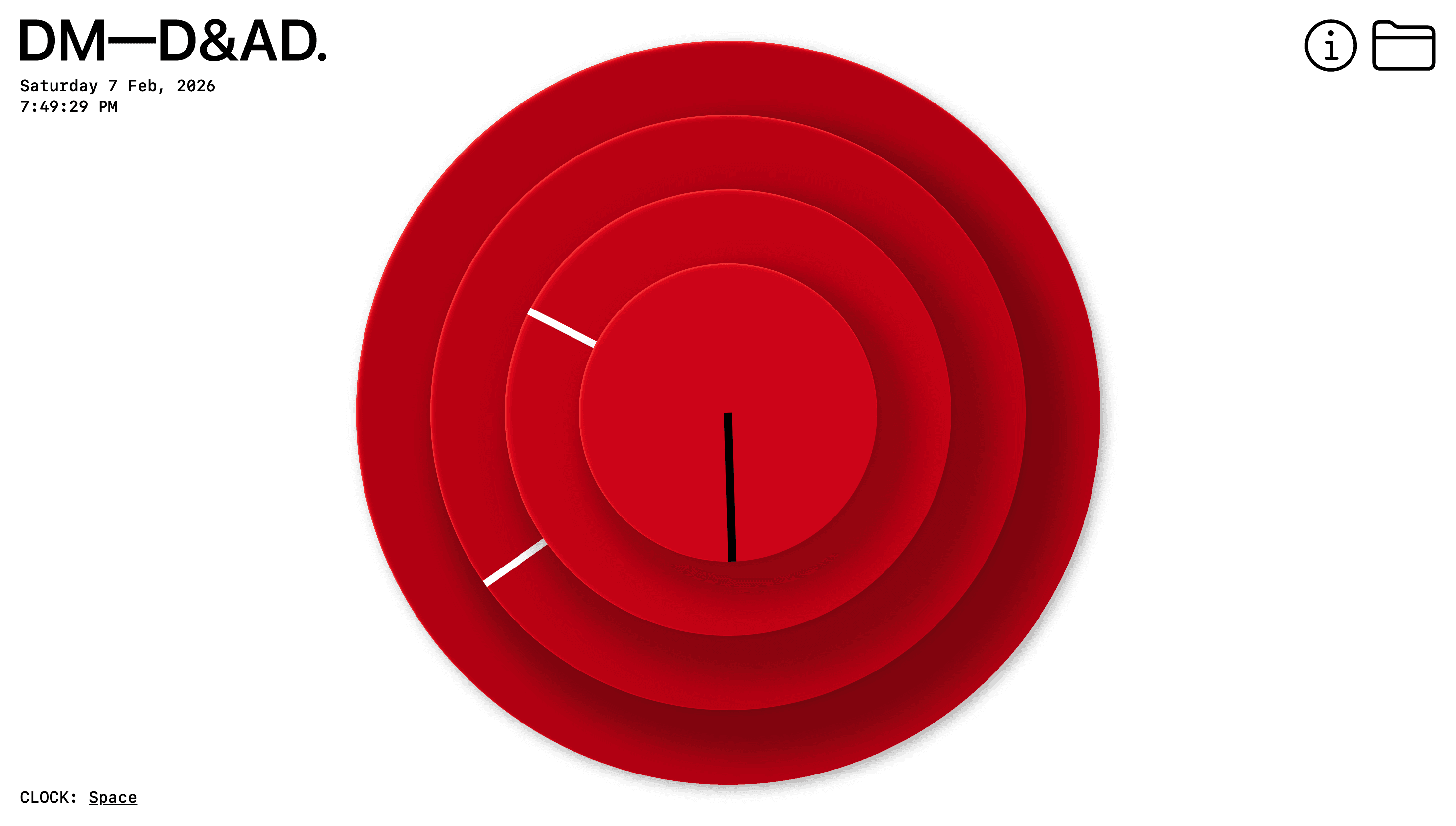
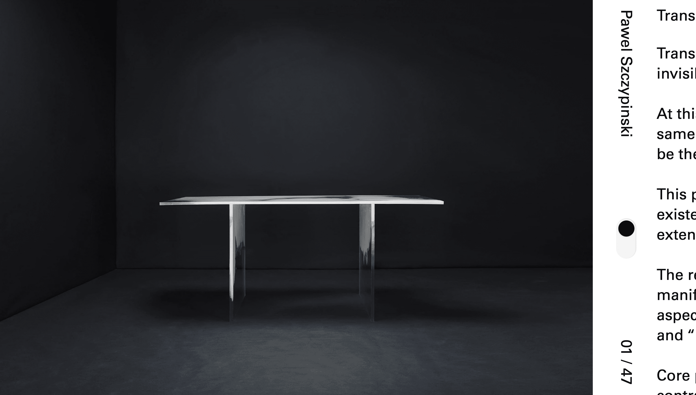
A pitch-black canvas hosts bold, monospace caps that flicker like a terminal. At load, a low-poly orb blossoms into a fluid point-cloud that tracks the cursor with spring physics. Section headers slide in on a strict 8-column grid, then dissolve into particles, echoing the transition from static to dynamic. Accent magenta appears only on hover states and CTA outlines restraint that heightens each interaction.
UX & Performance
Despite heavy shaders, LCP sits ≈ 1.2 s desktop / 1.6 s mobile: meshes arrive via Draco compression and textures stream in KTX2. prefers-reduced-motion freezes the orb and swaps particle transitions for opacity fades. Colour contrast passes WCAG AA, sticky nav collapses to a thumb-friendly pill under 480 px, and tab order mirrors visual flow so screen-reader users enjoy the same rhythm.
Takeaway
Eduard Bodak’s site proves that a developer portfolio can teach through sensation: disciplined performance budgets and semantic markup underpin a riot of generative motion, turning self-promotion into a hands-on demo reel.