Visit website
Studio Feixen
15 views4mo ago
Concept
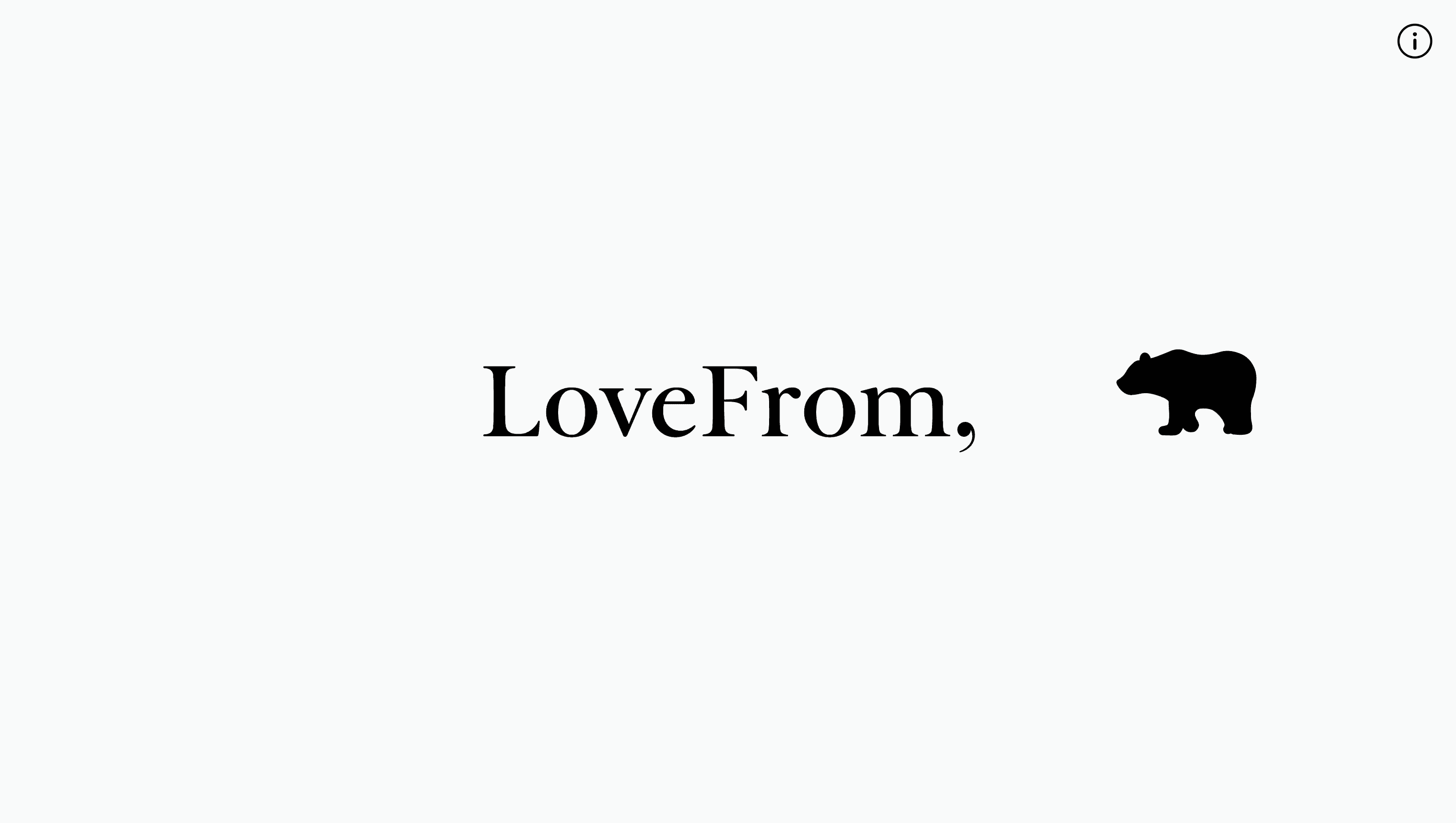
Studio Feixen positions itself as a “never-ending experiment in visual expression.”
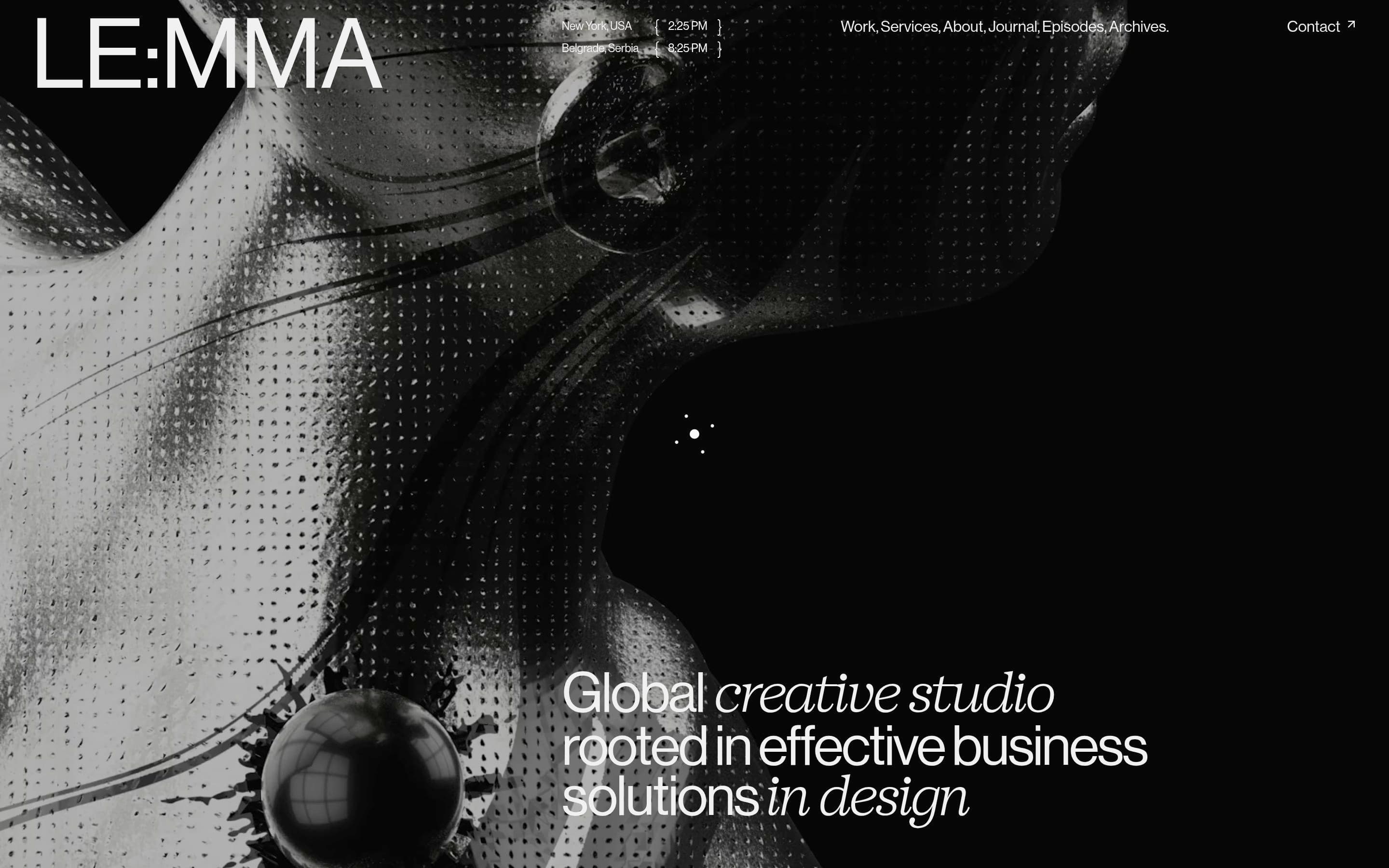
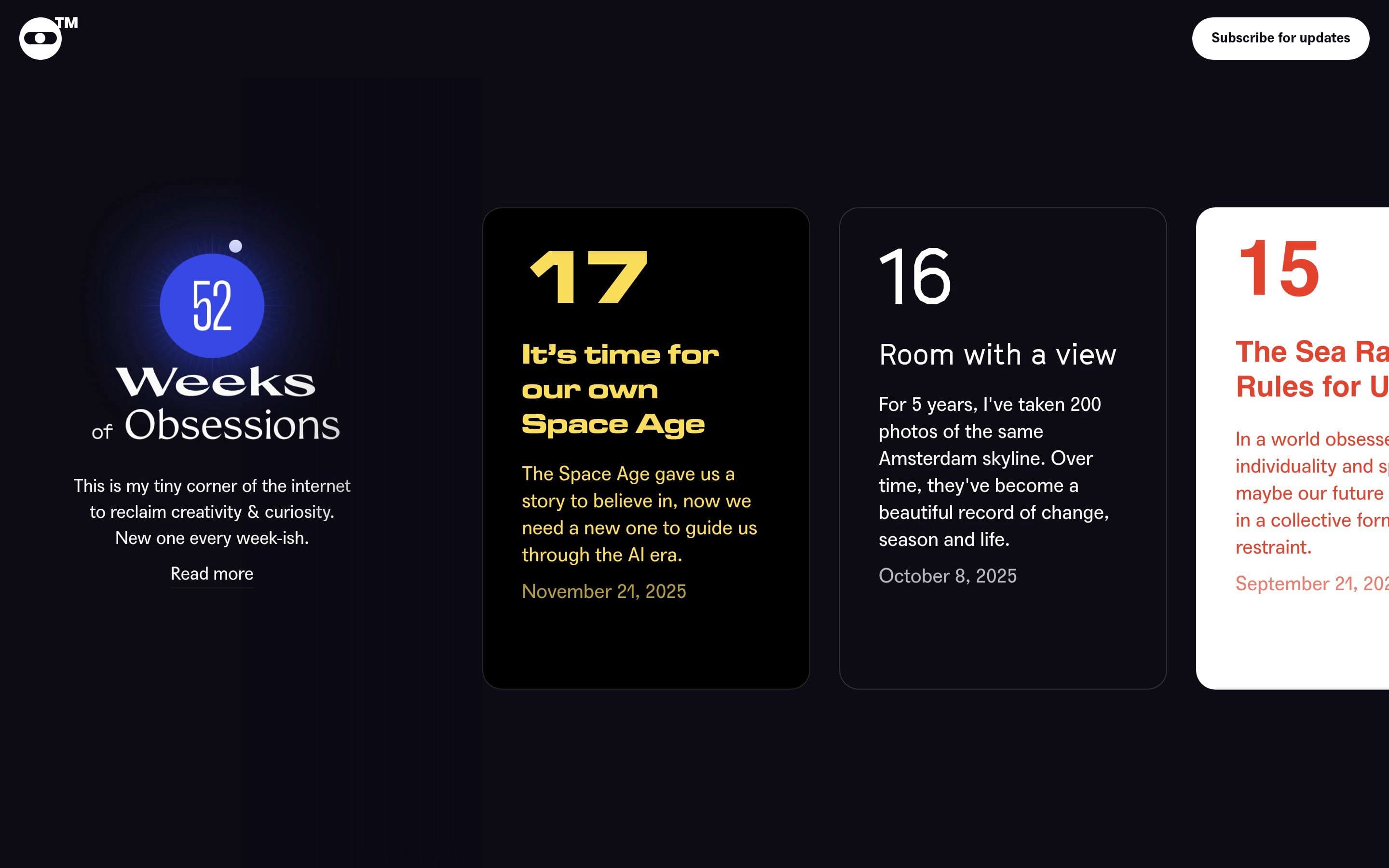
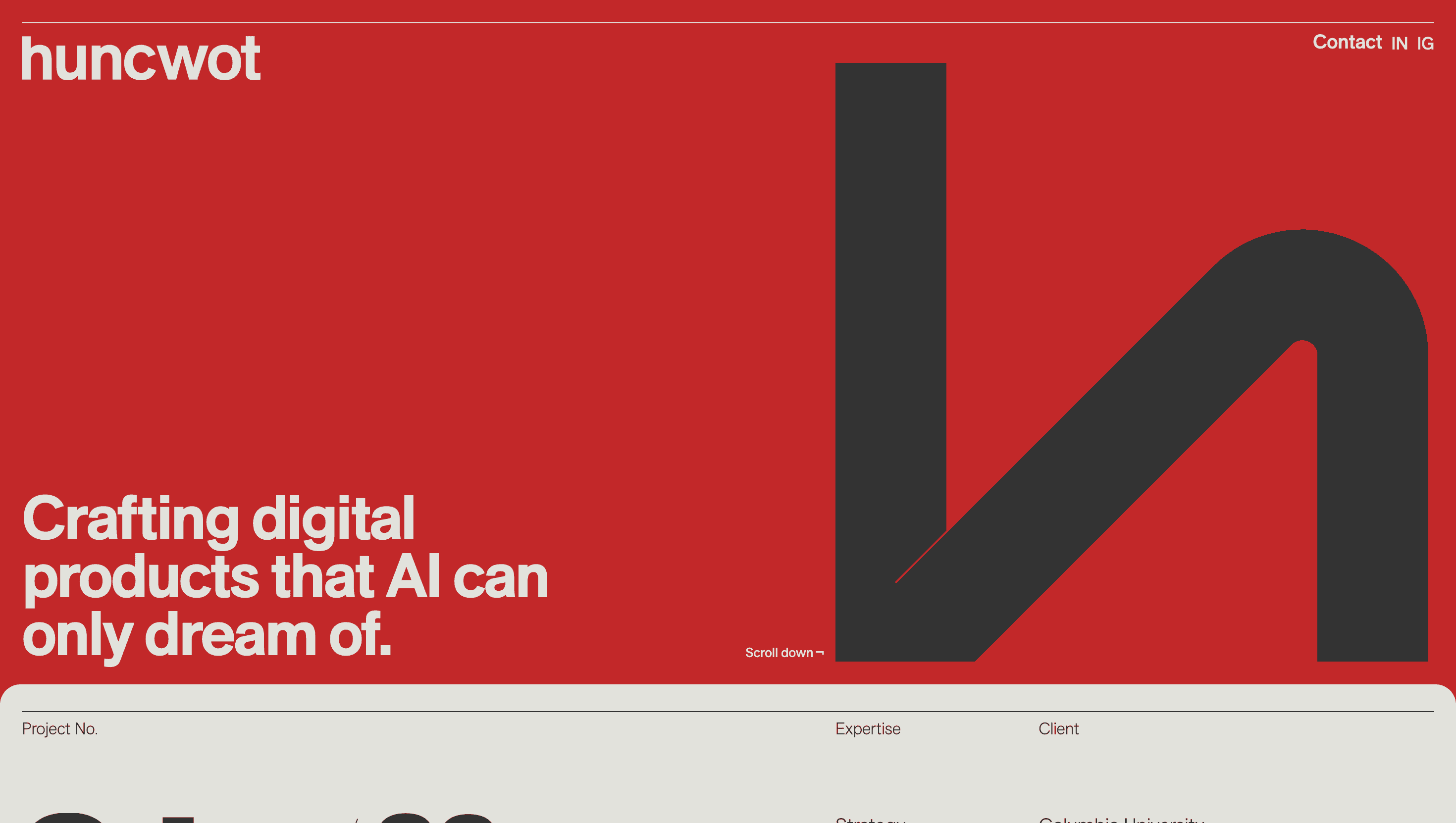
Their website feels like a graphic-design pinball machine: every scroll jolt reshuffles layouts, flips color schemes and animates glyphs, proving the team’s belief that rules are best understood by breaking them in style.
Visual Language & Motion
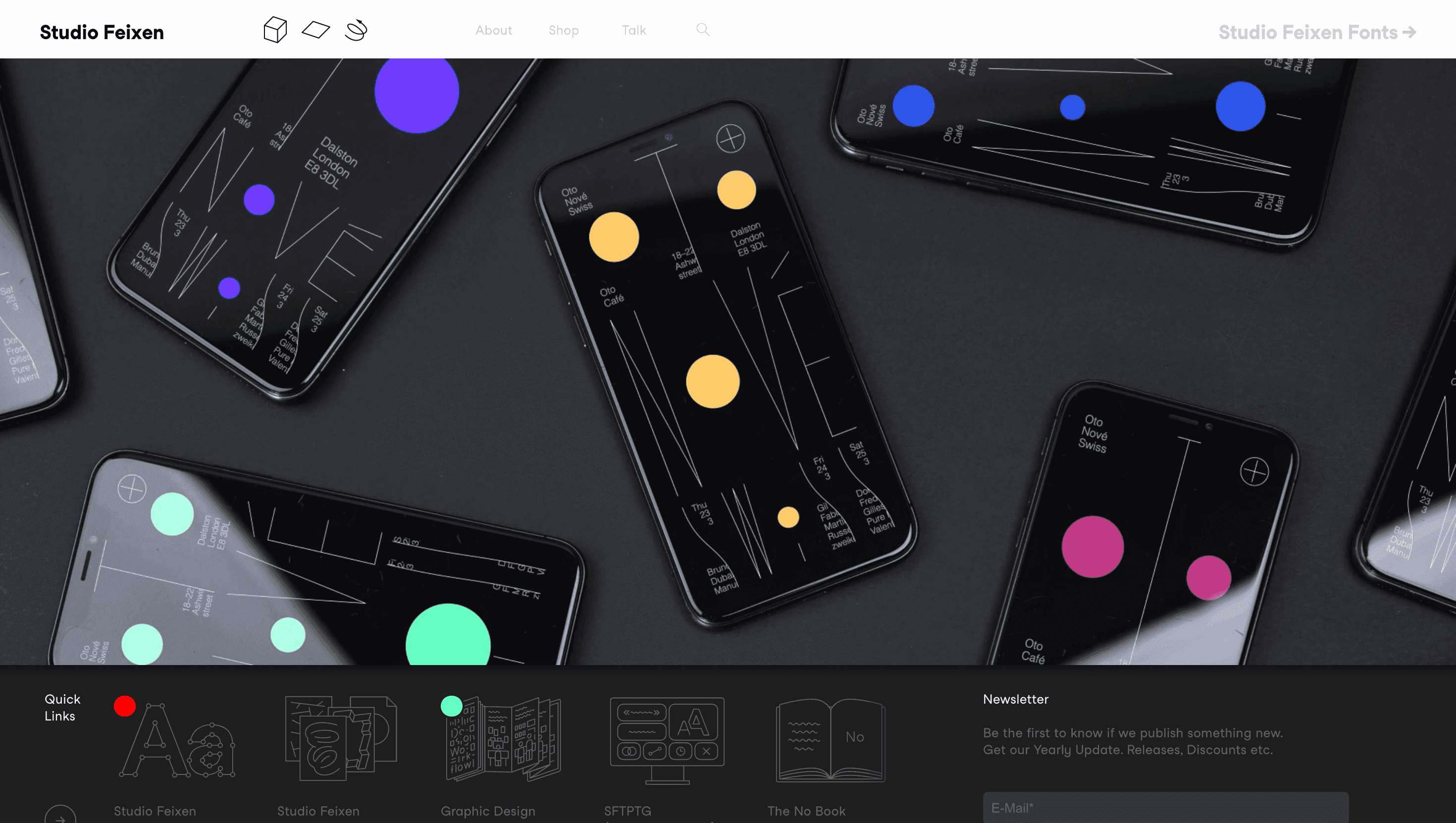
The home screen loads a stark white stage that’s instantly splattered by oversized, center-spine headlines stretching to the viewport edge. Click a project: the background floods electric magenta or acid green, and a carousel of posters whirls in on cubic-Bezier timing. Hover states nudge letters 4px off baseline, mimicking metal type that’s been slammed just a bit too hard. A sticky left-hand rail carries a rotating ☻ icon Feixen’s tongue-in-cheek grin doubling as global nav.
UX & Performance
Despite riotous visuals, LCP sits ≈ 1.1 s on desktop and 1.5 s over 4G: JPG XL thumbnails lazy-load; full-res PNGs load only when 75 % in view. Motion is CSS-only; prefers-reduced-motion freezes headline jumps and converts carousel spins to fades, keeping usability intact. High-contrast text (black on neon or vice-versa) passes WCAG AA, and keyboard arrows traverse projects in document order, so screen-reader users enjoy the same restless rhythm.
Takeaway
Studio Feixen shows that Swiss rigor can dance: a disciplined grid, pristine performance budgets and fearless color yield a portfolio that’s as energetic as it is masterful an open invitation to embrace design mischief with technical precision.