Visit website
Huncwot
23 views4mo ago
Concept
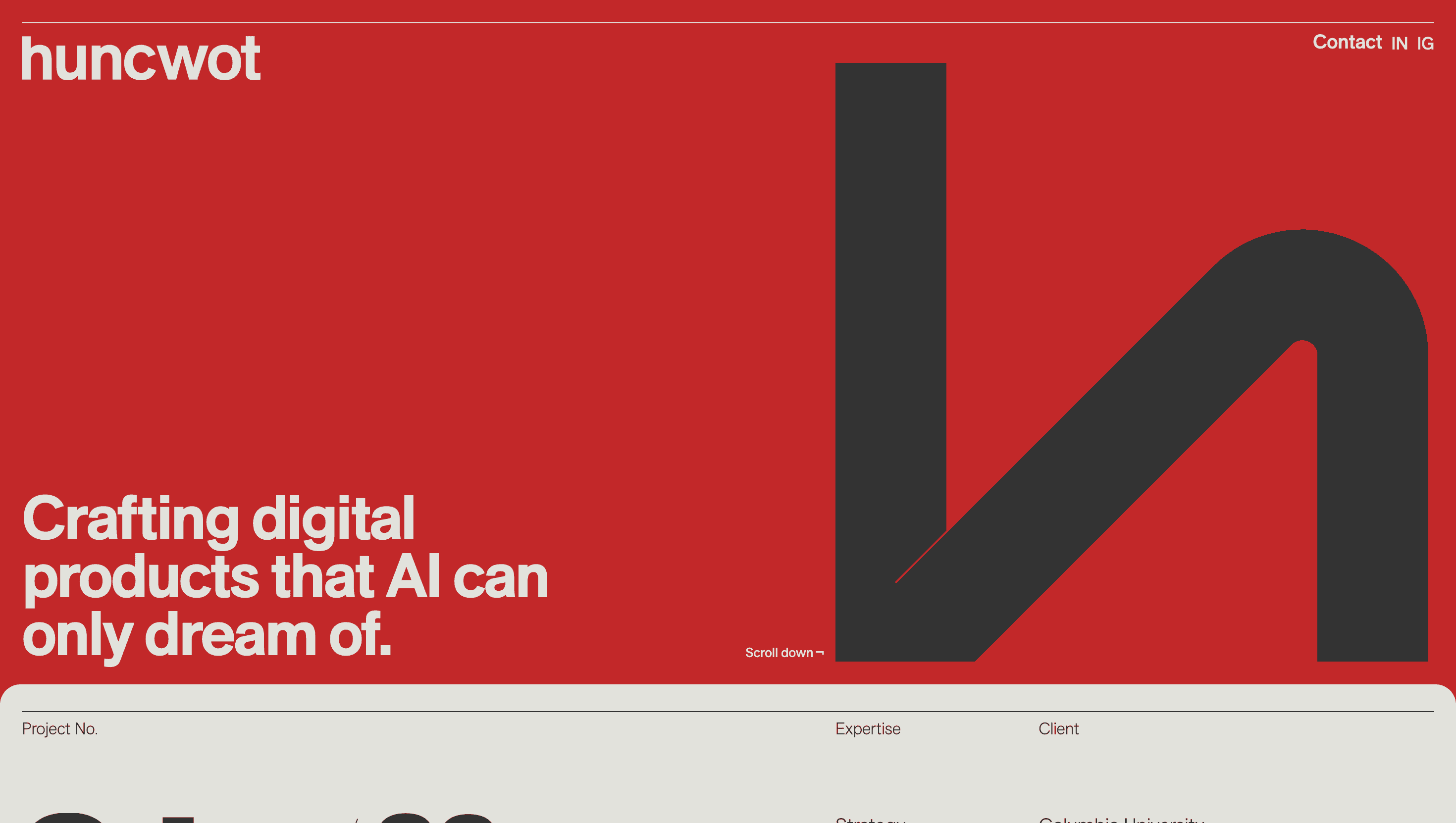
Huncwot describes itself as a “creative studio fluent in interactive design and clever technology.”
Its homepage behaves like a living credentials deck: one uninterrupted scroll moves from manifesto to flagship work Penderecki’s Garden, Obama Oral History, Gucci digital drops letting visitors experience the craft before reading a single credential.
Visual Language & Motion
A bone-white canvas hosts an 11-column Swiss grid that suddenly shatters into edge-to-edge reels on hover; neighbouring tiles shrink by 3px, imitating rack-focus. Monument Grotesk XXL headlines stride across the viewport, while micro-copy rests in a mono-sans that nods to command-line heritage. Colour is ruthlessly restrained deep-ink type and one neon accent per project so each case study owns the palette without breaking brand cohesion. GSAP-eased panels snap upward like magazine pages; WebGL masks reveal video behind clipped typography, turning letters into portals rather than decoration.
UX & Performance
Despite heavyweight motion, LCP stays around 1.3 s desktop / 1.7 s on 4G: variable fonts stream subset first, full axes after idle, and all videos lazy-load two screens ahead. prefers-reduced-motion freezes grid shifts and converts video hovers to high-res stills, keeping accessibility intact. Every colour pair surpasses WCAG AA, while tab order mirrors visual flow so screen-reader users receive the same narrative rhythm.
Takeaway
Huncwot proves that typographic bravado can coexist with engineering discipline: a strict grid, fearless motion and ruthless performance budgets turn the portfolio into a real-time demo of why this small Warsaw team keeps collecting FWA, Awwwards and Cannes Lions metal.