Radical Face
5 views2mo ago
Concept
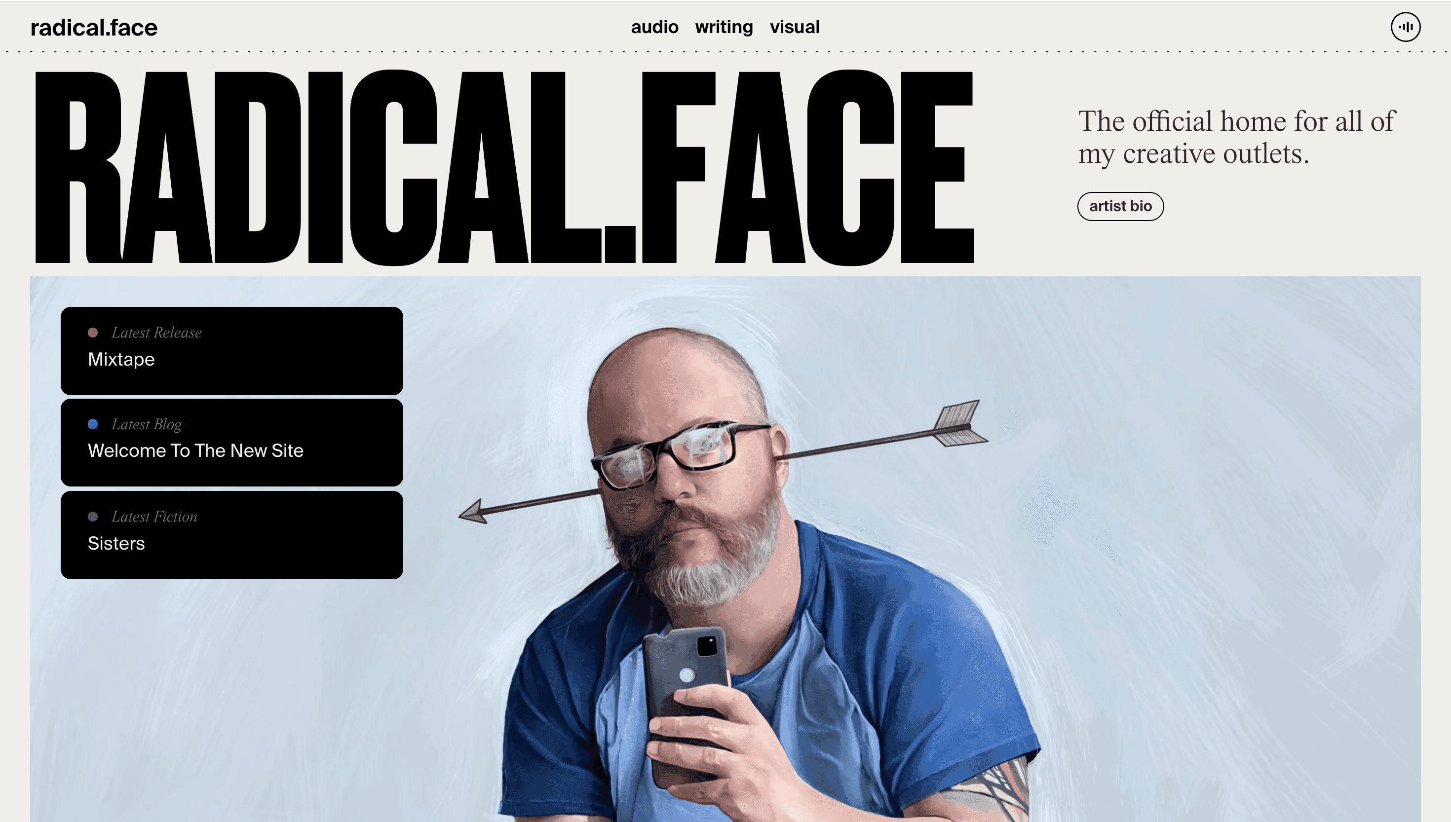
Radical Face is equal parts singer-songwriter, storyteller and visual artist, so the website works like a living anthology. Albums, short fiction, paintings and blogs share one scroll, inviting visitors to explore Ben Cooper’s universe in any order they choose. A subscription panel echoes his promise: “I’ll only write when I have something worth sharing,” framing the site as an anti spam refuge.
Visual Language & Motion
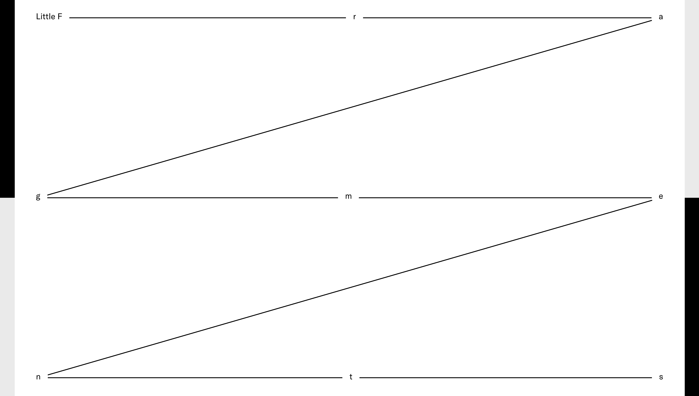
The redesign borrows from indie magazines: generous margins, serif headlines paired with modern sans copy, and pages that switch from full-bleed artwork to type only essays without breaking rhythm. Modular “cards” let longform text sit comfortably beside lyric videos or Bandcamp embeds an intentional nod to periodical grids. Subtle hover fades and slide in captions supply motion without stealing attention from lyrical content. A muted navy accent threads through links and buttons, mirroring the nocturnal tone of Cooper’s folk-goth melodies.
UX & Performance
With scarcely any heavy media above the fold, LCP lands near 0.9 s even on 3G. Images lazy load as AVIF; audio players defer until activated. prefers-reduced-motion freezes slide-ins, and all colour pairs exceed WCAG AA, proving that dark-folk aesthetic can coexist with accessibility.
Takeaway
Radical Face shows that a musician’s site can behave like a multidimensional notebook music, prose and painting stitched together by disciplined typography and lightning fast performance. The result is a home base that feels as handcrafted and as haunting as the songs themselves.
Similar project

Sponsor
Your ad here
