Visit website
Pam®
7 views4mo ago
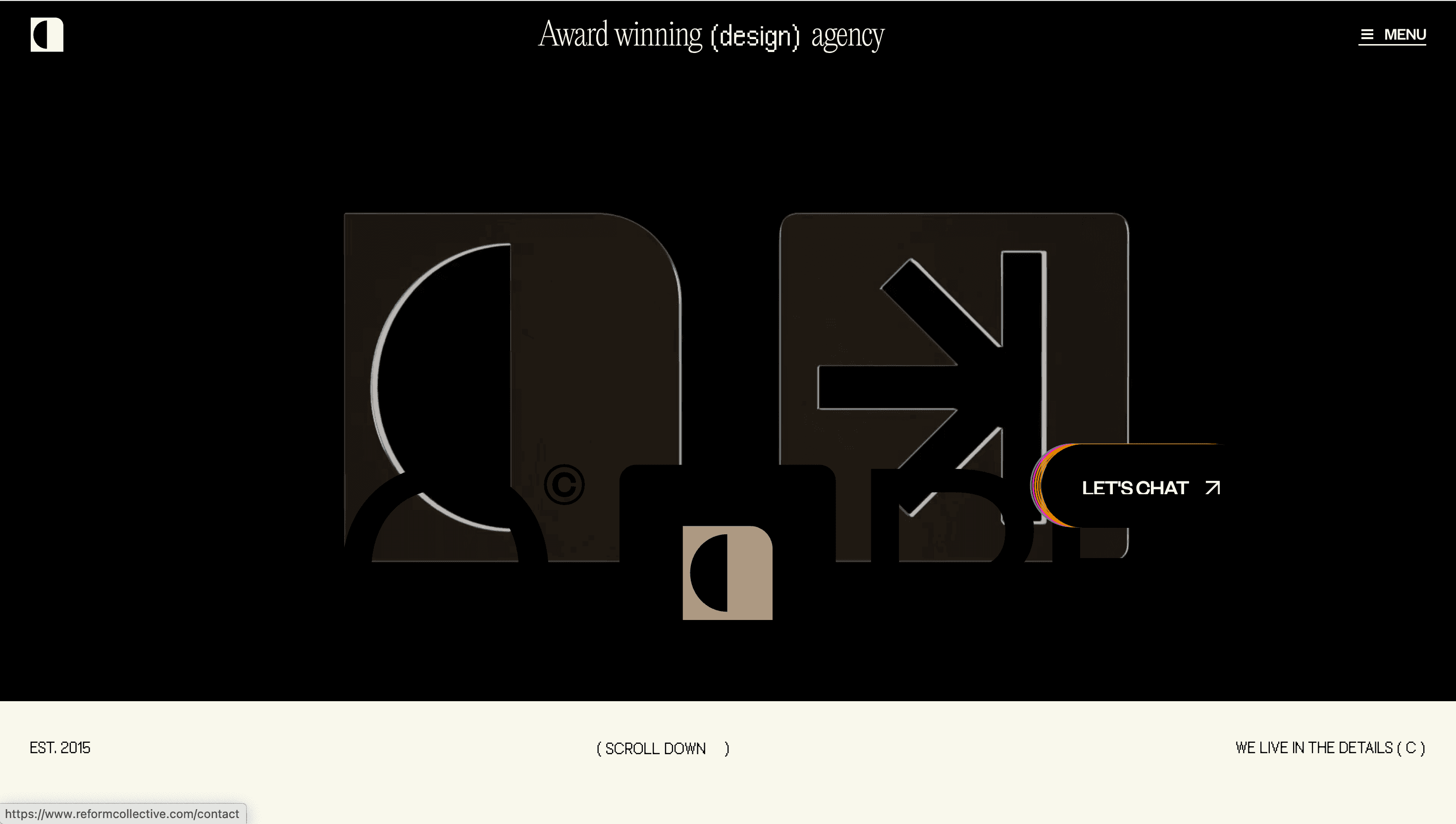
Concept
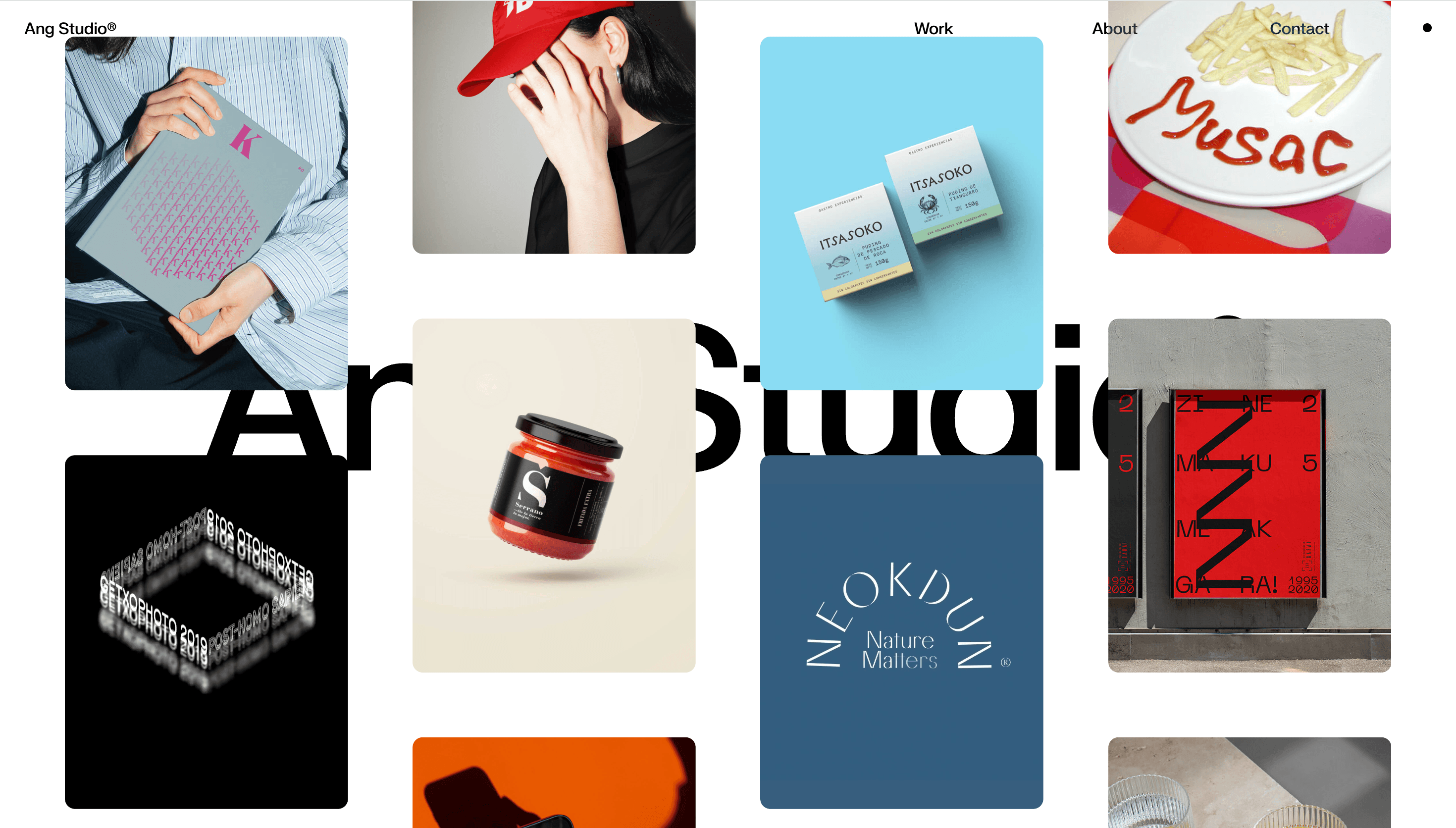
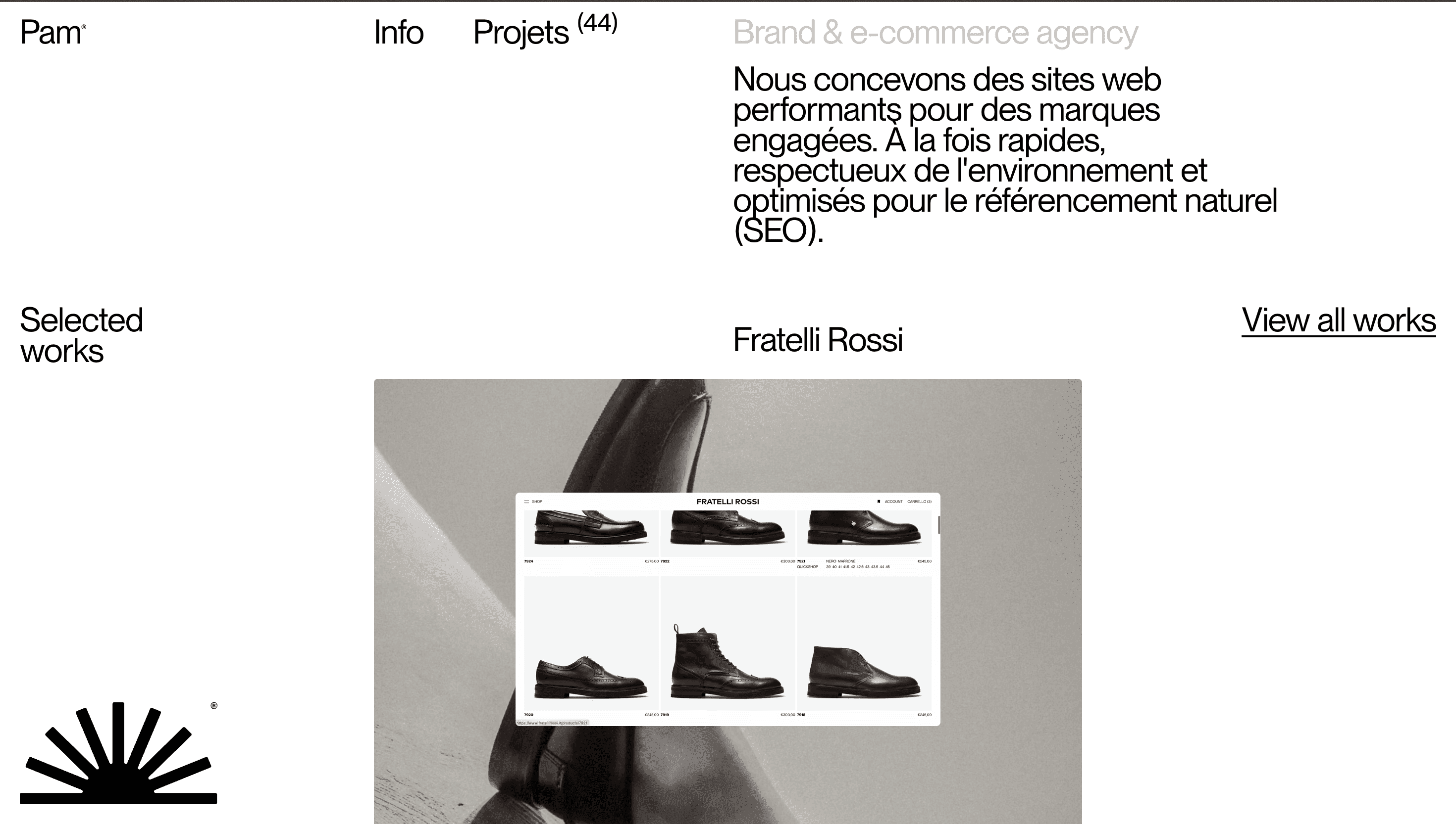
Pam® swaps glossy buzzwords for real-world craftsmanship. The agency’s mantra “We build high-performance websites for committed brands” greets you on line one. From there the narrative is simple: Think → Design → Ship → Evolve. Forty-plus case studies (Goodmoods, Fratelli Rossi, Rebellion®) prove the method, each pairing nuanced brand story with measurable speed gains.
Visual Language & Motion
A milk-white canvas, hairline grid and mono logo (“Pam ®”) evoke Swiss restraint. Category tabs sit flush left, then slide down 2 px on hover just enough motion to feel alive without stealing focus. When a project opens, the background adopts the client’s palette and the viewport fills with crisp AVIF stills. Micro-copy whispers in a utilitarian grotesque; a single orange accent underline guides the eye through specs, tech stack and launch KPIs.
UX & Performance
All thumbnails lazy-load (<40 KB AVIF); hero images stream at ≈ 120 KB, keeping LCP ≈ 1 s on desktop, 1.4 s on 4G. GSAP easing pauses when prefers-reduced-motion is detected. Every colour pair exceeds WCAG AA, and tab order mirrors visual flow so screen-reader users enjoy the same cadence as sighted guests. Continuous maintenance plans surface right inside each case study proof that Pam designs for the long haul, not launch-day vanity.
Takeaway
Pam® shows how a boutique studio can turn performance and sustainability into brand assets: disciplined grid, client-specific colour bursts and ruthless optimisation transform portfolio browsing into a quiet masterclass on modern, planet-friendly e-commerce.