Visit website
Resn
23 views4mo ago
Concept
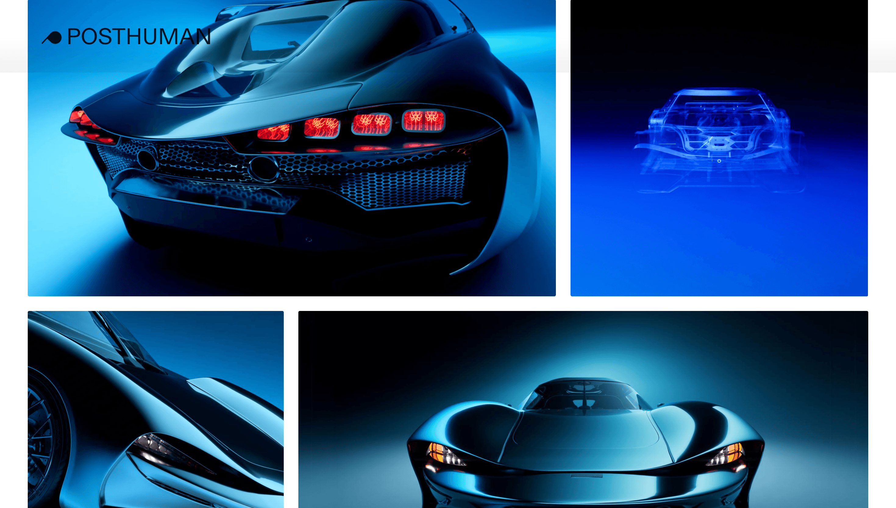
Resn’s site acts as the studio’s virtual avatar—a one-page manifesto that, in their own words, aims to “infect minds with gooey interactive experiences that amaze and stupefy.”
Visual Language & Motion
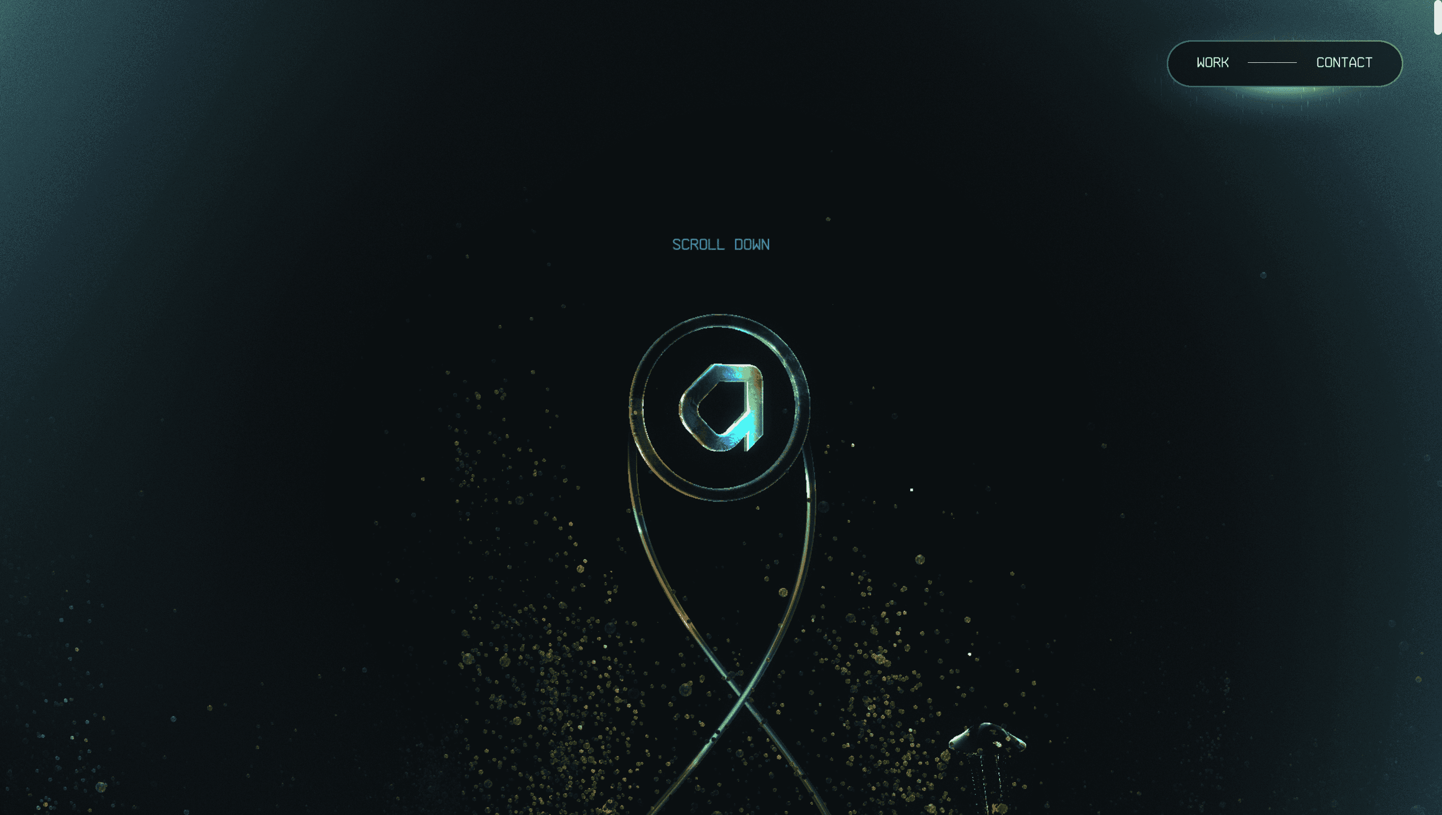
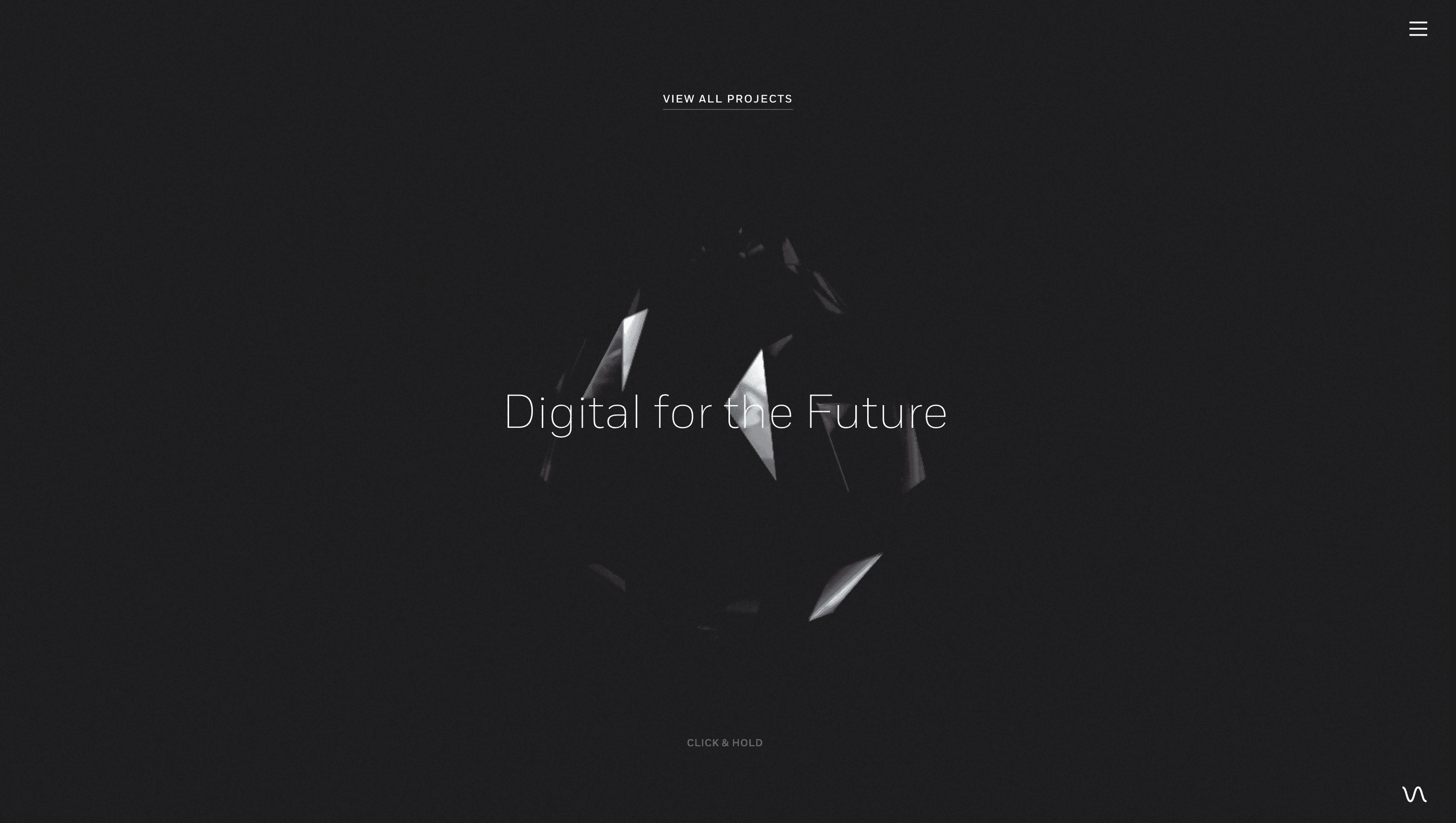
The voyage opens on a floating, prismatic Resn Gem that reacts to cursor pulls and even browser-window resizing—facets shear, merge and refract, hinting at the team’s multi-disciplinary nature.
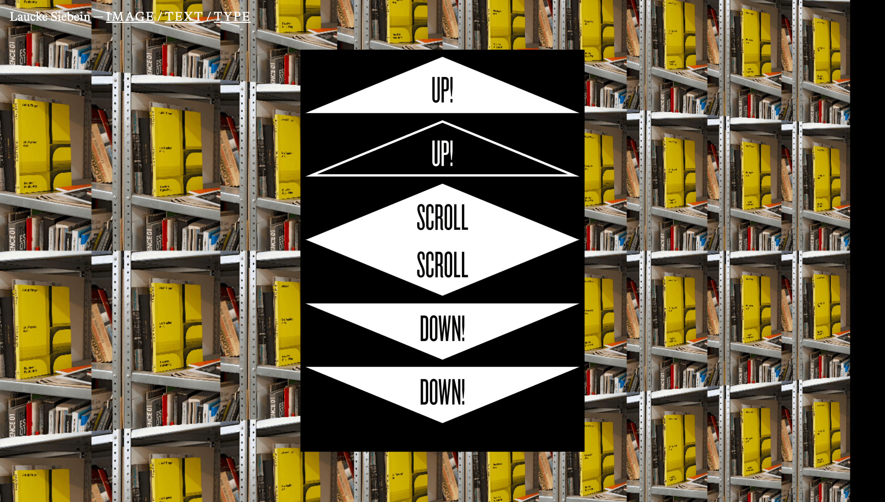
Scroll-held banners slam into view with elastic GSAP easing; WebGL shaders smear headlines into viscous liquid before snapping back to crystal clarity. A hidden rail-switch menu reveals itself with a top-right flick, launching PJAX-smooth transitions that keep the soundtrack humming.
UX & Performance
Geometry arrives via Draco compression, textures lazy-load only when their section is near, and idle callbacks defer shader boots, holding LCP around 1.3 s on desktop. The site listens for `prefers-reduced-motion`, swapping fluid distortions for crisp SVG frames so no visitor feels queasy. High-contrast greyscale type on a deep-ink canvas passes WCAG AA, while keyboard arrows step between “carriages” of content.
Takeaway
Resn turns a portfolio into a living R&D playground: every interaction doubles as demo reel and invitation, proving that experimentation can coexist with accessibility and performance.