Visit website
Guillermo Seis
11 views4mo ago
Concept
Guillermo Seis’s site is a self-portrait in motion. Rather than a static archive, it behaves like a design playground—oversized words stretching, bouncing, collapsing—each movement echoing his obsession with typography and rhythm. The site is less a portfolio, more a manifesto: design should be loud, unapologetic, and alive.
Visual Language & Motion
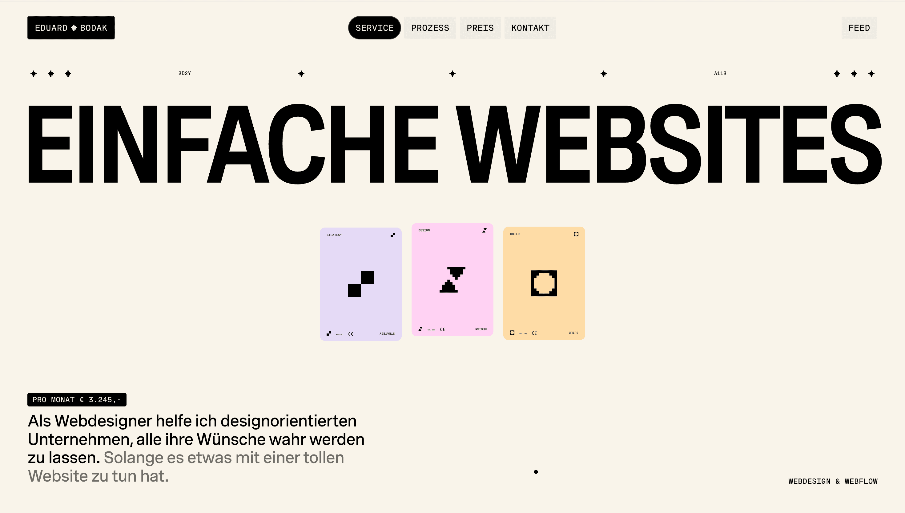
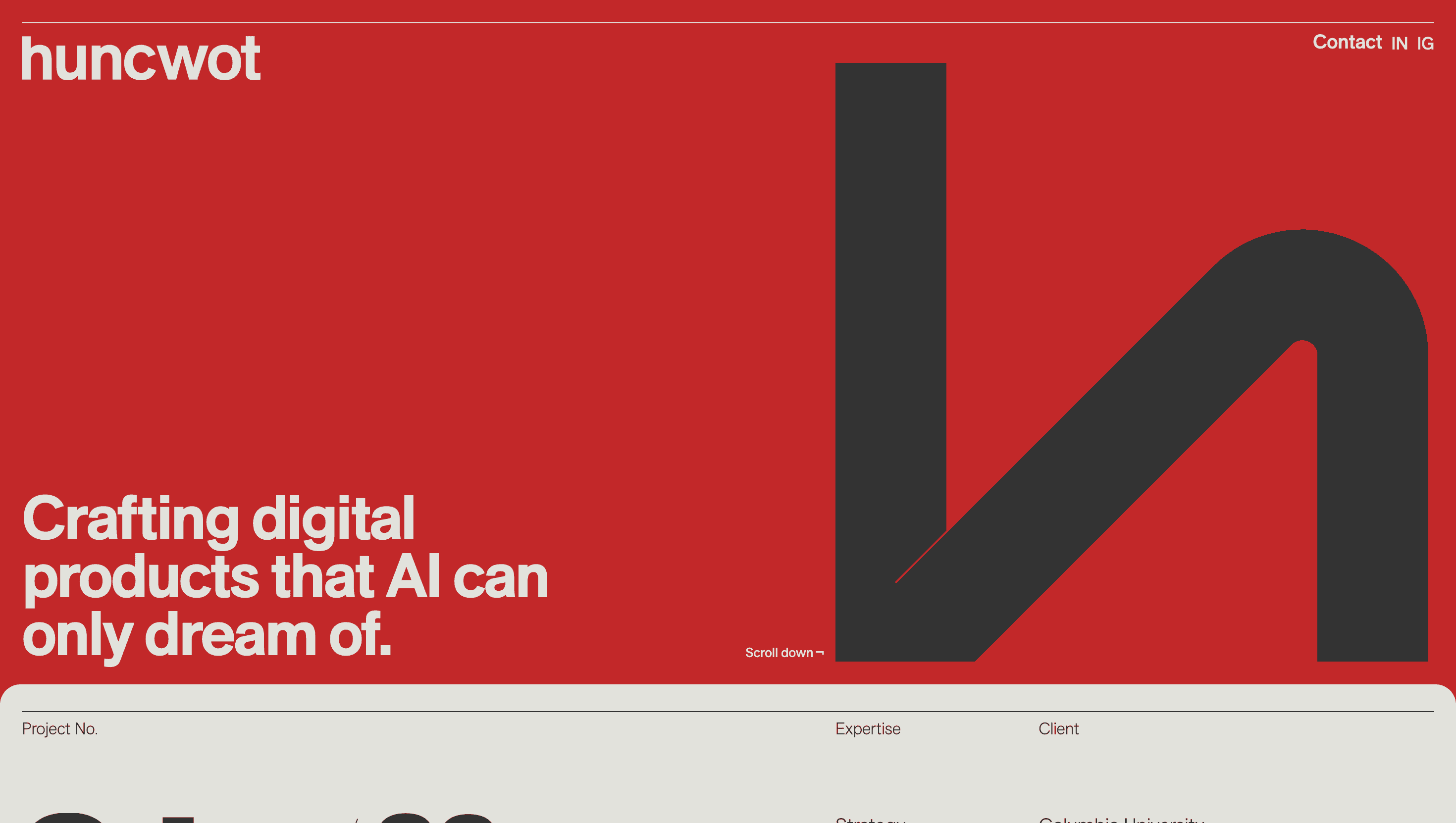
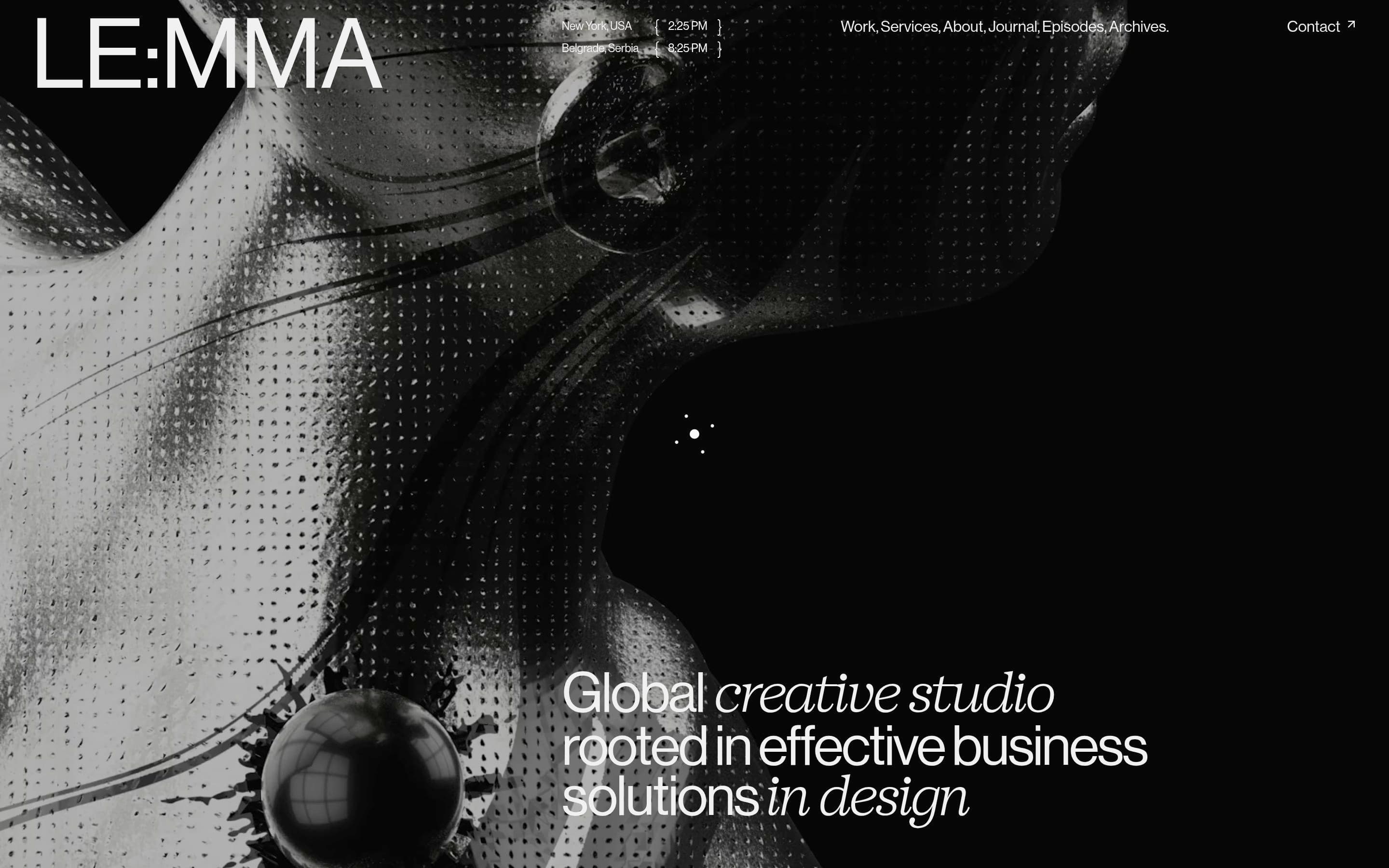
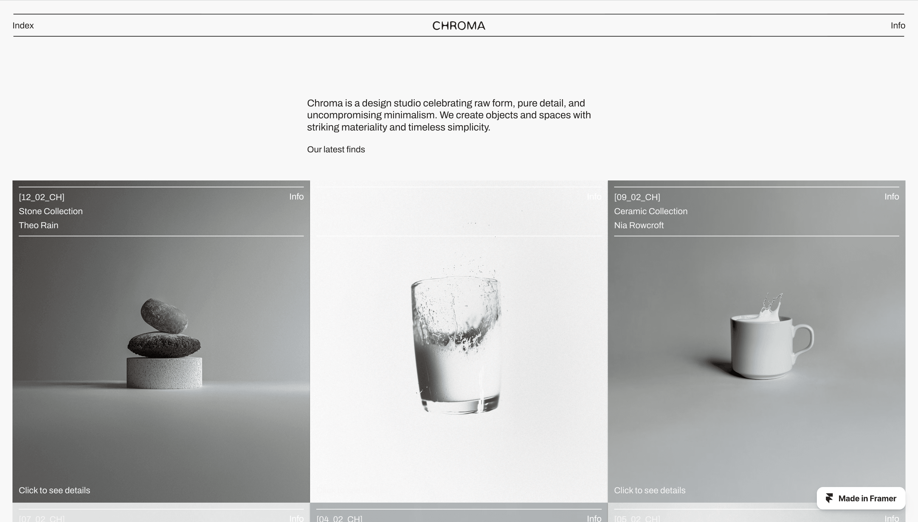
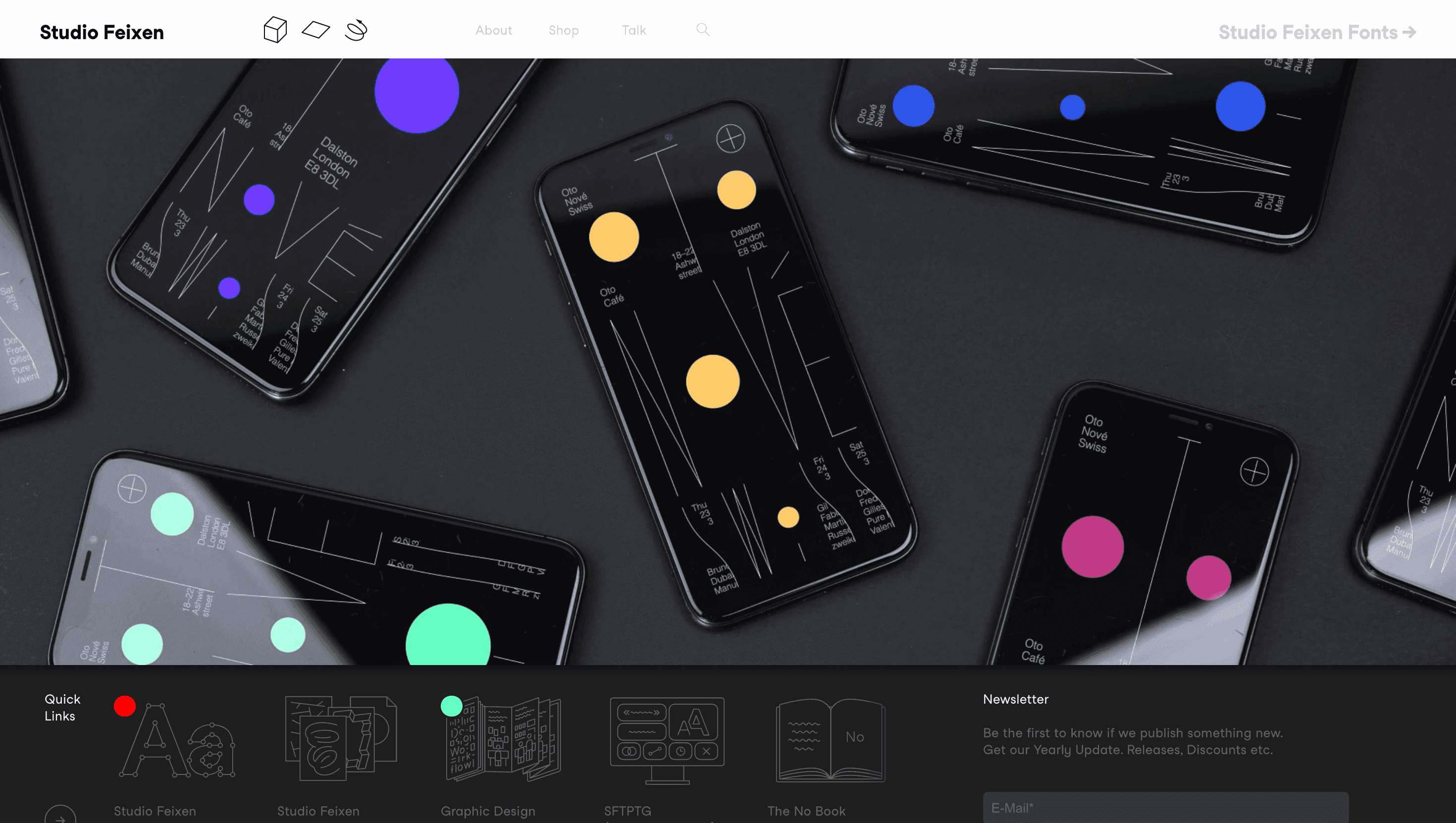
A clean white background forms the stage for XL grotesque type that bends with scroll inertia. Colours shift project by project—acid green, cobalt blue, coral red—so each client world dominates the viewport. Hover states make letters shiver or tilt 5°, injecting micro-chaos into an otherwise strict grid. Project pages open to full-bleed stills or loops, anchored by sharp copy in minimal sans. Motion is the glue: every transition feels like a kinetic poster.
UX & Performance
Despite heavy typography, LCP ≈ 1.1 s on desktop and 1.5 s mobile: fonts load as WOFF2 subsets, projects lazy-load only as they approach view. Navigation is stripped to essentials—Work and About—keeping interaction clear. prefers-reduced-motion disables typographic bending and hover jitters, opting for fades. Contrast ratios remain AA-compliant, even on neon-heavy palettes.
Takeaway
Guillermo Seis demonstrates how a personal portfolio can double as a design experiment: fearless type, energetic transitions and restrained structure turn browsing into an immersive dive into a singular creative voice.