Visit website
Bureau Borsche
11 views4mo ago
Concept
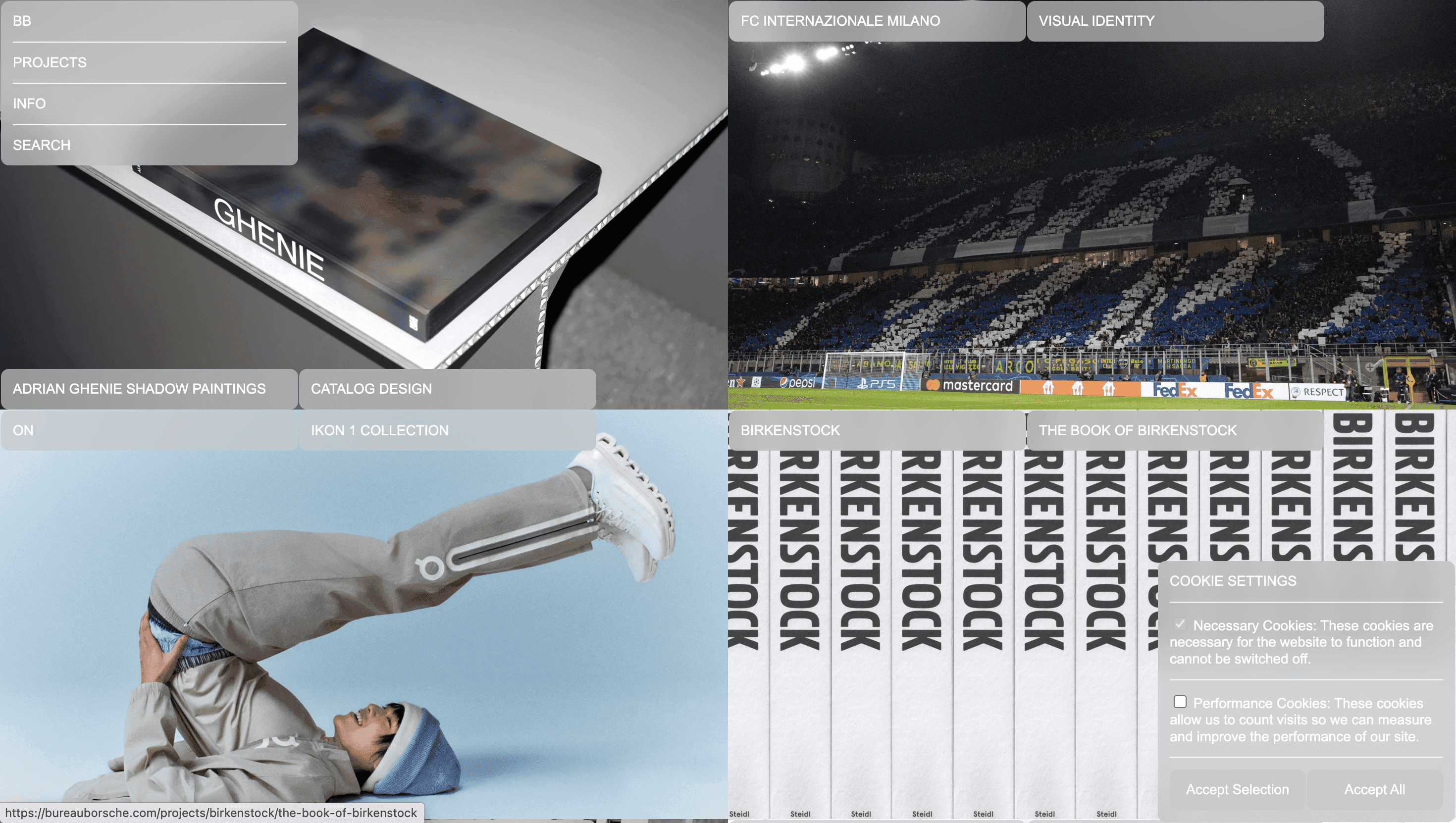
Bureau Borsche’s site feels less like an agency portfolio and more like a digital archive of contemporary graphic culture. Projects Bayern Munich rebrand, Suprematist campaigns for Supreme, identity systems for Venice Biennale sit in a perpetual scroll that reads like a research library: no sales copy, just evidence of craft.
Visual Language & Motion
A milk-white canvas hosts an 11-column Swiss grid; thumbnails lock to precise baselines, then gently expand on hover, revealing full-bleed stills or muted video loops. Season-specific accent colours canary this quarter, ultramarine last repaint the grid labels and scroll-bar, signalling that the site evolves like a fashion collection. Headlines in a custom-cut grotesk slam left-aligned; microcopy whispers in a utilitarian mono, echoing print spec sheets. Motion is surgical: fade-ins run 240 ms cubic-bezier and pause if prefers-reduced-motion is detected.
UX & Performance
With imagery lazy-loading via AVIF and IntersectionObserver, LCP stays ~1.0 s on desktop, 1.4 s on 4G. Keyboard arrows traverse the grid row by row; focus rings inherit the accent colour for instant orientation. All colour pairs exceed WCAG AA even on neon season palettes underpinning enterprise-grade polish beneath the experimental veneer.
Takeaway
Bureau Borsche proves editorial discipline can amplify creative swagger: ruthless grids, restrained motion and evolving colour stories turn a minimalist portfolio into a living design periodical one that teaches as much as it sells.