Visit website
Huge Inc.
23 views4mo ago
Concept
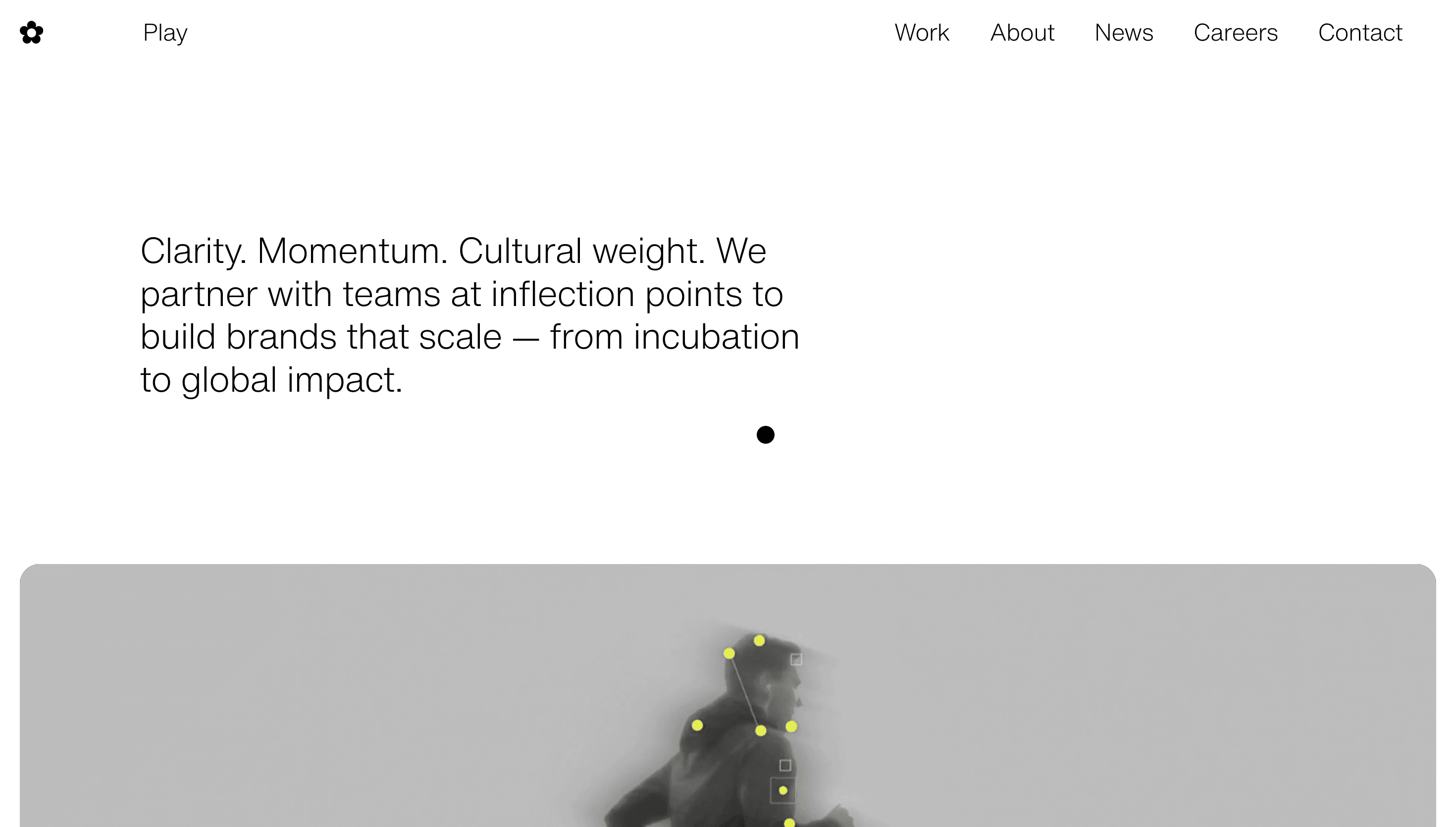
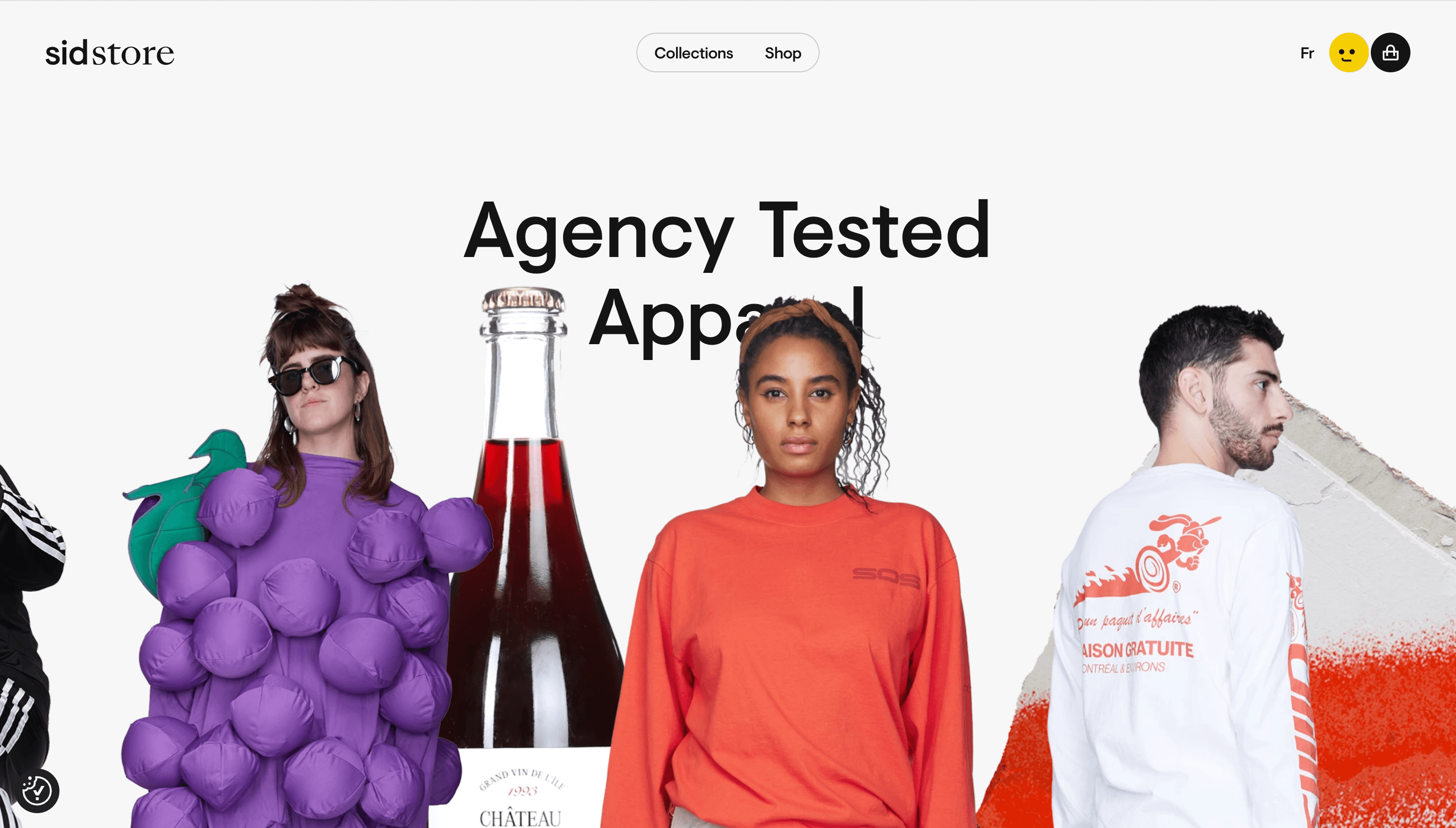
Huge rewired its entire model around one promise: “Make Huge Moves.” Instead of endless retainers, the agency sells outcome-focused sprints that compress discovery, prototyping and pilot launch into 12-week bursts. The site mirrors that momentum Ambition → Moves → Work → Thinking → Careers so visitors feel the urgency before reading a single KPI.
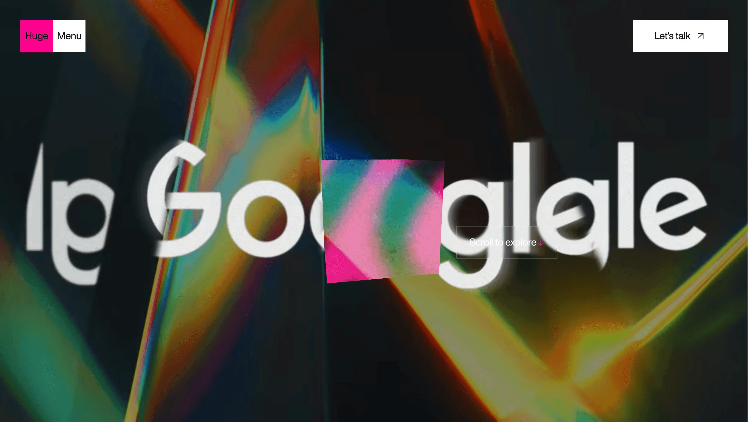
Visual Language & Motion
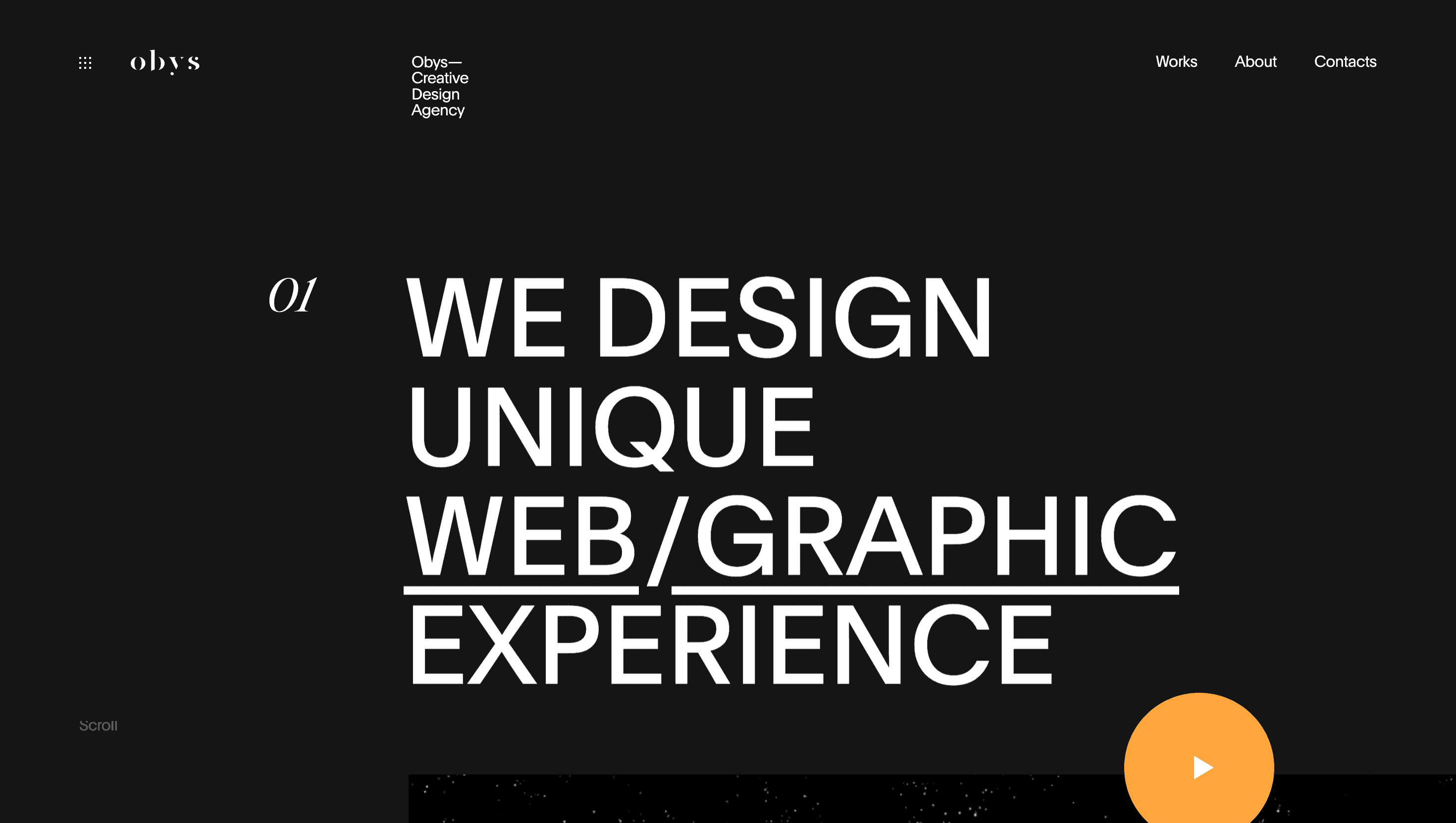
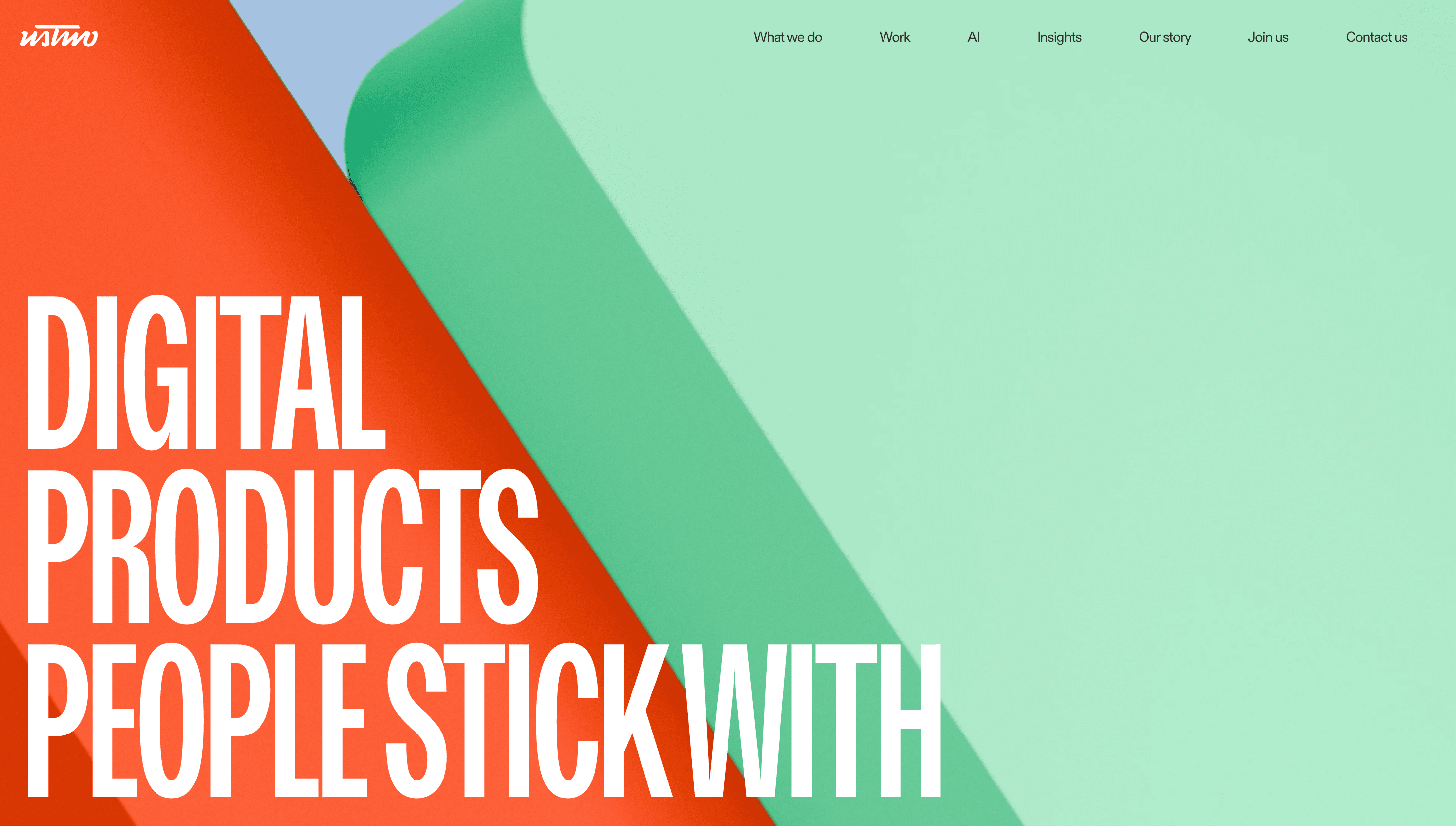
A stark, near-black canvas (#0A0A0A) lets electric magenta accent lines slash across the 12-column grid. Monument Grotesk XXL headlines snap in with spring easing, while body copy rests in a restrained PP Neue Machina, balancing swagger with clarity. Case-study cards bloom to full-bleed video on hover; neighbouring tiles recede 2 px, creating rack-focus without GPU bloat. Subtle “scanline” shaders ripple behind hero text, nodding to Huge’s Brooklyn-tech roots.
UX & Performance
Hero reels encode to AV1 and lazy-load only on ≥1024 px screens; mobiles see poster frames, keeping LCP ≈ 1.2 s desktop / 1.6 s on 4G. IntersectionObserver preloads the next case two sections ahead to avoid stutter. A sticky nav shrinks from 80 px to 48 px after 120 px scroll, but the “Start a Move” CTA pill stays thumb-reachable on mobile. prefers-reduced-motion pins scanlines and swaps snap-scroll for fades, preserving accessibility. All colour pairs exceed WCAG AA even magenta on black reinforcing enterprise-grade trust beneath the bravado.
Takeaway
Huge Inc. proves speed and scale can coexist: disciplined grid, fearless type and ruthless performance budgets turn a global agency portfolio into a kinetic manifesto that invites clients to stop planning and start moving.