Visit website
NEVERHACK
26 views4mo ago
Concept
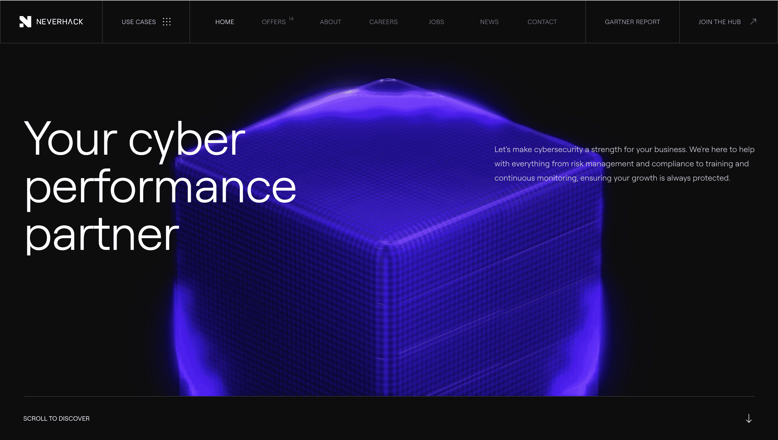
Neverhack brands itself as a “cyber-performance partner.” Instead of another matrix of check-marks, the homepage reads like a mission briefing: a single promise make breaches impossible then three pathways: Assess → Defend → Train. Each scroll notch deepens the narrative so prospects move from curiosity to “book a demo” without detouring through jargon.
Visual Language & Motion
A carbon-black canvas carries pulses of electric violet and safety-green colours lifted from terminal screens but polished into luxury tech. The hero shows a low-poly shield morphing into a data wave as you scroll; GSAP springs snap service cards into an isometric grid, hinting at modular stacks. Headlines in Space Grotesk burst to 6 vw, while micro-icons animate like status LEDs, underscoring an always-on SOC mentality.
UX & Performance
AVIF hero (< 400 KB) lazy-loads after Largest Paint, keeping LCP ≈ 1.1 s desktop / 1.5 s mobile. A sticky “Talk to an expert” button shadows the viewport yet collapses to a thumb-reachable pill on 360 px phones. prefers-reduced-motion freezes shield morphs and swaps grid flips for fades, ensuring accessibility. Every colour pair surpasses WCAG AA, critical for trust in security spaces.
Takeaway
Neverhack shows how clarity can outshine fear-based marketing: stripped palette, disciplined motion and a funnel framed like a product tour turn heavy cybersecurity services into a confident, instantly legible offer.