Visit website
Einride
12 views4mo ago
Concept
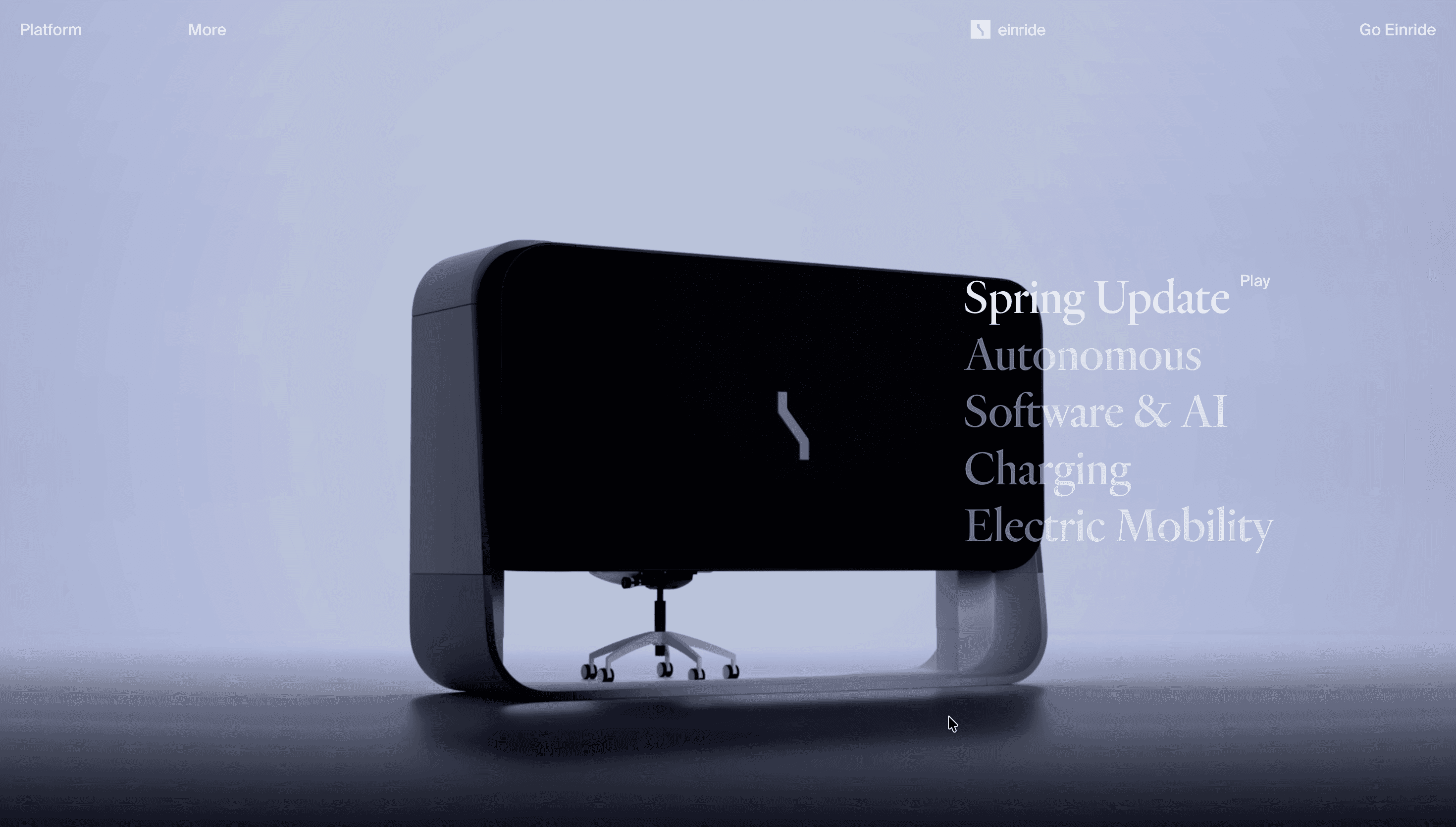
Einride positions itself not just as a trucking company but as a movement to reprogram freight. The brand story threads through three pillars—Vehicles → Platform → Vision—tying autonomous electric fleets to a cloud-native logistics OS and, finally, to climate goals. It’s equal parts product showcase and manifesto.
Visual Language & Motion
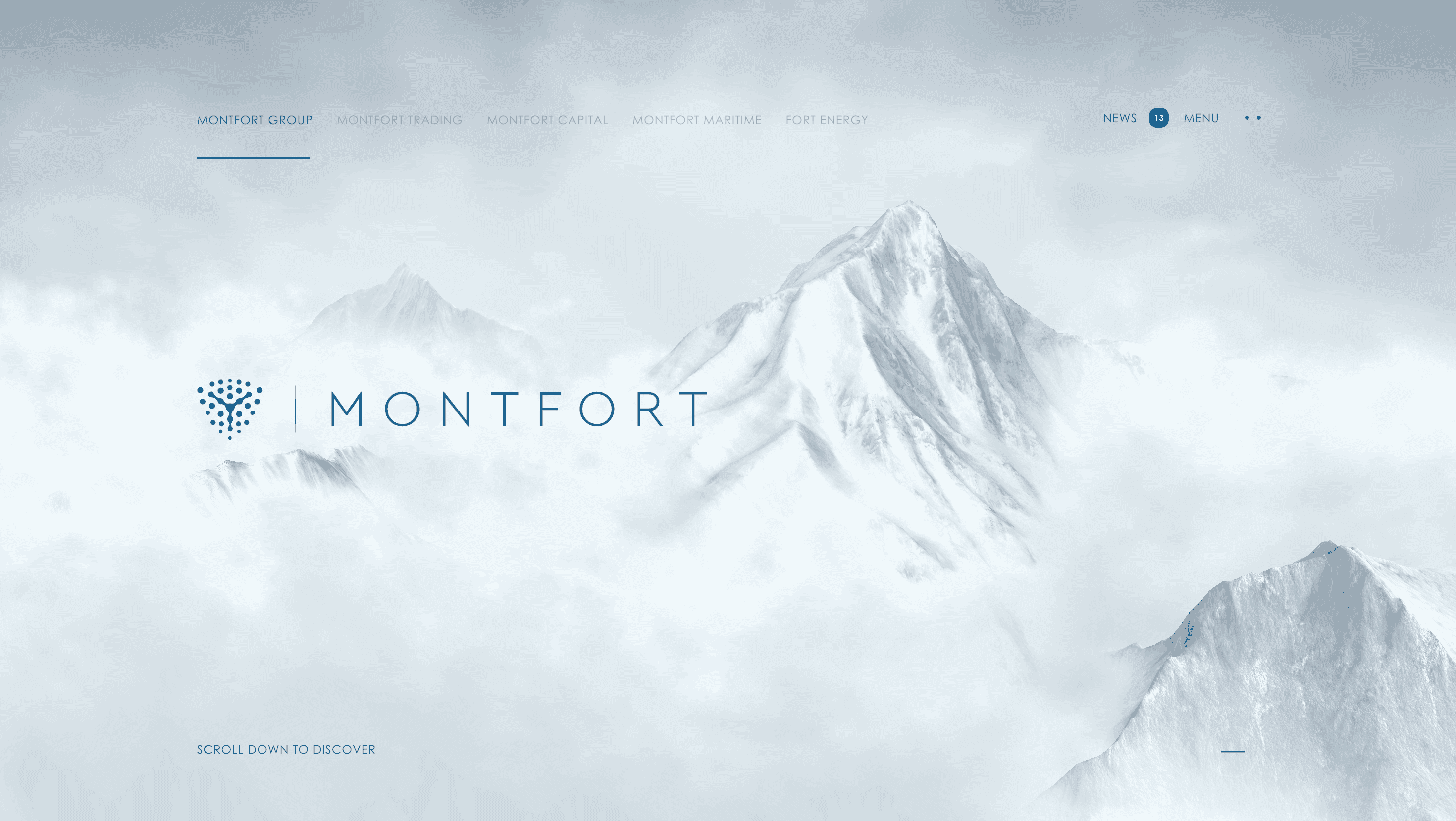
The website wears a stark Scandinavian minimalism: monochrome palette, geometric sans type, generous white space. Hero sections spotlight the angular Pod truck against void-black backgrounds; scroll reveals product specs in crisp two-column layouts. Accent gradients—cool teal to electric blue—add a futuristic hum. Subtle GSAP animations fade in trucks as if rolling onto a stage, while infographics animate line by line, underscoring data transparency.
UX & Performance
AVIF hero imagery (< 400 KB) and deferred video reels keep LCP ≈ 1.2 s on desktop, 1.5 s on 4 G. The global nav collapses seamlessly for mobile, with a sticky “Talk to Sales” CTA anchored for enterprise conversion. prefers-reduced-motion halts truck-roll animations and converts infographics to static diagrams. All contrast ratios surpass WCAG AA, reflecting the enterprise-grade trust essential in B2B mobility.
Takeaway
Einride proves sustainability and tech can be packaged as desire: minimal yet cinematic design, disciplined performance and a manifesto-like tone turn freight from a back-office concern into a cultural statement about the future of movement.
More Projects

Sponsor
Your ad here