Phantom.land
8 views2mo ago
Concept
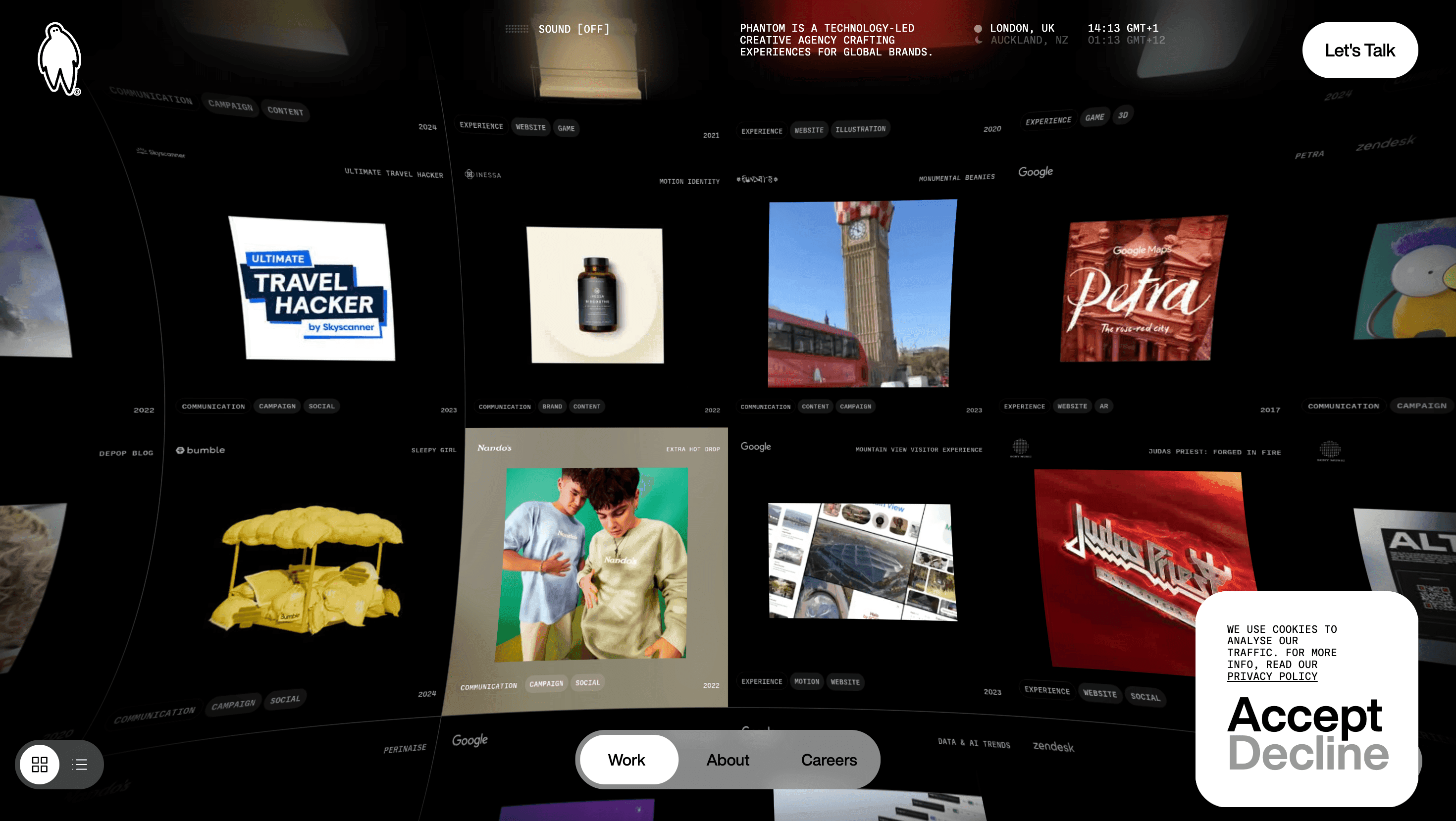
Phantom calls its website a “shape-shifting vessel for our global work.” It behaves like an interactive manifesto: no static “Our Services” page, just an infinite ribbon of projects and philosophies that bends, stretches and recolours itself as you scroll. The experience echoes the studio credo believe in the unbelievable—while positioning Phantom as equal parts agency, R-and-D lab and cultural commentator.
Visual Language & Motion
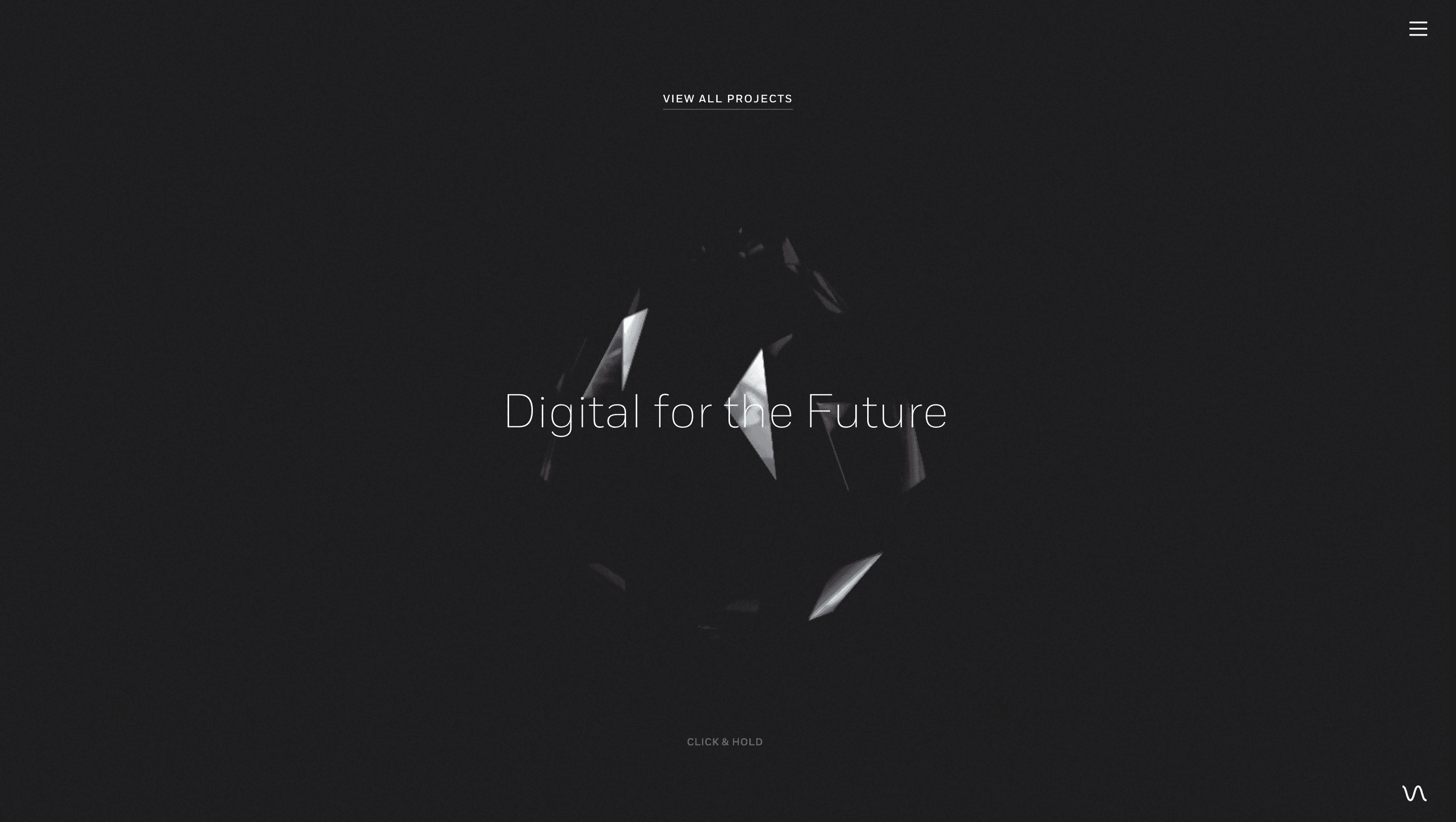
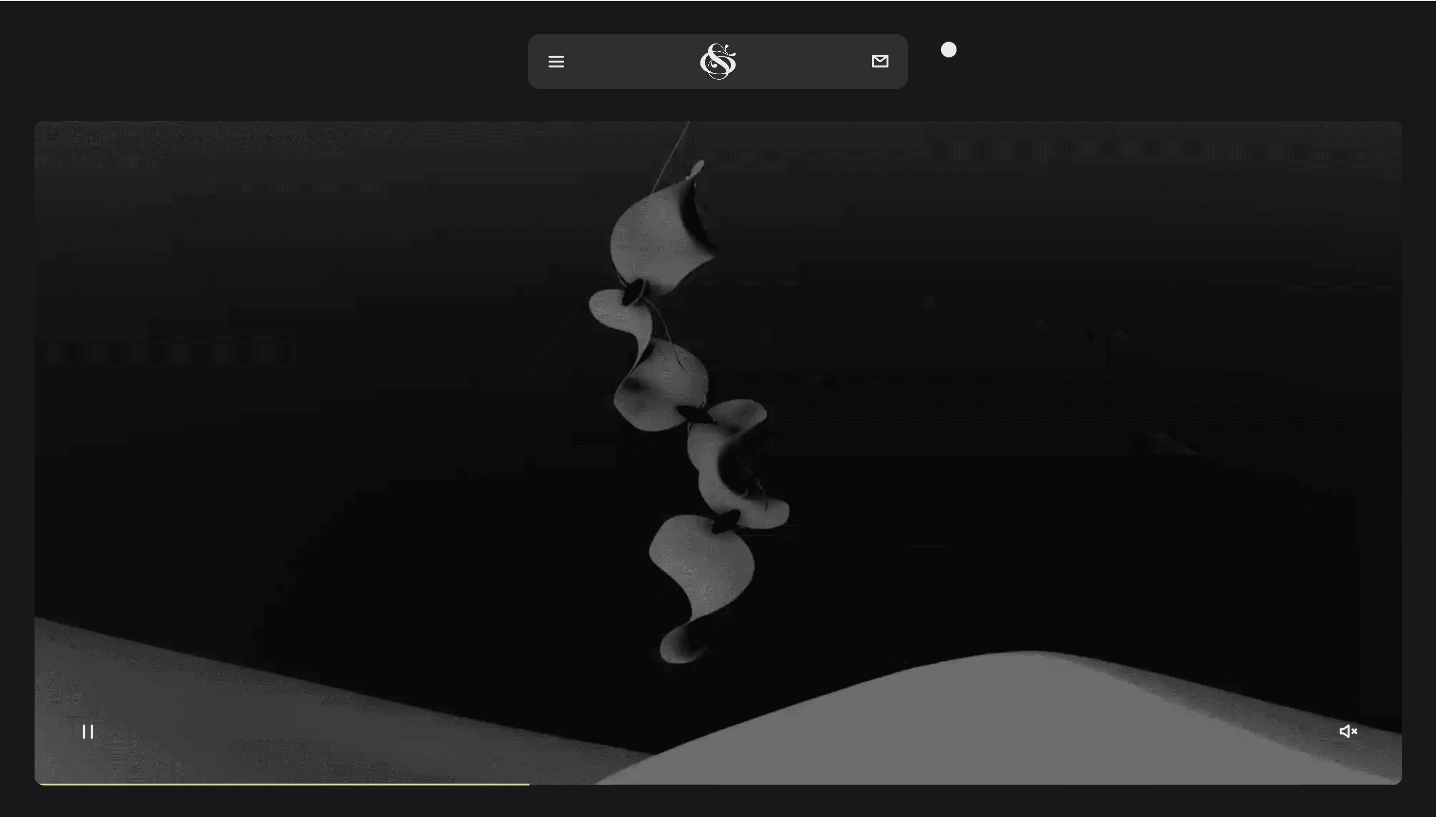
Visitors spawn inside an ink-black void speckled with low-poly shards that track the cursor like magnetic filings. Section headers land in Monument Grotesk caps, then ripple outward via fluid shader displacement; body copy sits in a humanist grotesque to soften the tech edge. Project thumbnails are square masks that morph into edge-to-edge video on hover, revealing lasers, AR helmets or AI-generated Valentines before snapping back into the grid. Micro-gestures scroll-hint arrows that flutter, a morphing “ghost” cursor keep the experience playful without drowning the work.
UX & Performance
Despite heavyweight WebGL, the homepage holds LCP ≈ 1.3 s on desktop and 1.8 s on 4G: meshes arrive through Draco compression, hero shaders boot only after the main thread goes idle, and images lazy-load via IntersectionObserver. A sticky radial menu doubles as progress rail and global nav; on ≤ 480 px screens it collapses into a thumb-friendly tab bar. prefers-reduced-motion swaps shader ripples for opacity fades, maintaining brand vibe while protecting motion-sensitive users. Colour pairs meet WCAG AA even against pulsating neons a nod to enterprise clients who equate accessibility with professionalism.
Takeaway
Phantom proves an agency website can demo its own super-power: the portfolio is not a slide deck but a living playground where code, craft and storytelling collide in real time. Designers can mine it for lessons in thematic cohesion every shader, grid-snap and micro-copy line reinforces the promise that technology and creativity don’t have to live in separate worlds.
Similar project


Sponsor
Your ad here
