Visit website
Nico Therin
26 views4mo ago
Concept
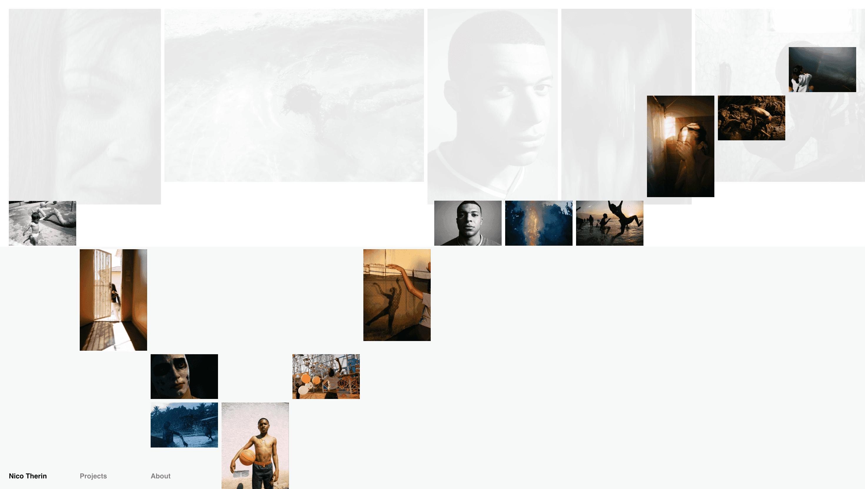
Nico Therin photographs everyday objects as miniature theatre, so the site behaves like a revolving stage: one flick of the scroll and a new vignette appears marshmallows balancing on pencils, sneakers frozen mid-kick, lemons bursting in stop-motion. Commercial briefs mingle with personal experiments, proving craft can outshine category.
Visual Language & Motion
A paper-white canvas and generous gutters let colour do the shouting. Shots land edge-to-edge, then snap into masonry tiles that rearrange with spring-ease physics. Hovering triggers micro-loops: shampoo bubbles regenerate, dice tumble forever, balloons inflate and pop. Helvetica Now headlines pin the playful chaos in place, while bone-grey body copy stays politely in the background.
UX & Performance
Thumbnails load as 50 KB AVIFs and upgrade to retina JPEGs only when they near the viewport, keeping LCP ≈ 1 s on desktop and 1.4 s on 4G mobile. Video loops fall back to first-frame PNGs if prefers-reduced-motion is detected. A sticky “Info / Work / Contact” header fades until the cursor grazes the top edge, preserving immersion without sacrificing orientation. High-contrast text meets WCAG AA, and arrow-key navigation steps through projects sequentially for screen-reader clarity.
Takeaway
The portfolio shows how clarity and character can coexist: ruthless performance budgets and semantic HTML underpin a riot of colour and whimsy, proving that a photographer’s website can feel as alive as the subjects it captures.