Visit website
Sam George
22 views4mo ago
Concept
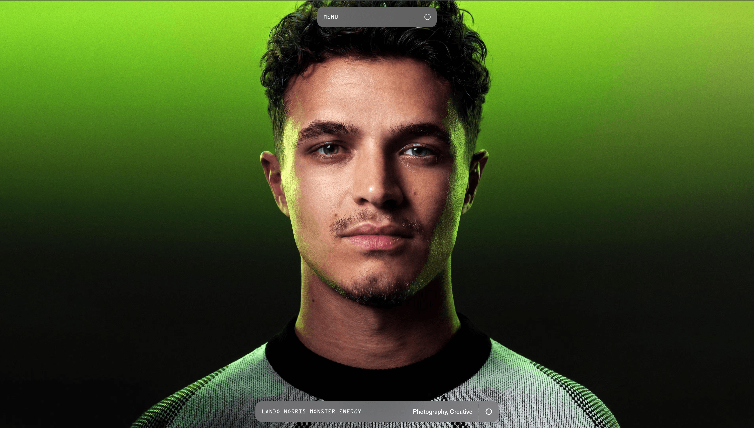
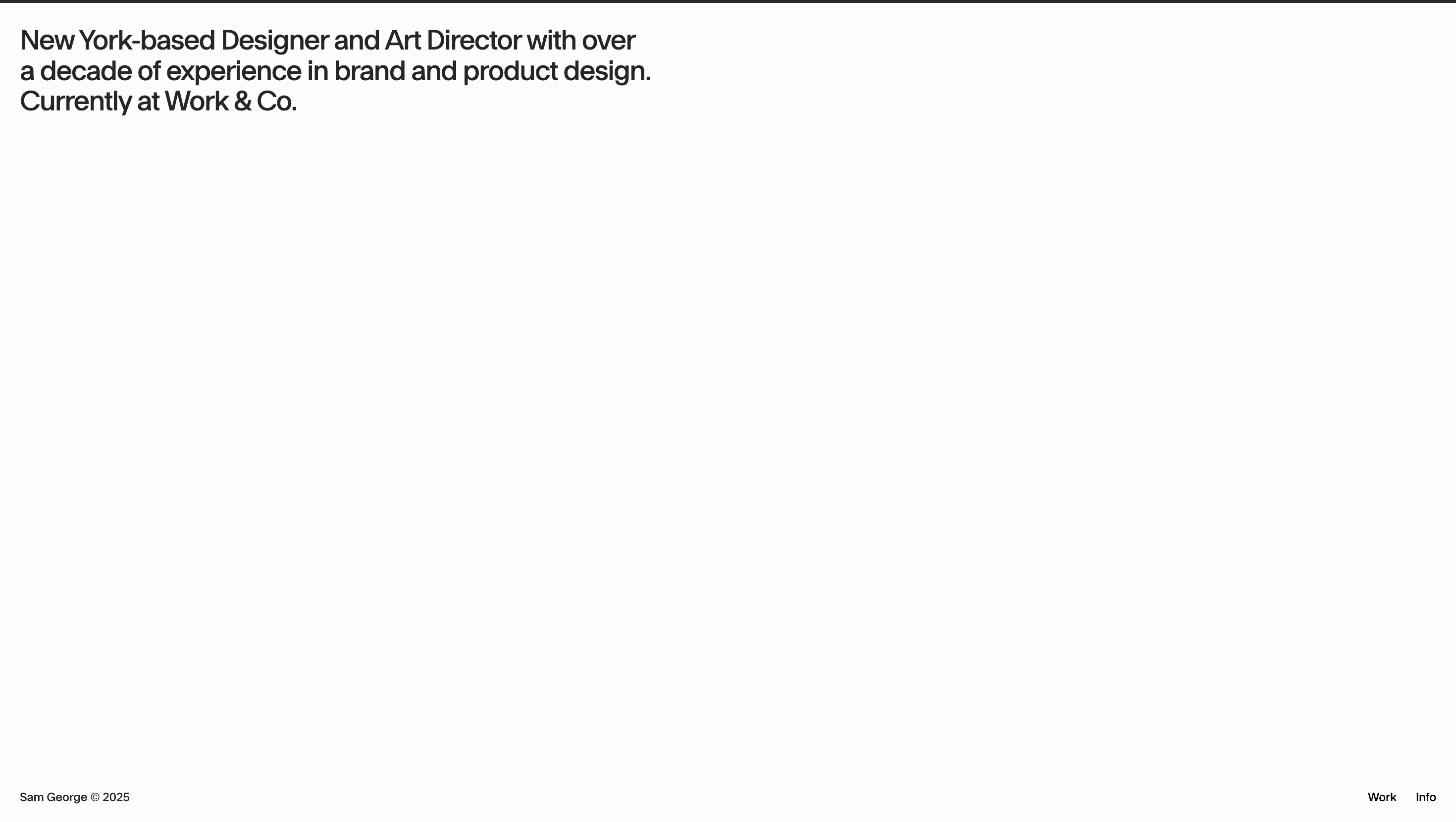
Sam George’s site is a reel in gallery form a tight edit of films, campaigns and branded content that merge cinematic storytelling with brand precision. Each project tile is a still frame that feels like a poster: saturated, carefully lit, and hinting at the emotion inside. Clicking one expands it to full-bleed video, instantly immersing you without preamble.
Visual Language & Motion
The palette is understated charcoal background, white typography allowing vibrant campaign imagery to dominate. Project thumbnails subtly scale on hover, while a custom cursor shifts from a dot to a ring, signalling interactivity without clutter. Video modals open with a one-second crossfade, making the transition from static to motion feel cinematic in itself.
UX & Performance
The site’s minimal structure keeps LCP ≈ 1.0 s desktop / 1.3 s mobile: images are served in AVIF/WebP, videos preload only on click. Navigation is reduced to essentials Work and About with a sticky corner logo returning you to the grid. prefers-reduced-motion disables hover scaling and uses instant modal reveals, maintaining accessibility.
Takeaway
Sam George demonstrates that a director’s portfolio should be a moodboard that moves immersing visitors in the craft instantly, without marketing fluff, and letting the imagery speak for itself.