Visit website
Faint Film
16 views4mo ago
Concept
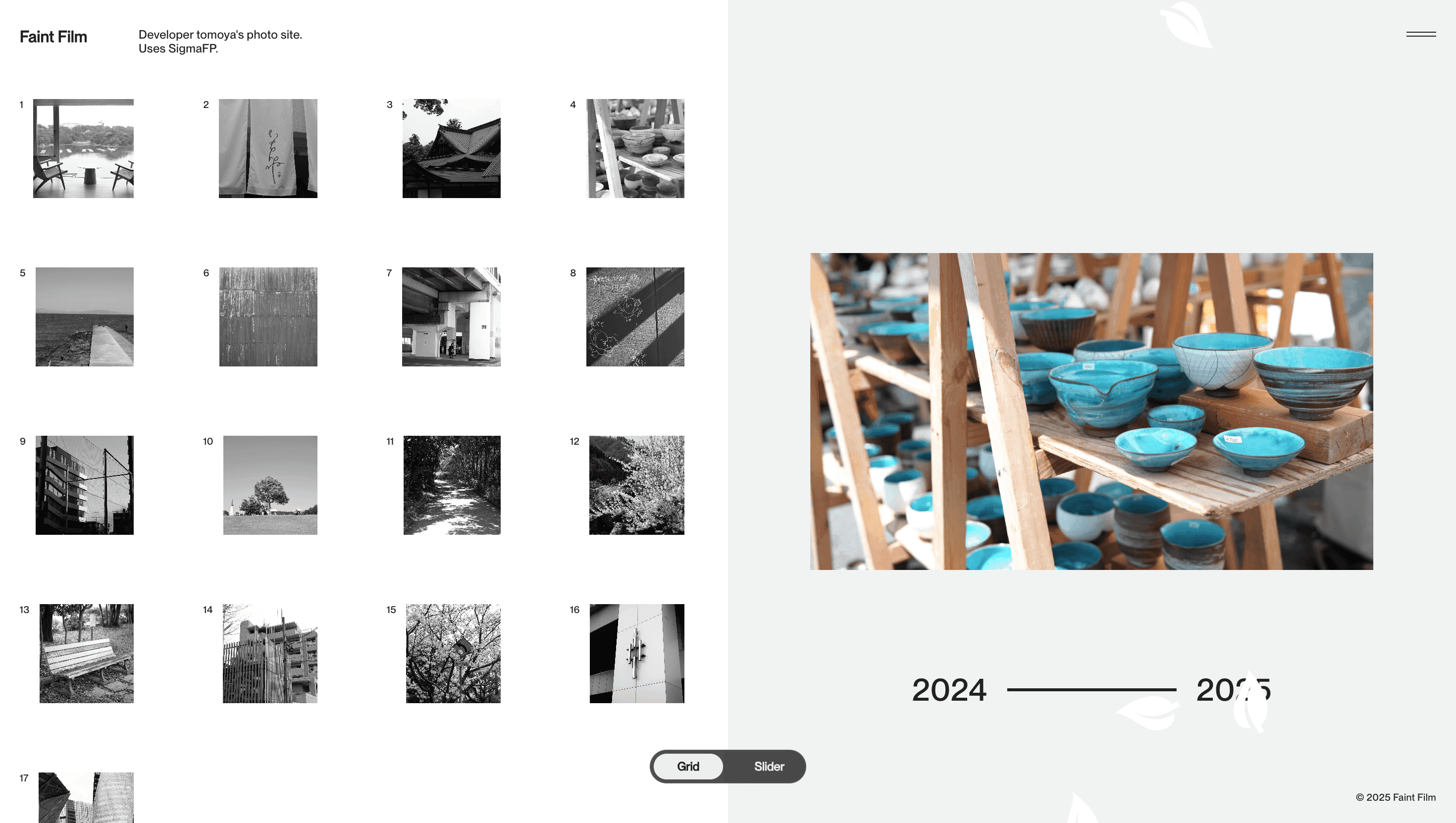
Faint Film is built as a quiet time capsule. No ads, no cookie banners ust one idea: photographs can “faintly bring back the moment” even decades later. The landing screen announces the credo in an ASCII-stretch logotype, then fades into a grid where each shot becomes a doorway to a different fragment of daily life.
Visual Language & Motion
The UI is stripped to essentials: black monospaced headline on milk-white canvas; thumbnail grid that snaps to fullscreen on click; tiny “thought” paragraph that reads like a haiku about nostalgia. Motion is equally restrained gallery slides ease horizontally while a soft “Loading” ghost text flickers during image prefetch, echoing the site’s theme of faintness.
UX & Performance
With almost zero JavaScript, LCP lands under 0.8 s even on 3 G. AVIF thumbnails lazy-load; full-res JPEGs defer until focus, protecting mobile data. Colour contrast passes WCAG AA; keyboard arrows navigate the slider; screen-reader labels describe each frame, turning a personal diary into an inclusive exhibit.
Takeaway
Faint Film proves less can revive more: by removing every non essential element, it lets Sigma FP imagery and a single line of poetry do what thousands of pixels often fail to make a memory breathe.
More Projects


Sponsor
Your ad here