Visit website
Opal Tadpole
30 views4mo ago
Concept
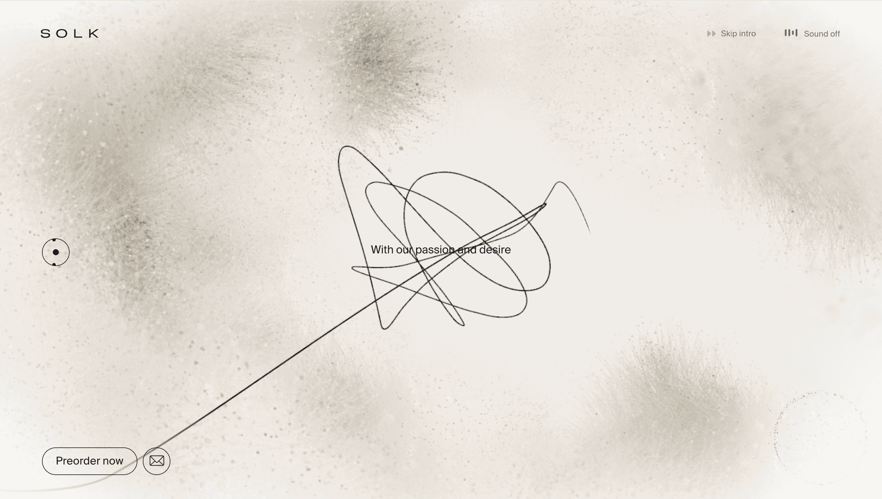
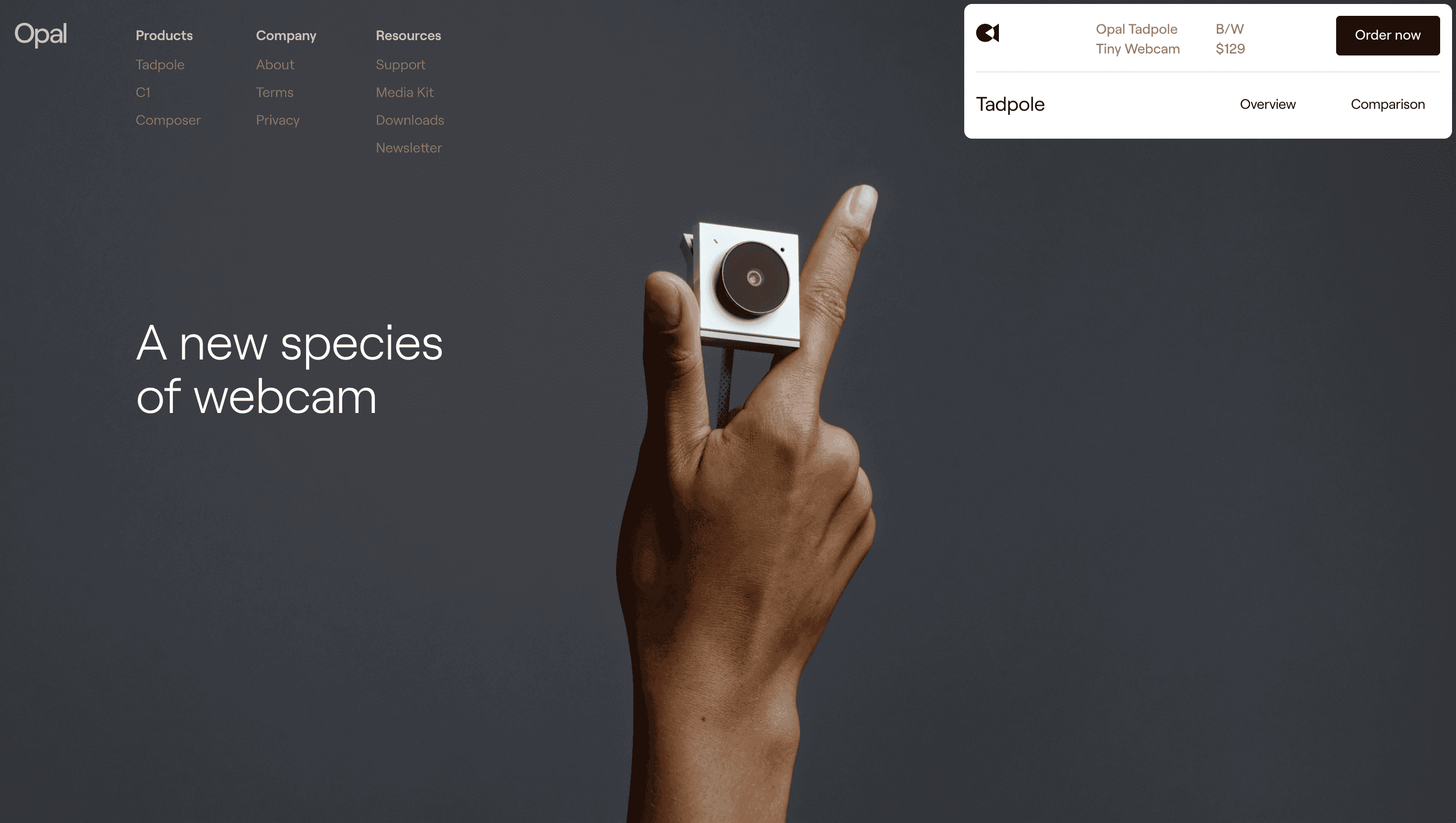
The Tadpole site is built as a micro-odyssey inside a USB-C plug: every scroll notch nudges you deeper into the circuitry, mirroring how Opal shrank studio-grade optics into a pocket stick. Rather than shouting megapixels, the narrative argues for presence—why a webcam should feel like jewellery, not hardware.
Visual Language & Motion
A stark white canvas sets the stage for hyper-real, shadow-less renders that pivot on the Y-axis as you scroll—each tick offers a new facet: sapphire-coated lens, the cable’s carbon sheath, the built-in mic array. Typographic pacing borrows from print adverts: bold GT America headlines slam left, while sub-copy floats right like spec call-outs on a blueprint. Subtle morphing blobs echo bokeh and guide the eye downward, then snap into crisp icons when specs appear. Accent colour is a single electric teal, reserved for CTAs and tiny focus rings on product shots—restrained, yet ownable.
UX & Performance
At 4 K resolution the hero video weighs < 1 MB, encoded in AV1 and progressive-loaded only on ≥ 1024 px screens; mobiles get a sprite sheet fallback ensuring LCP ≈ 1.1 s. Features ride in via `position:sticky` “slides,” limiting reflow and keeping GPU paint times low. Every render lazy-loads through `loading="eager"` once it is 150 px from viewport, ensuring immediate clarity without scroll jank. `prefers-reduced-motion` swaps spin animations for cross-fades, maintaining visual parity for motion-sensitive users.
Takeaway
Tadpole shows that hardware launches can whisper their tech cred instead of scream specs: one product, one story, immaculate craft. Designers can borrow its lesson in restraint—when your renders already dazzle, interaction should simply choreograph the reveal, never steal the spotlight.