Visit website
Dropbox
11 views4mo ago
Concept
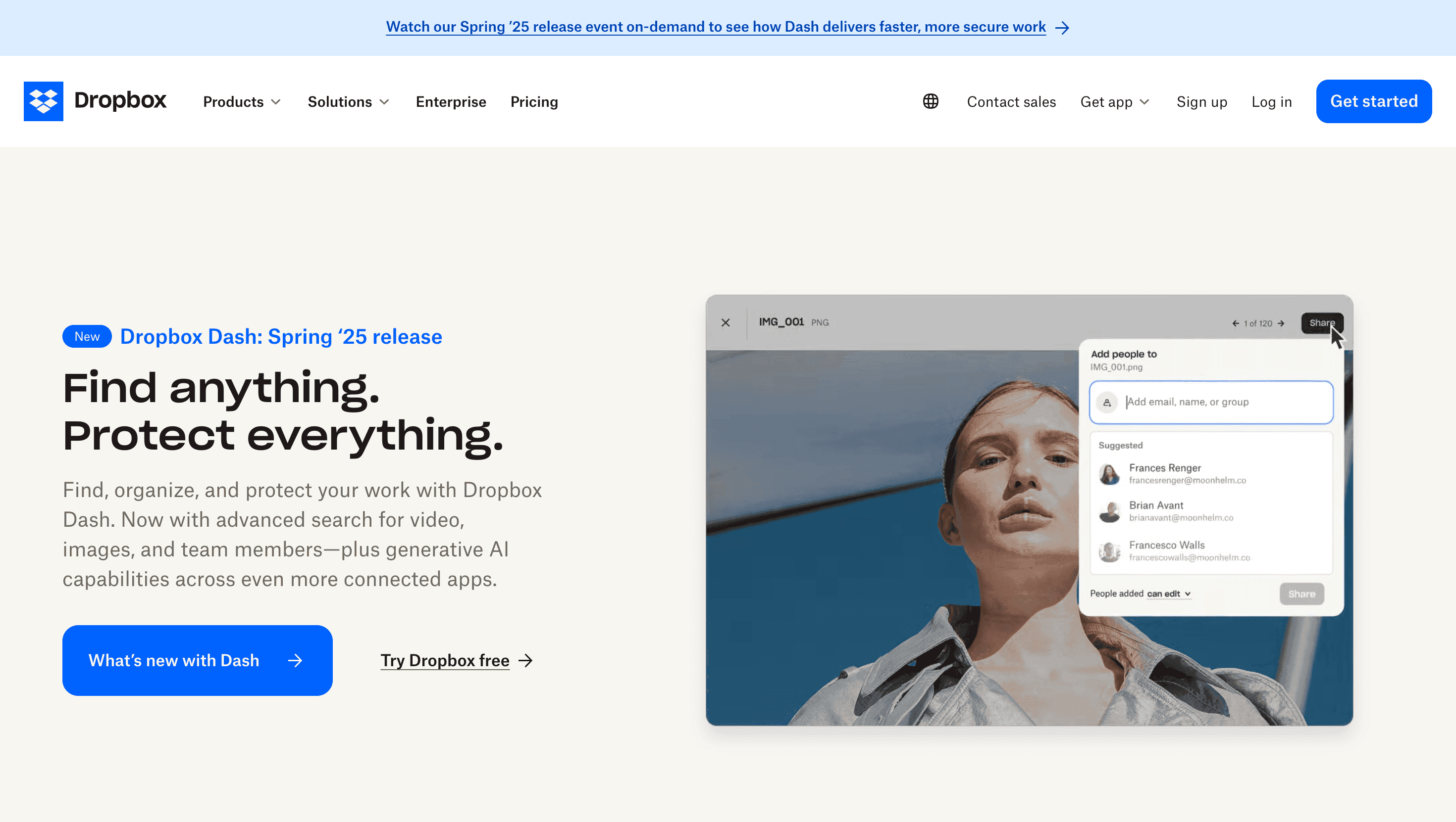
Dropbox’s homepage reframes cloud storage as a modular teamwork hub. The narrative moves in four crisp beats Store → Share → Collaborate → Grow so visitors grasp the value ladder in a single scroll: from gigabyte vault to video-review canvas to AI-powered search that “finds the file you only half remember.”
Visual Language & Motion
A bright, almost gallery-white canvas lets Dropbox Blue (#0061FF) pop. Hero copy lands in bold Neue Haas Grotesk, while the brand’s trademark cut-paper illustrations animate with gentle overshoot, echoing Post-it notes in a brainstorming session. Feature cards ride a 12-column grid; hover and they lift 4 px with a soft shadow, inviting exploration. Accent lilac highlights DocSend, mint signals Replay, terracotta marks Capture colour-coding that mirrors in-product hubs.
UX & Performance
AVIF hero (< 300 KB) lazy-loads after Largest Paint, keeping LCP ≈ 1.1 s desktop / 1.5 s on 4G. IntersectionObserver defers autoplay screen recordings until they’re 50 % in view, guarding CPU cycles. prefers-reduced-motion pins illustration loops and swaps card slides for fades; every colour pair clears WCAG AA. A sticky “Get Dropbox” pill trails the scroll, collapsing to a thumb-sized button below 480 px for frictionless sign-ups.
Takeaway
Dropbox proves utility can wear a friendly face: disciplined performance budgets, human-centred illustrations and AI previews turn plain file storage into an approachable productivity launchpad.