Visit website
Turn.io
9 views4mo ago
Concept
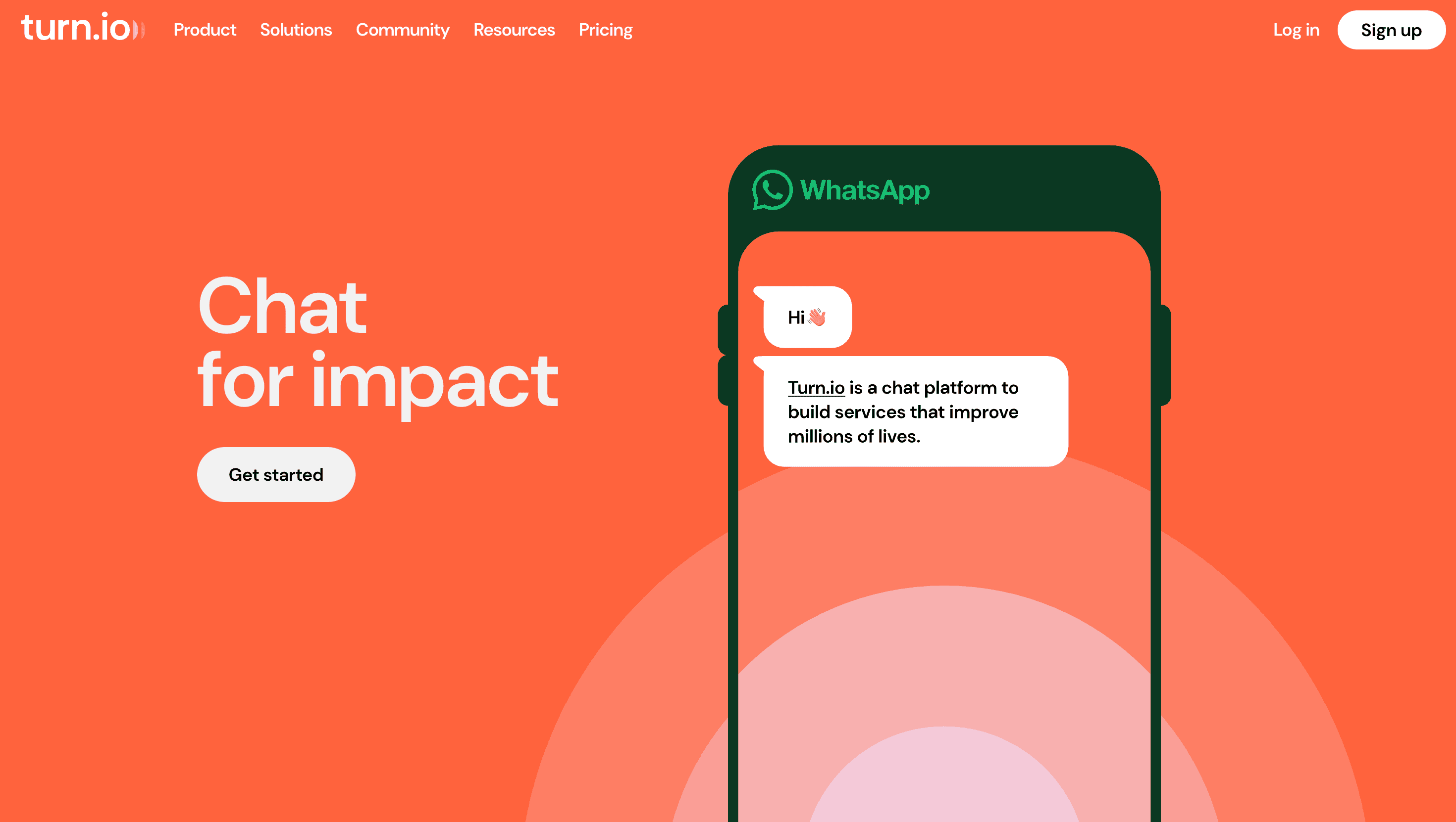
Turn.io began inside a UNICEF chatbot pilot and has grown into a full-stack “impact messaging platform.” The product thesis is simple: life-changing advice—HIV adherence tips, refugee legal aid, farmer pricing—should land where people already talk: WhatsApp. The site tells that story through a funnel that feels more manifesto than marketing: Why Messaging? → What Turn Does → Proof in 40+ Countries → Start Building.
Visual Language & Motion
The palette borrows WhatsApp’s emerald and soft-tones it with humanitarian blues and sunrise corals. A bold, humanist grotesque headlines every section while rounded icons hint at chat bubbles and empathy. GSAP-eased slides snap left—mobile-first storytelling that mimics swiping between chats. Hero screenshots show a counsellor’s dashboard alive with colour-coded intents; hover reveals live KPIs that tick upward in real time, underscoring data-driven impact.
UX & Performance
Hero PNGs lazy-load via srcset AVIF; Motion-heavy SVGs run only above the fold, holding LCP ≈ 1.1 s desktop / 1.5 s mobile. A sticky “Get API Access” button shadows the scroll yet collapses to a single icon on 360 px phones. prefers-reduced-motion flattens slide-ins to fades. All colour pairs hit WCAG AA—critical for NGOs working in bandwidth-constrained regions. Signup is frictionless: Google OAuth or one-minute email form, then straight into a sandbox workspace.
Takeaway
Turn.io proves tech-for-good UX can rival Silicon-Valley polish: restrained visuals, conversational narrative and ruthless performance budgets invite NGOs, governments and startups alike to ship chatbots that save time—and lives.
More Projects

Sponsor
Your ad here