Visit website
Secco Squared
12 views4mo ago
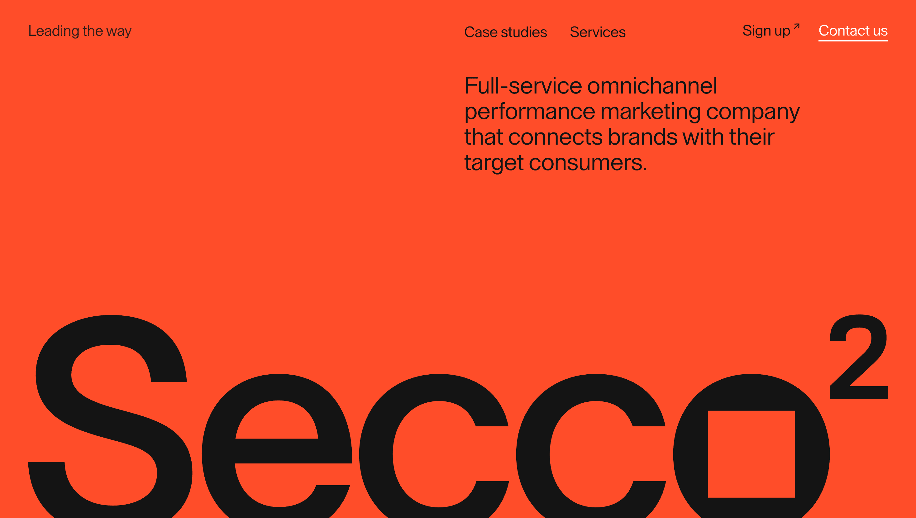
Concept
Secco²’s redesign turns a marketing agency site into a living case study in geometry: every block, from logo to menu, emerges from the humble square that inspired the name. Slide past the hero and the square grows into a hovering 3-D cube, signalling the shift from flat thinking to volumetric, full-service execution.
Visual Language & Motion
A stark graphite backdrop hosts snowy white type and a single molten-orange accent—used sparingly on CTAs and data points. The layout obeys a 12-column Swiss grid; yet GSAP easings let cards “click” into place like Lego bricks, softening the rigidity. Hover any service tile and the icon flips on its Z-axis, echoing the cube motif while revealing sub-copy on the reverse. Case-study thumbnails adopt a square mask that morphs to 16:9 on hover, underscoring the theme of dimensional expansion.
UX & Performance
Hero cube geometry streams via Draco; background textures lazy-load just-in-time, keeping LCP ≈ 1.2 s desktop and 1.6 s on 4 G mobile. A sticky corner nav doubles as progress tracker; prefers-reduced-motion swaps flips for opacity fades and freezes the cube into an isometric logo. All colours hit WCAG AA, and keyboard arrows step through sections in logical order.
Takeaway
Secco² proves that branding can be a layout system: anchor everything in one primitive form, then let animation reveal its hidden dimensions. The result is a portfolio that feels both strict and playful—an object lesson in turning identity into interface.
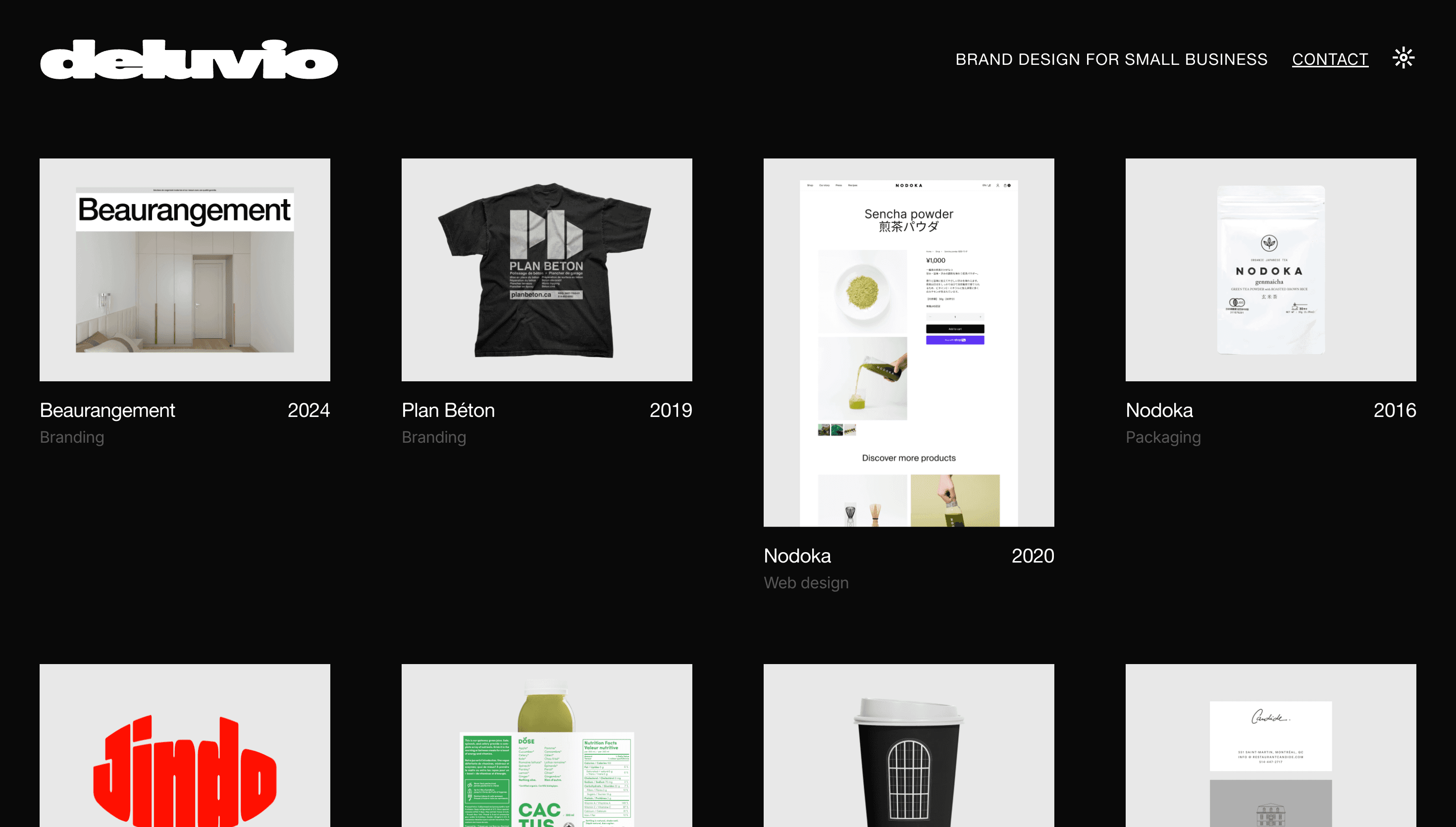
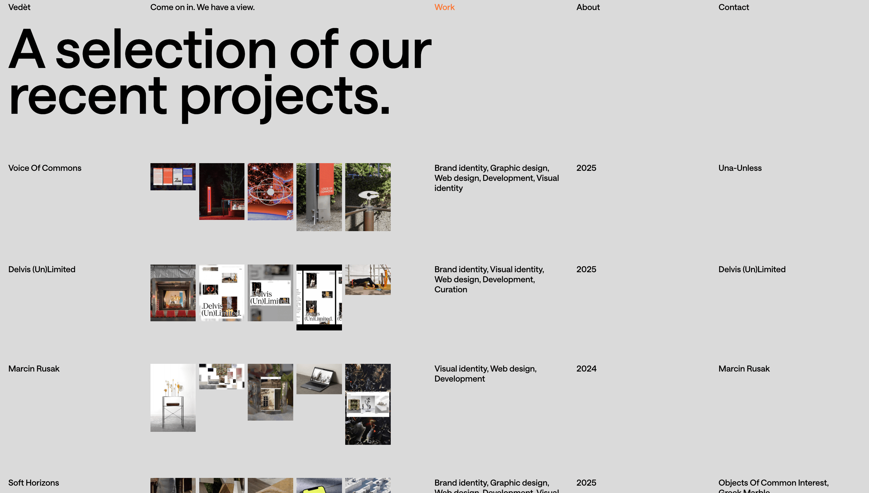
More Projects

Sponsor
Your ad here