Visit website
Impronta
12 views4mo ago
Concept
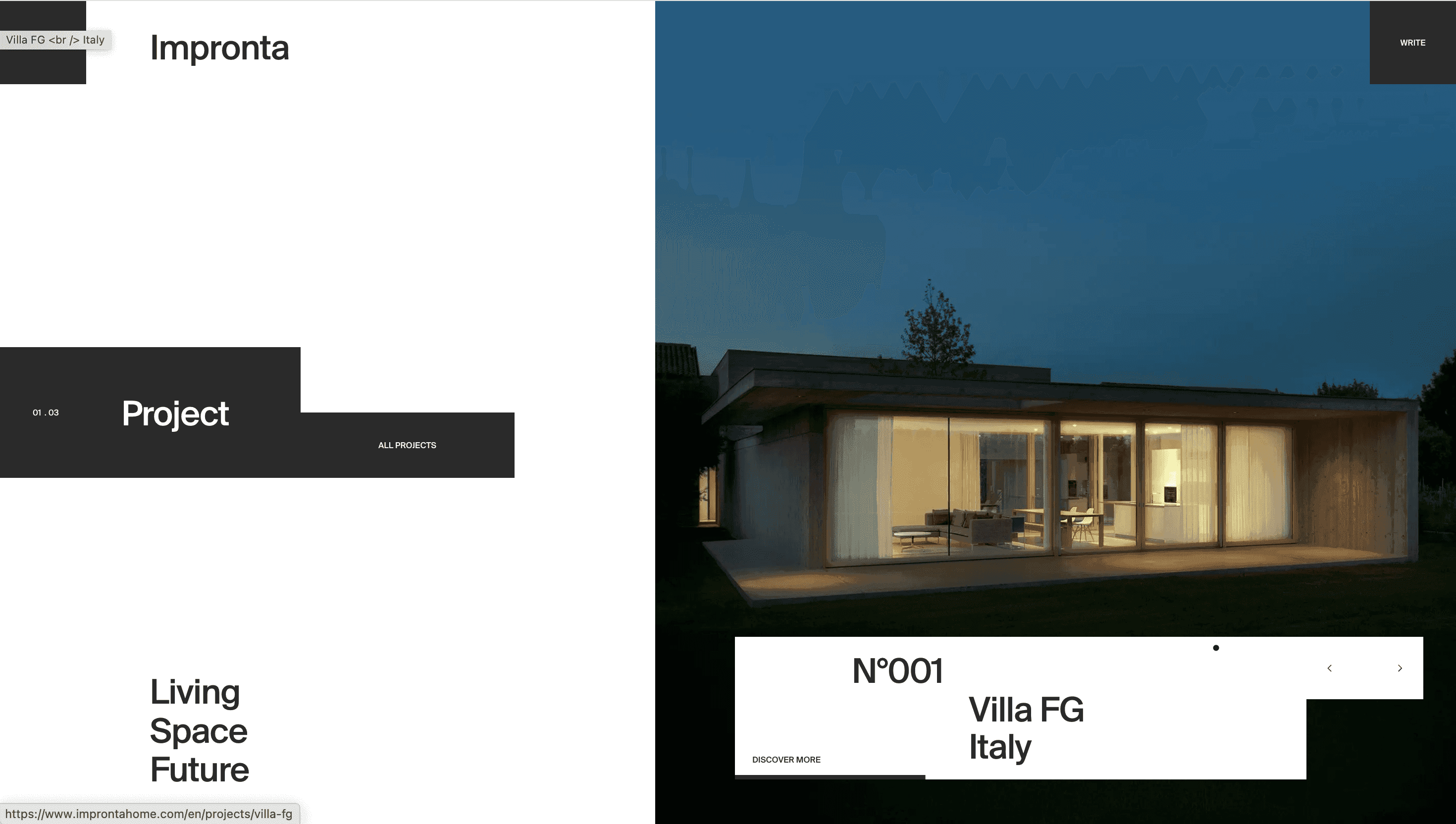
Impronta positions itself as a “designer of light” not merely a frame maker. The site therefore reads like an architectural monograph: Collection → Craft → Projects → Services. Visitors glimpse how aluminium-minimal profiles, wood-aluminium hybrids and fully timber lines can fit a chalet in the Alps or a glass cube in Milan, turning a catalogue into a story of possibilities.
Visual Language & Motion
A warm-gray canvas recalls concrete formwork; full-bleed hero photos crop windows as negative space so the landscape becomes part of the UI. Headings in a refined neo-grotesk stride across a 12-column grid, while body copy rests in a humanist sans. Scroll cues fade panels upward frames, finishes, hardware mirroring the way daylight rises across a wall. Hover states tint product shots with a soft sepia, evoking sun patinated oak. Accent terracotta appears only on CTAs and tiny section markers, letting the materials carry the palette.
UX & Performance
AVIF hero images (< 350 KB) lazy-load just after Largest Contentful Paint, keeping LCP ≈ 1.2 s on desktop and 1.6 s on 4G devices. A sticky “Request a consultation” drawer shadows the viewport yet collapses to a thumb-sized pill under 480 px. prefers-reduced-motion swaps fade-ups for static reveals. All colour pairs exceed WCAG AA, critical for a B2B brand selling precision and trust.
Takeaway
Impronta demonstrates how a manufacturing site can feel as curated as an architecture magazine: restrained palette, editorial photography and disciplined performance budgets turn technical specs into inspiration proving that craftsmanship and engineering can share the same window.
More Projects


Sponsor
Your ad here