Visit website
OPTIKKA
11 views4mo ago
Concept
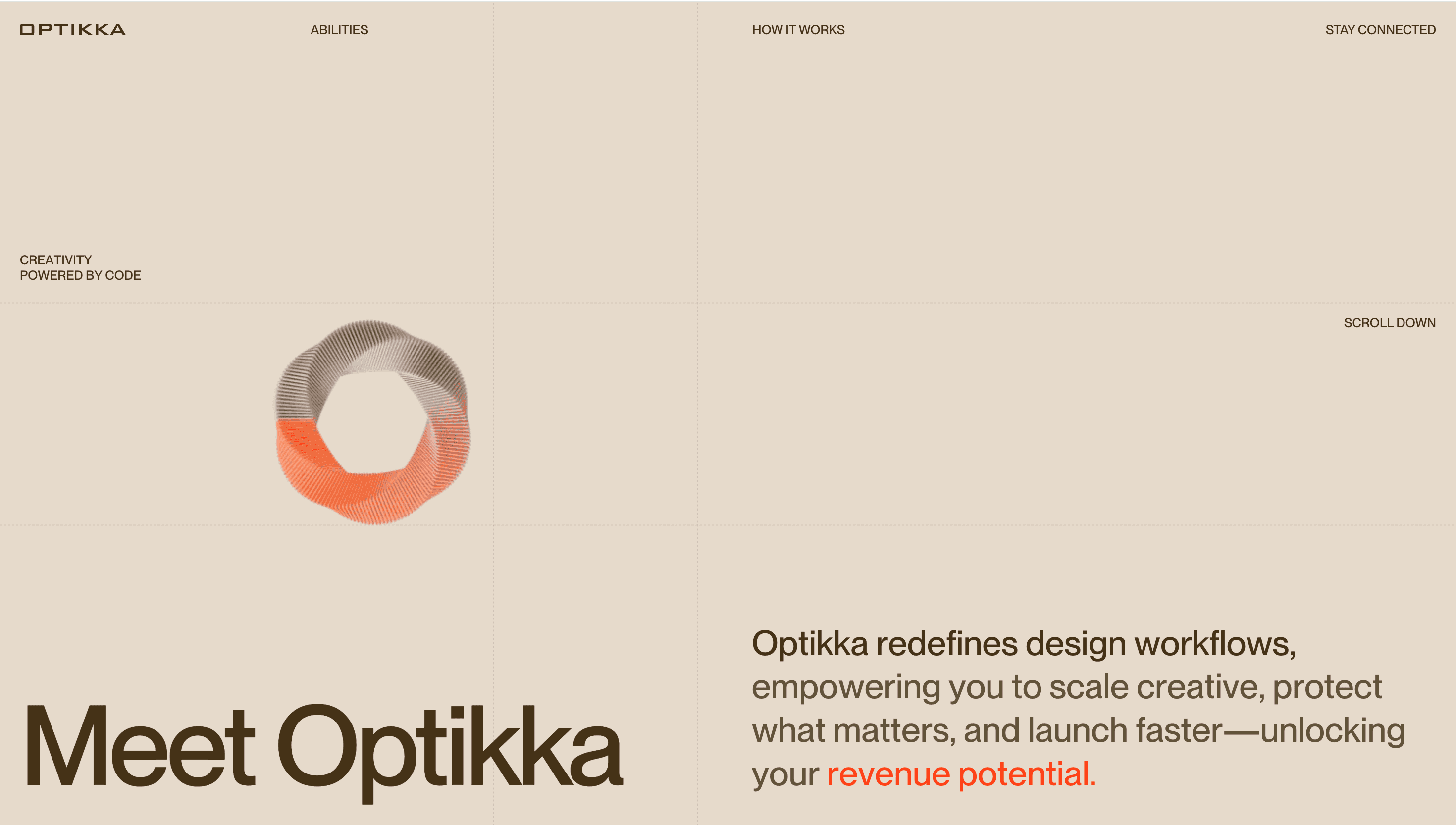
Optikka brands itself as a creative-orchestration platform: instead of siloed files and hand-offs, you get a living design system driven by code and AI “agents.” The home page behaves like a funding deck in motion Meet Optikka → How It Works → Benefits → Book Demo so founders, CMOs and engineers all find a clear path to “why” and “how” inside two scrolls.
Visual Language & Motion
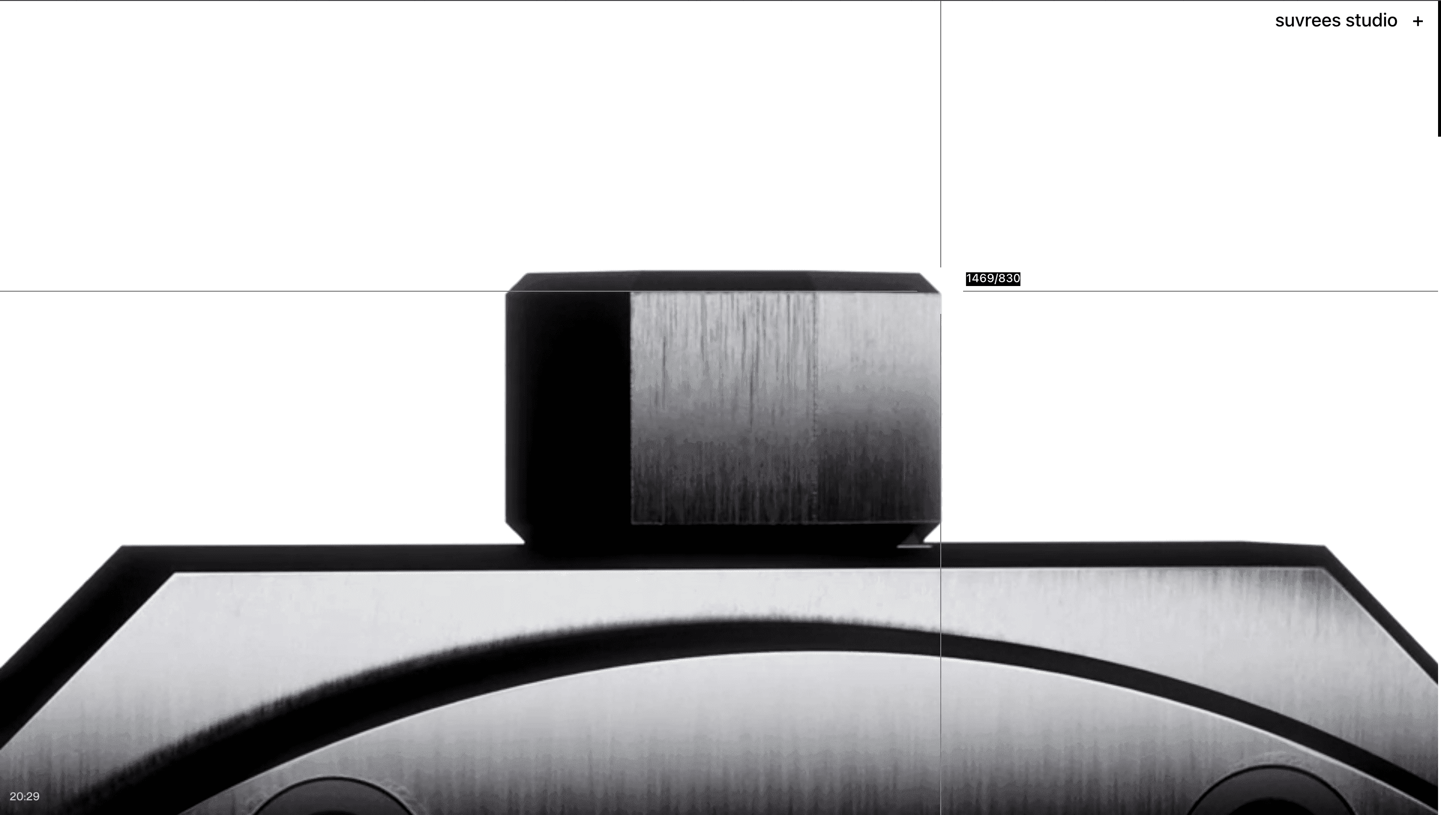
The stage is a calming cream (#E4DACD); accent orange (#E95330) zips across headings and CTA borders like a highlight pen on a brief. A hovering 3D “spinner cube” pivots with cursor drag, visualising tokens snapping into layouts. Headlines in Space Grotesk shout at billboard scale, while body copy rests in a friendly sans that keeps the SaaS vibe approachable. Scroll reveals cards that slide up on GSAP spring easing, their shadows stretching 2 px to mimic stacked modules in a design system.
UX & Performance
Hero spline (< 500 KB .gz) lazy-loads after LCP, keeping LCP ≈ 1.2 s desktop / 1.6 s on 4 G. IntersectionObserver prefetches video demos one viewport ahead, so playbacks feel instant without hogging memory. prefers-reduced-motion freezes cube spin and swaps slide-ins for fades. Beige-on-black text hits WCAG AA, and a sticky “Get Early Access” drawer collapses to a thumb-friendly pill under 480 px.
Takeaway
Optikka proves that design tooling can market itself through system thinking restrained palette, modular grid and code-driven 3D metaphors turn a dense SaaS proposition into an elegant, instantly legible experience.
More Projects


Sponsor
Your ad here