Visit website
Moooi
16 views4mo ago
Concept
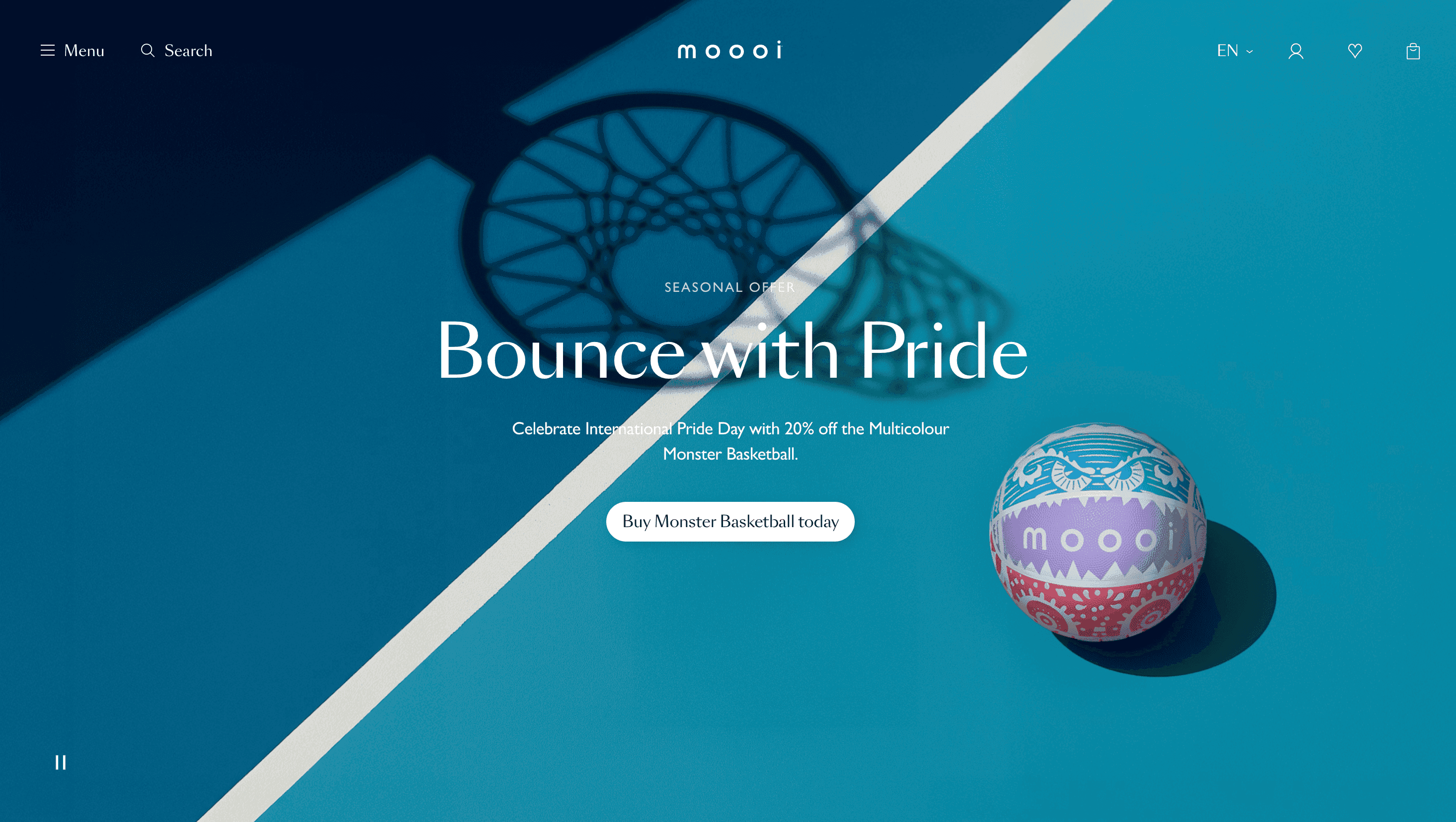
MOOOI believes objects should “dare to be different,” so the site works as a digital showroom crossed with a design magazine. Landing on the home page is like stepping into an open-plan loft: every scroll unveils a new vignette—pendant lamps afloat in velvet darkness, sofas staged in dreamlike colour palettes, curios posed on marble plinths—each accompanied by the brand’s trademark poetic copy.
Visual Language & Motion
A rich charcoal backdrop makes colours glow. Oversized GT Sectra headlines slide in on gentle spring easing, while body copy rests in a readable grotesque. Hover any product card and it inflates into a full-bleed 3-D viewer; scroll-wheel zoom lets you inspect brass screws or woven upholstery fibres. Subtle parallax shifts entire room sets a few pixels off axis, creating the sensation of walking past real furniture. Accent pink sparks across CTAs and section dividers, echoing the fuchsia thread in MOOOI’s stitched logo.
UX & Performance
High-resolution imagery streams as AVIF thumbnails, upgrading to WebP only on intersection, keeping LCP ≈ 1.2 s desktop / 1.6 s mobile. A sticky filter bar collapses to a single icon on phones, while prefers-reduced-motion disables parallax and swaps 3-D viewers for stills. Checkout lives in an overlay drawer so shoppers never leave the immersive flow. Contrast ratios pass WCAG AA—even against moody backdrops—and all interactive elements are keyboard-reachable.
Takeaway
MOOOI demonstrates that online retail can feel like gallery curation: editorial storytelling, cinematic lighting and disciplined performance budgets combine to turn browsing into an experience of wonder—and to prove premium furniture can sell itself through atmosphere, not hard specs.