Visit website
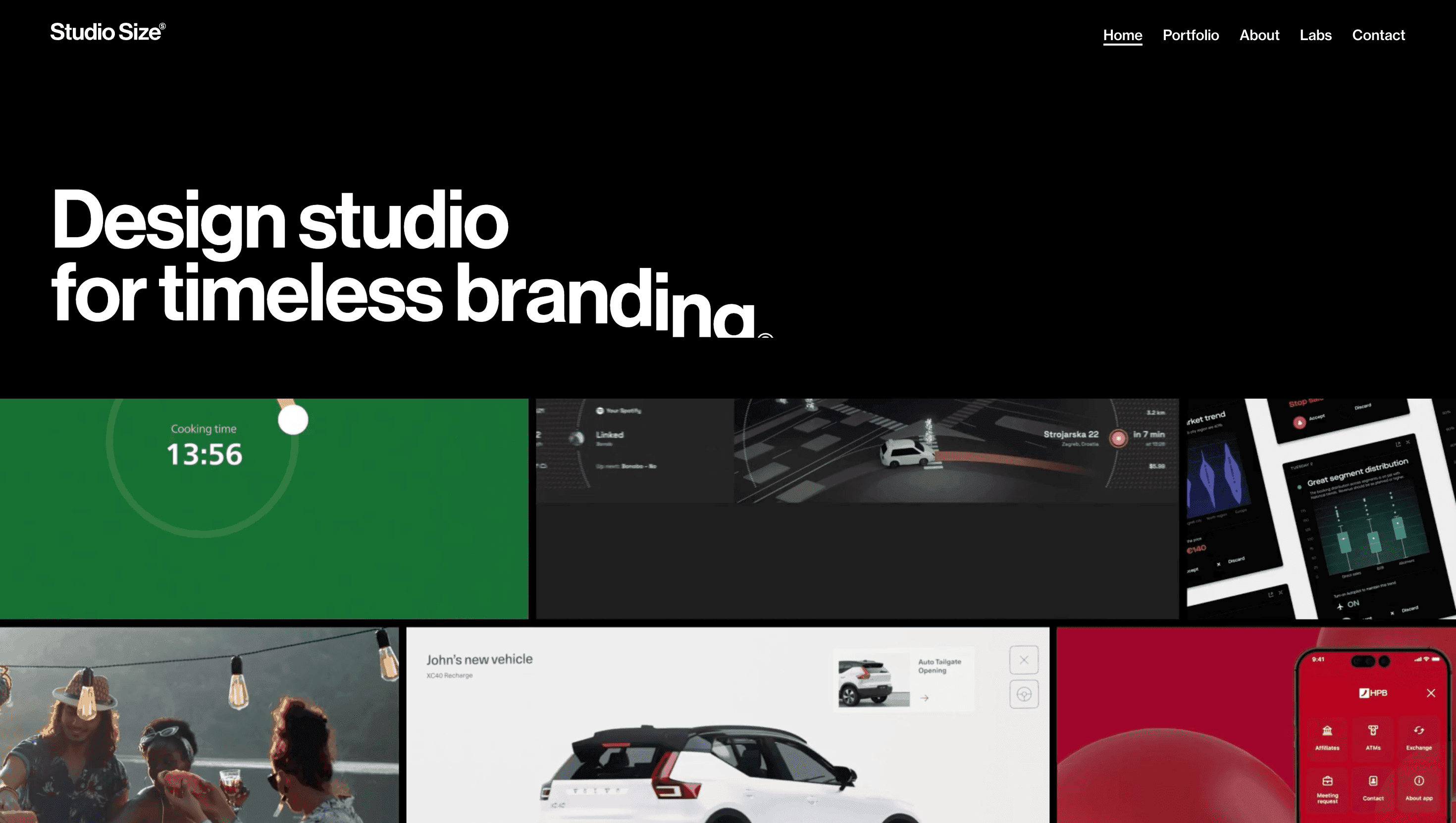
Studio Size
60 views4mo ago
Concept
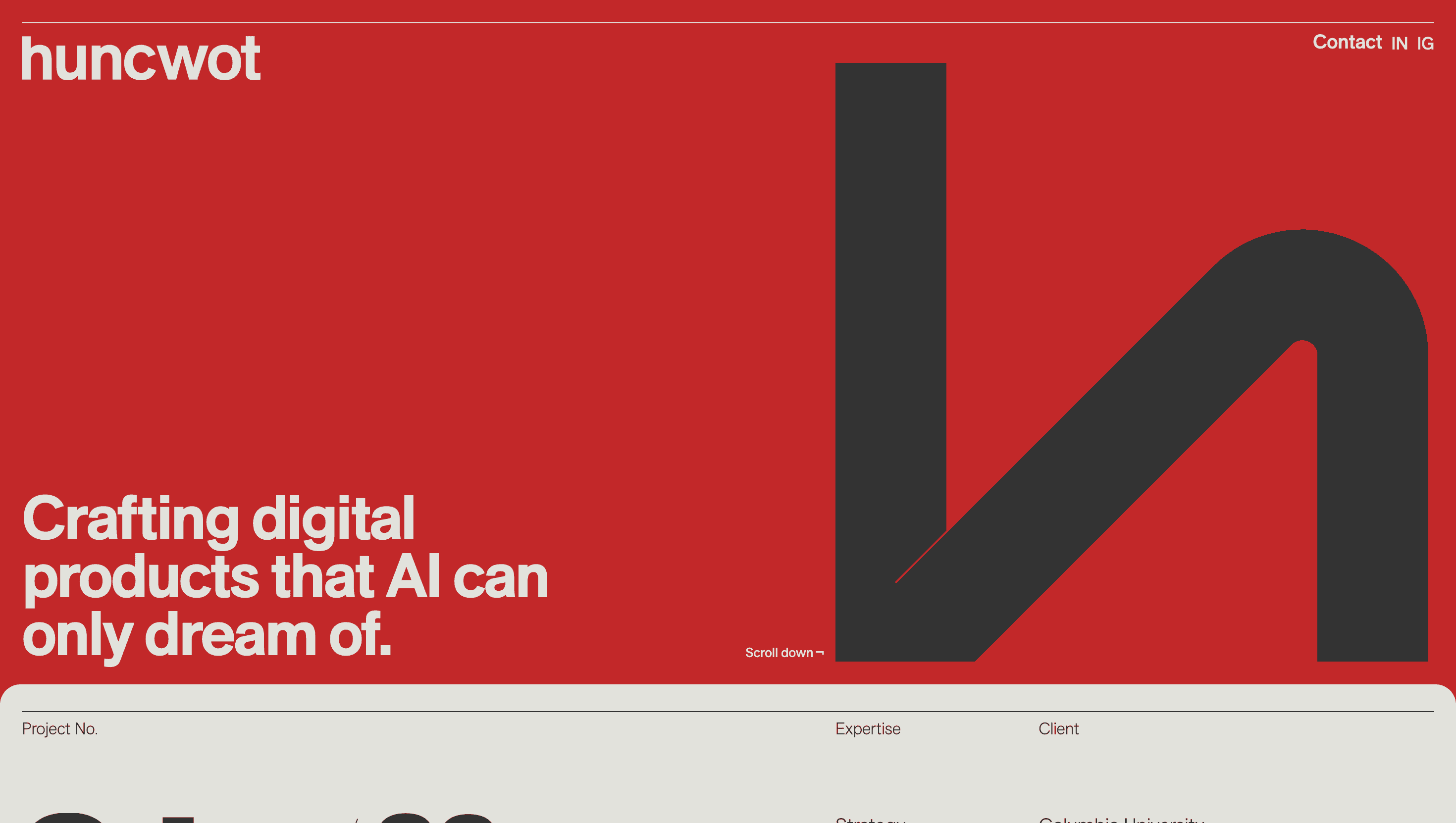
Studio Size frames itself as a graphic design studio for the digital age. Instead of a restrained case-study list, the homepage reads like a typographic playground—oversized words stretching, sliding, and colliding as you scroll. The message is clear: they design identities that don’t just sit still, they perform.
Visual Language & Motion
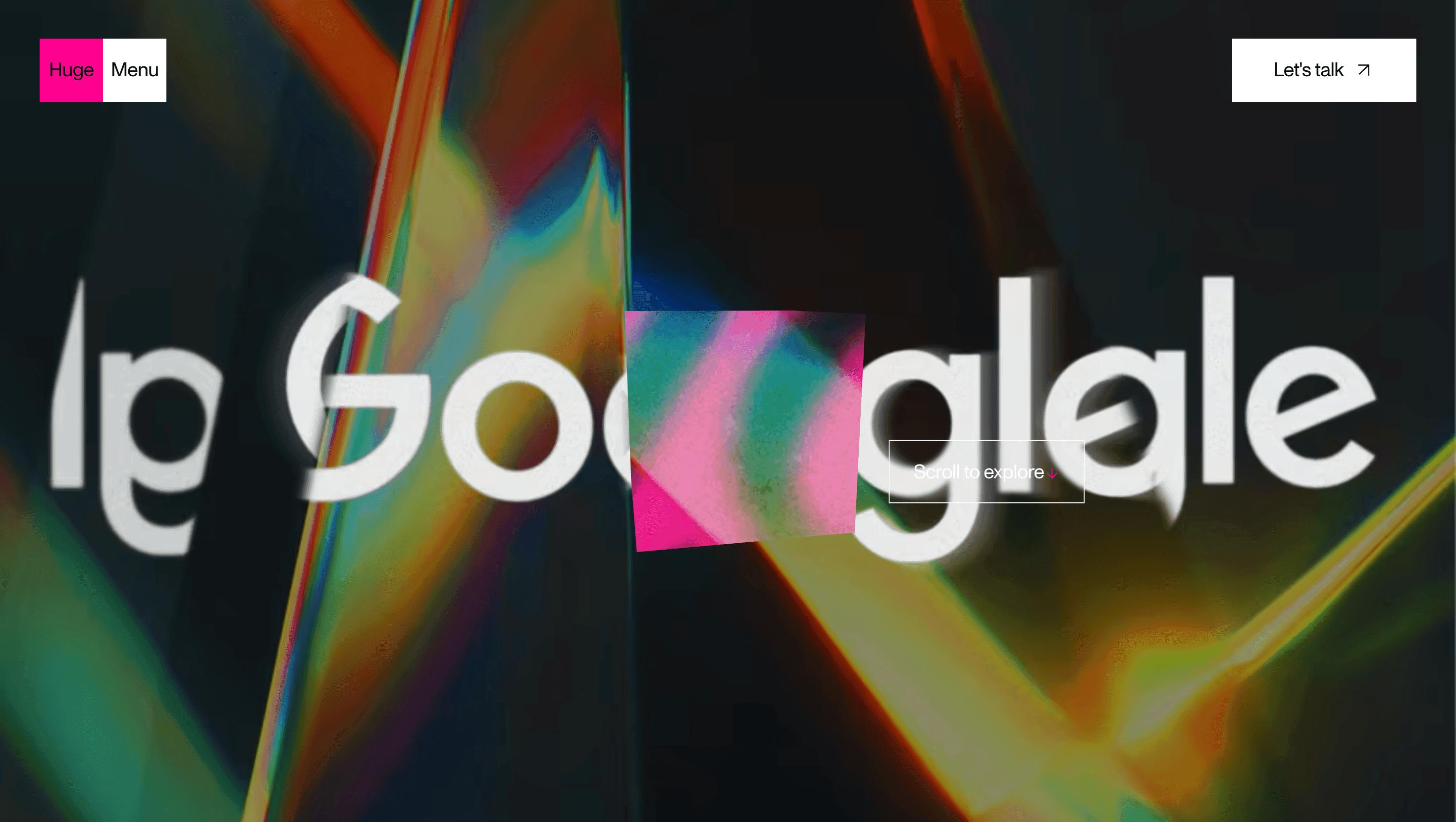
A crisp white background hosts giant, grotesque type that warps with scroll inertia. Each project link bursts into full-bleed colour—acid green for a music festival, coral pink for a cultural institution—transforming the whole viewport into client branding. Hover effects shift letter spacing and baseline position, producing a jittery, kinetic rhythm. Navigation is reduced to a slim corner index, so type and colour dominate.
UX & Performance
With lightweight SVG typography and AVIF image assets, LCP ≈ 1.1 s desktop / 1.5 s on 4G. Interaction feels immediate: projects expand inline instead of loading new pages, collapsing back with a single click. prefers-reduced-motion locks typographic warps and replaces scroll animations with fades. Colour choices keep high contrast, hitting WCAG AA even when backgrounds shift to neon.
Takeaway
Studio Size proves identity work can live as performance, not just presentation—fearless type, daring colour and disciplined performance turn their website into an ongoing demo reel of brand energy.
More Projects

Sponsor
Your ad here