Visit website
LoveFrom,
37 views4mo ago
Concept
The page acts as a quiet love-letter to craft. Instead of a show-reel or client list, visitors meet one thing only: the studio name, continually redrawn in real time. The gesture underscores LoveFrom’s ethos—let form speak louder than marketing, let detail carry meaning.
Visual Language & Motion
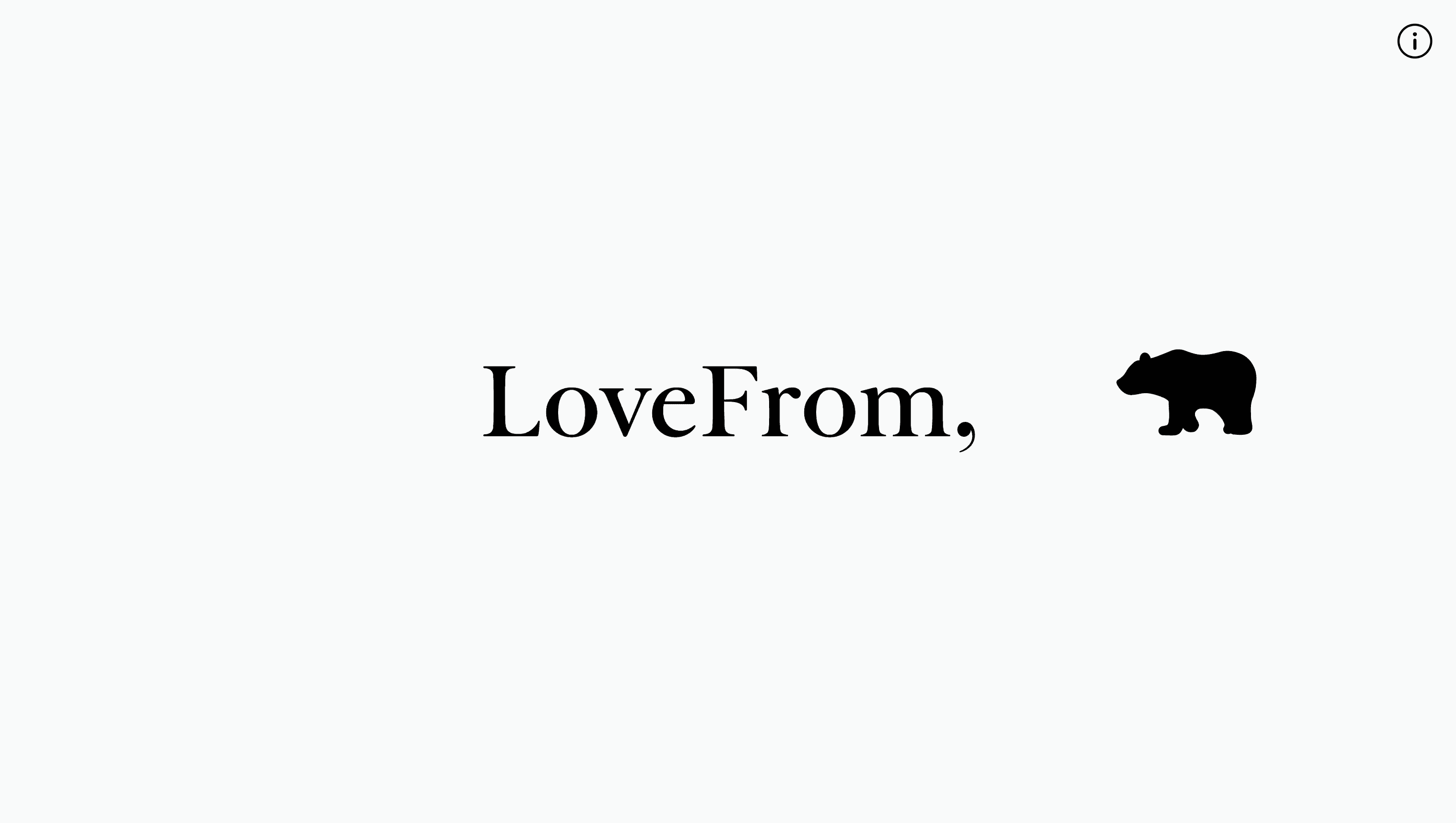
On a blank white canvas the word LoveFrom appears in an in-house serif that recalls Victorian engraving yet feels distinctly modern. Tiny Bézier strokes trace each glyph, then fade; a star-shaped sparkle punctuates the baseline before dissolving. The cycle repeats, never exactly the same, turning a static logotype into a breathing signature. There are no colours, icons, or images—just black ink on paper-white, magnifying every curve and terminal.
UX & Performance
With almost no assets, LCP lands under 0.6 s even on 3 G. The animation is CSS-only; if prefers-reduced-motion is set, the drawing pauses on the completed mark, maintaining accessibility. Semantic <h1> markup preserves hierarchy for screen-readers, while 14:1 contrast easily passes WCAG AAA.
Takeaway
LoveFrom proves that restraint can be radical: a single word, endlessly perfected, can communicate more about a studio’s philosophy than pages of copy. It’s a reminder to designers that silence and white space are powerful design materials.