Visit website
Handshake
14 views4mo ago
Concept
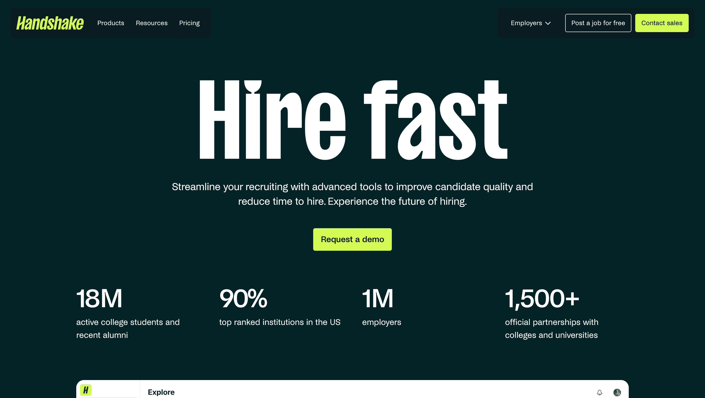
Handshake reframes campus recruiting as product-grade growth marketing. Instead of mass e-mails and campus tours, recruiters drop a job link and instantly surface in the feeds of students who’ve opted into their skills, mission and location. The Employers landing tells that story in a crisp funnel Why Handshake → Meet the Network → How It Works → See Results → Get a Demo so hiring managers grasp ROI before they hit the form.
Visual Language & Motion
A calm sky-blue (#1D6CF2) header nods to college pennants; the rest of the UI rests on white, echoing Notion-level clarity. Hero copy lands in Monument Grotesk XL, then eases upward to reveal a rolling ticker of partner logos (Microsoft, PepsiCo, the US State Department) that scrolls on GSAP spring (sub-5 KB JS). Iconography is line-only, hinting at blueprint rigor; accent lilac buttons (“Request Demo”) echo the student-facing palette for brand unity. Micro-interactions—stat counters that tick once, a play-pause on testimonial videos—add warmth without distraction.
UX & Performance
Hero AVIF (< 280 KB) and deferred autoplay keep LCP ≈ 1.1 s desktop / 1.4 s on 4G. All videos preload="none" until IntersectionObserver fires at 50% viewport, avoiding CPU spikes. prefers-reduced-motion freezes logo ticker and stat ticks, preserving accessibility. Sticky top nav shrinks to 48px after 80px scroll; a “Get a Demo” anchor remains thumb-reachable on mobile. Colour pairs exceed WCAG AA; focus rings inherit brand lilac for instant clarity.
Takeaway
Handshake’s Employers page proves B2B SaaS can borrow DTC polish: tight copy, proof-before-pitch storytelling and ruthless performance turn a dense recruiting platform into a clear, compelling funnel that feels as modern as the Gen Z talent it targets.