Visit website
Basic/DEPT®
9 views4mo ago
Concept
BASIC/DEPT® believes brands should move culture forward. Their site acts like a walking tour through that philosophy no “Our Services” boilerplate, just a tight arc: Purpose → Selected Work → Thinking → Culture → Open Roles. Each section proves the mantra “Build less, matter more” by letting case studies, essays and team rituals do the talking.
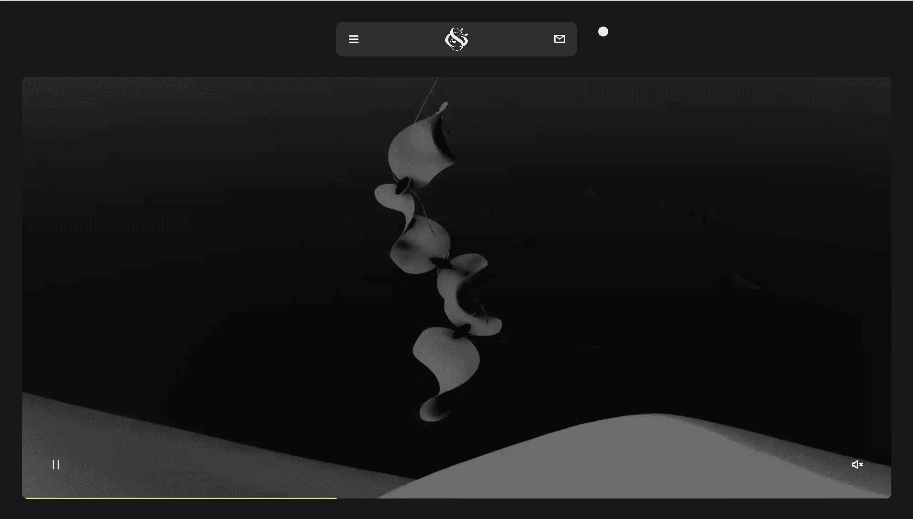
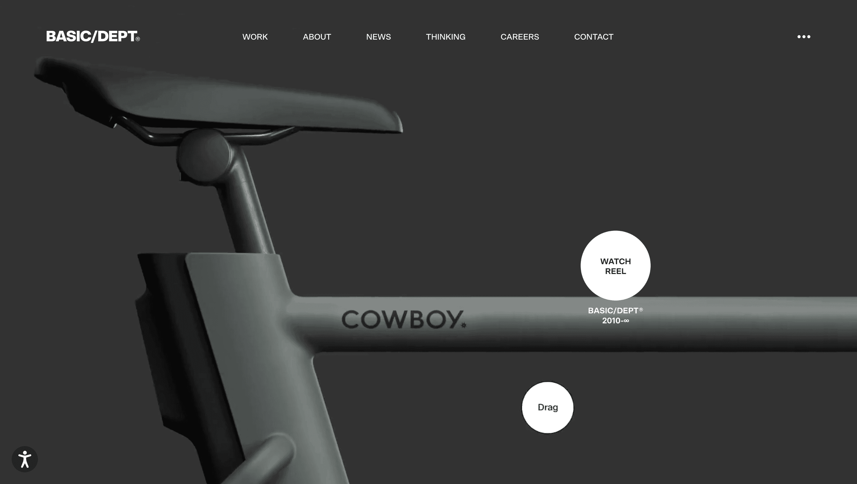
Visual Language & Motion
A rich charcoal canvas (#111) lets full-bleed work explode with colour. XXL Neue Haas Grotesk headlines stride across a rigorous 12-column grid, while body copy whispers in GT America for editorial warmth. Scroll and GSAP-spring panels snap upward like magazine pages; hover a project card and it blooms to full-bleed video while neighbouring tiles shrink 3 px an analog rack focus translated to CSS. Accent copper (#B56A4D) appears only in CTAs and tiny progress dots, reinforcing restraint.
UX & Performance
Hero reels encode to AV1 and lazy-load only on ≥ 1024 px; mobiles receive poster frames, keeping LCP ≈ 1.2 s desktop / 1.6 s on 4G. IntersectionObserver prefetches the next case study two screens ahead for jitter-free playback. prefers-reduced-motion freezes snap-scroll and swaps parallax video for high-res stills, preserving accessibility without dulling vibe. Colour pairs smash WCAG AA even copper on black cementing enterprise-grade trust.
Takeaway
BASIC/DEPT® shows how an agency can sell by curating: disciplined grid, fearless type and ruthless performance budgets turn browsing into a mini-masterclass on purposeful design making the “Let’s Talk” button feel inevitable, not intrusive.