Visit website
Montfort
33 views4mo ago
Concept
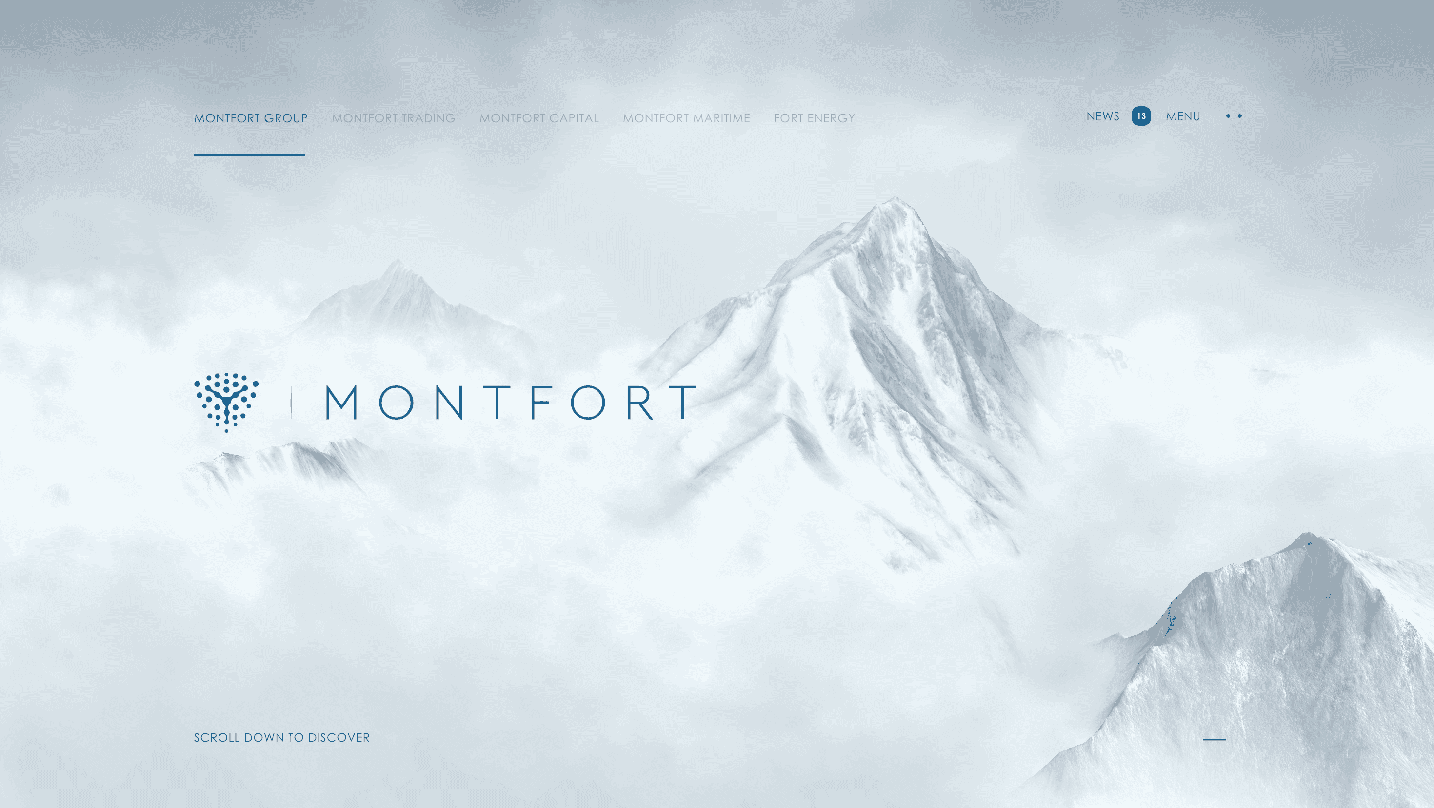
Montfort’s platform recasts an energy trading conglomerate as a single, scrollable narrative of movement: oil tankers, capital pipelines and maritime routes fuse into one story of “value in motion.” Instead of siloed sub-brands, a continuous track Group → Trading → Capital → Maritime → Fort Energy lets visitors grasp the portfolio in minutes.
Visual Language & Motion
A midnight-blue canvas (#29648E) meets off-white typography, mirroring crude-to-clean transformation. Hero text glides over a glassy globe that tilts with cursor drift; section dividers unfurl like shipping lanes traced on a nautical chart. Icons are line-drawn arrows, drums and hull silhouettes that animate on hover, hinting at restless logistics. Colour pops amber for Trading, emerald for ESG signpost divisions without fracturing brand unity.
UX & Performance
Draco-compressed globe geometry and AVIF hero stills keep LCP ≈ 1.2 s desktop / 1.6 s mobile. IntersectionObserver lazy-loads video b-roll only when 40 % in view; prefers-reduced-motion freezes map spin and swaps slide-ins for fades, protecting motion-sensitive users. Sticky side nav doubles as progress rail on wide screens and collapses to a hamburger below 768 px. All colour pairs meet WCAG AA critical for corporate trust.
Takeaway
Montfort shows that B2B energy can feel premium and legible: disciplined grid, restrained palette and subtle WebGL cues convert a complex enterprise stack into a concise, confidence-building journey.