Visit website
Jitter
23 views4mo ago
Concept
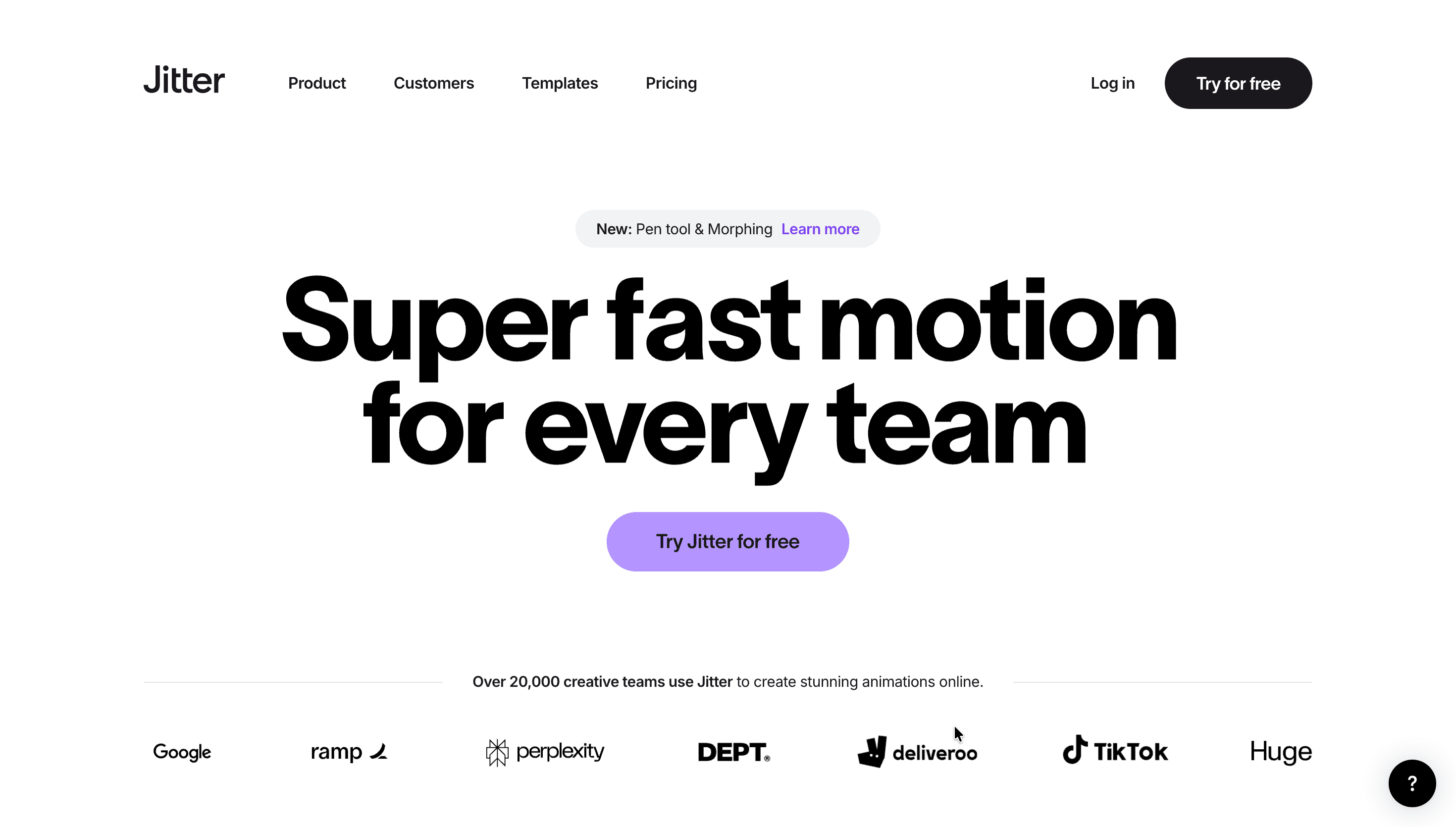
Jitter’s promise is simple: motion design without After Effects.
It brings the ease of Figma into animation: layers, timelines, easing curves—all in the browser, all multiplayer. The homepage funnels users straight into making: Create → Animate → Export. Case studies show startups whipping up pitch-deck animations, indie devs exporting Lottie for apps, and creators pushing TikTok-ready video in minutes.
Visual Language & Motion
The site embodies its product—bright, kinetic, playful. Hero sections open with a looping demo: a logo scales, text fades, and a shape bounces, all built in Jitter itself. Rounded grotesque type reinforces accessibility, while candy-colour gradients (coral, aqua, lime) accent CTAs. Micro-interactions—buttons that pop 2 px on hover, subtle parallax on cards—remind you the tool is about liveliness.
UX & Performance
Because the tool is the demo, the marketing site runs lean: AVIF hero animations (< 200 KB) and deferred video keep LCP ≈ 1 s desktop / 1.4 s on 4 G. A sticky nav anchors Start for Free, with SSO log-in (Google/Figma) one click away. prefers-reduced-motion disables looping hero demos and parallax, ensuring comfort. All colours and type pairs pass WCAG AA, underscoring inclusivity.
Takeaway
Jitter proves motion design doesn’t need to be intimidating. By stripping tools down to the essentials and presenting them with playful clarity, it reframes animation as something any designer—or founder—can wield instantly.
More Projects


Sponsor
Your ad here