Visit website
Anton Shavkero
20 views4mo ago
Concept
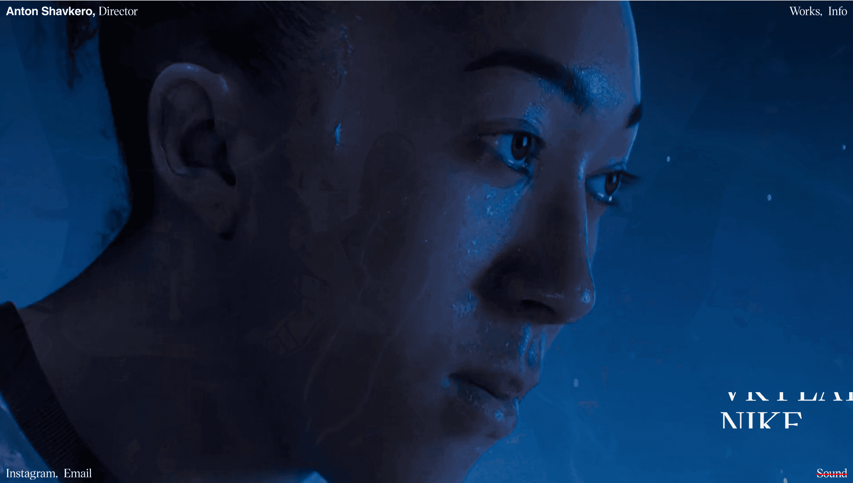
Anton Shavkero’s site is a quiet proof-of-craft. One click opens Works a noir-white grid of title frames; one more reveals Info, where festival laurels (Berlin Commercial, Ciclope, OFFF) and brand logos (PUMA, Aston Martin, Nike) replace sales copy. The structure says everything: the work speaks, the director steps aside.
Visual Language & Motion
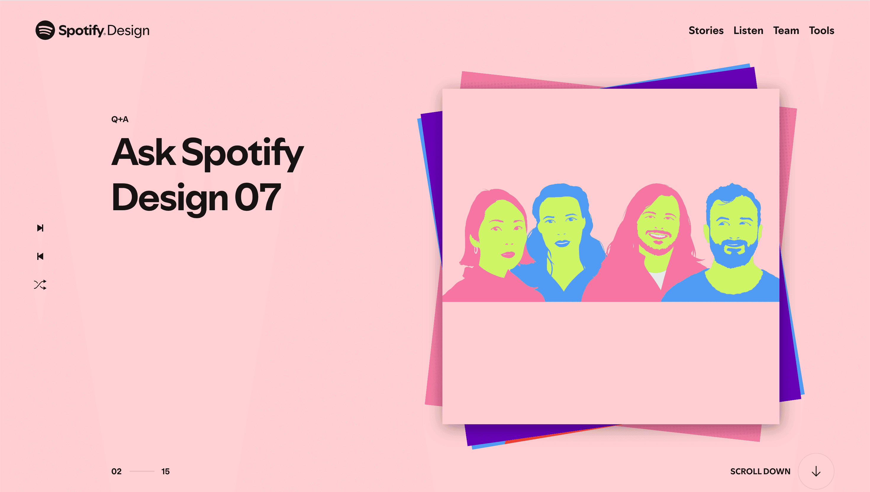
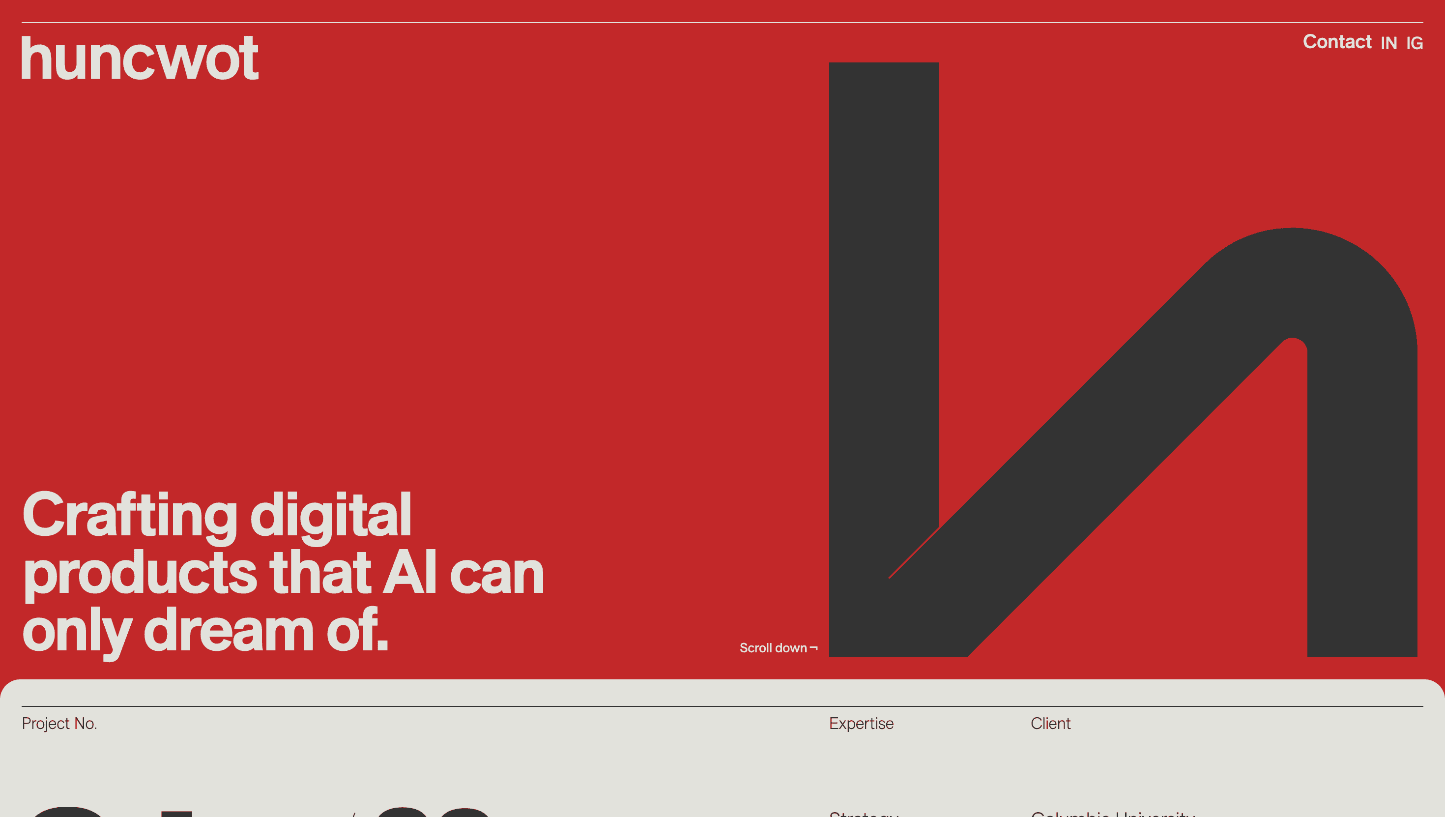
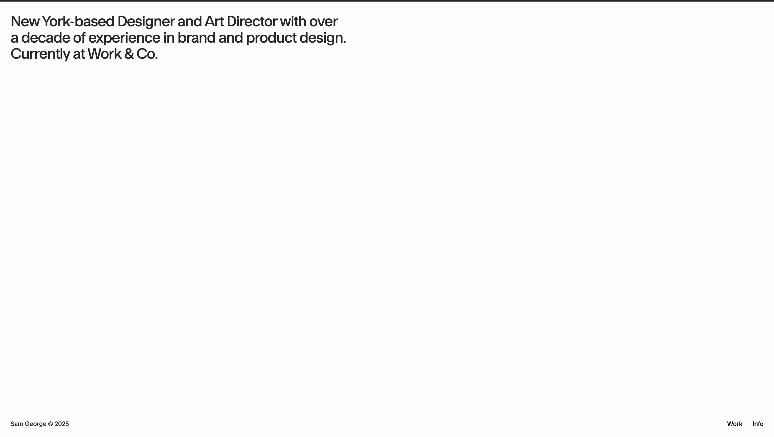
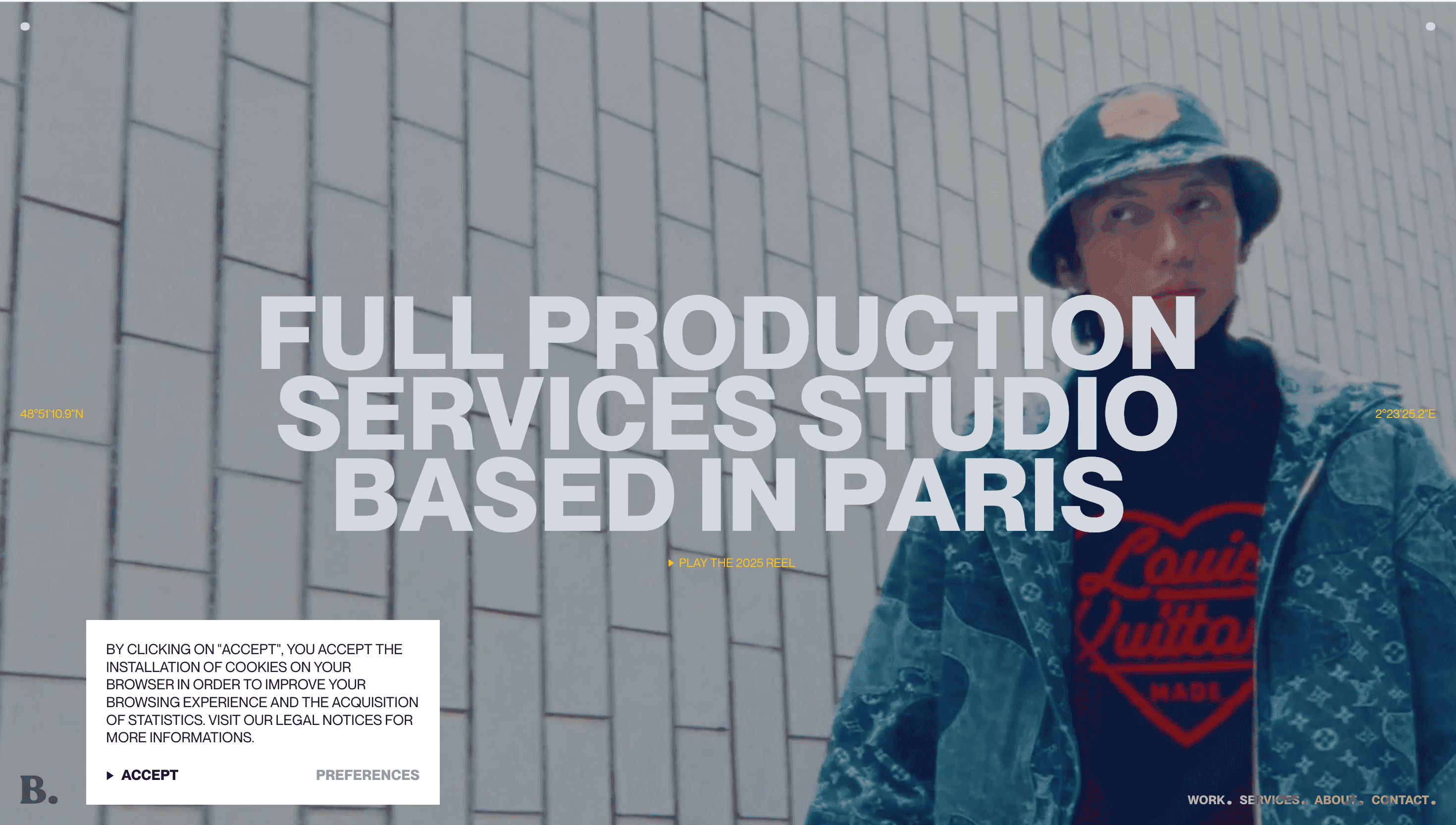
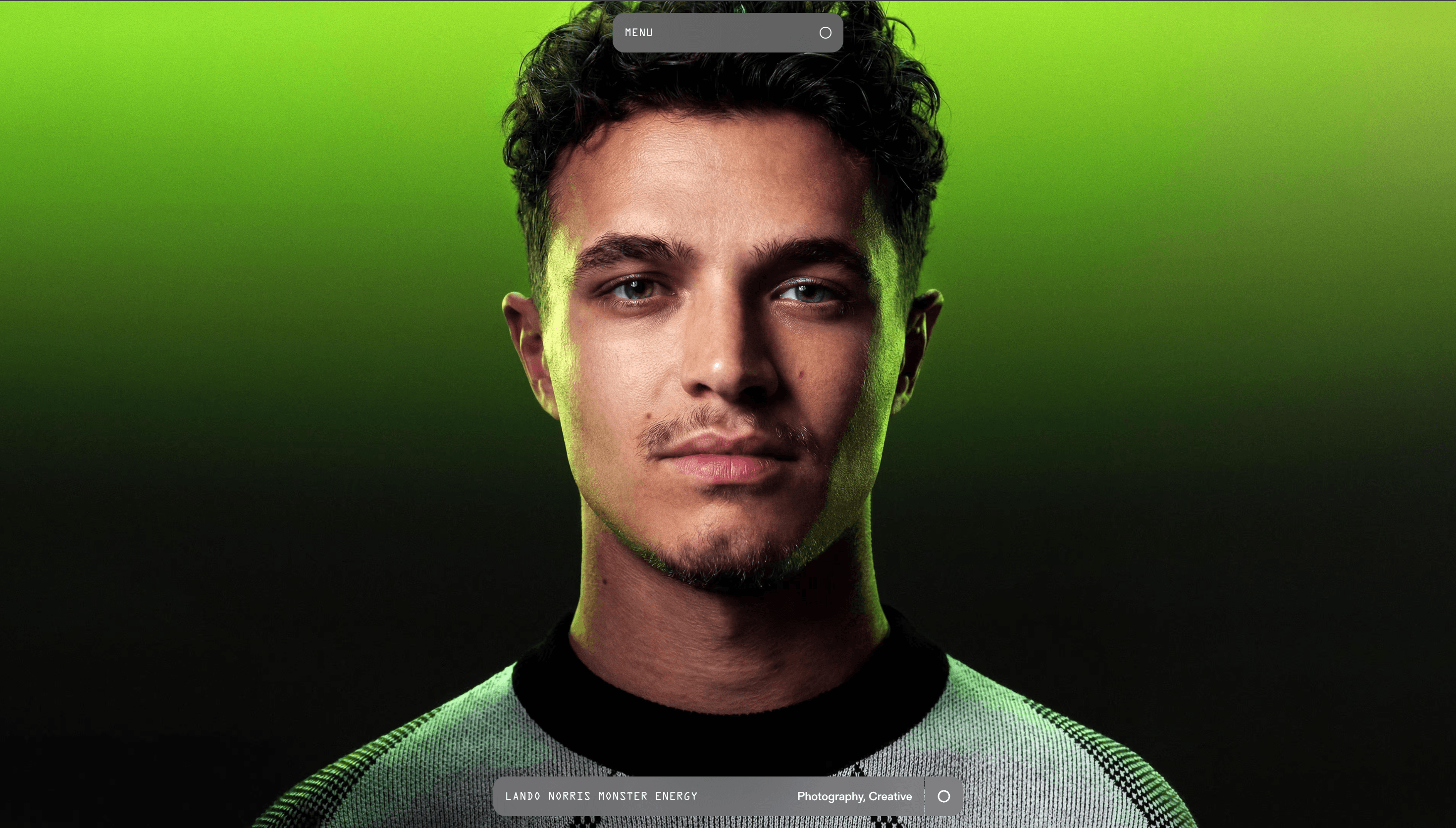
The landing view is blank ink on snow (#000fff). A centered logotype “Anton Shavkero — Director” sinks 8 px on load, then rests motionless Zen calm before the reel. Thumbnails float in a 4-column masonry; hover and they brighten 10 % while a play-icon fades up, hinting at cinema without breaking monochrome discipline. Scroll inertia is gentle, GSAP-springing grid rows upward like a curated contact sheet. No colour until a project page, where brand palettes (Volt green for PUMA, British-racing green for Aston Martin) flood the frame and retract on exit.
UX & Performance
With JavaScript disabled the site politely asks for it; once allowed, LCP hovers ~1 s (90 KB AVIF hero, lazy thumbnails). Videos stream only on click, guarded by <video preload="none">, keeping idle network lean. prefers-reduced-motion freezes grid shifts and swaps hover fades for static borders. Keyboard arrows walk the masonry row-by-row; focus rings inherit the monochrome palette, maintaining WCAG AA contrast throughout.
Takeaway
Shavkero proves restraint can amplify spectacle: by stripping UI to black, white and tiny kinetic cues, the work takes center stage and the director’s vision lands before a single play button is pressed.