Visit website
ChainGPT Labs
32 views4mo ago
Concept
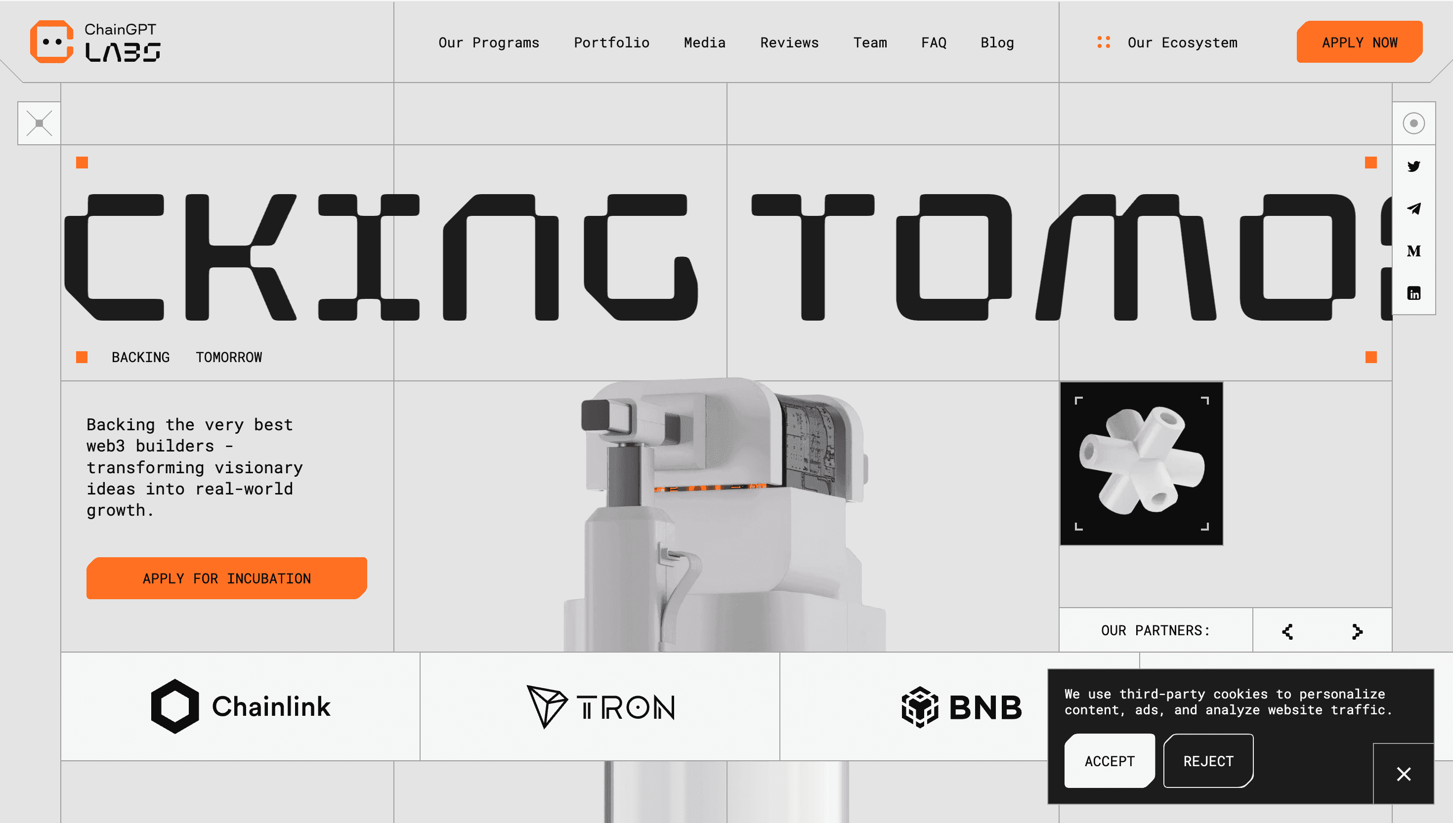
ChainGPT Labs positions itself as the accelerator that “weaponises AI for Web3 builders.” Rather than a dull investment deck, the site behaves like a recruitment beacon: one scroll greets you with the promise of Telegram-scale distribution, the next drops you into a portfolio of AI, DePIN and gaming experiments, then an application form that feels more VIP boarding pass than Google Sheet.
Visual Language & Motion
A cool-white stage meets pulsing electric-blue gradients—an homage to the ChainGPT brand. Hero copy in bold mono caps slides over a wireframe sphere that morphs into a 3-D cube when you hover, subtly foreshadowing the incubator’s “from idea to product to company” ethos. GSAP-driven cards snap into a masonry grid, flicking neon borders when a cursor grazes them. Portfolio pages retain the motif: vertical tabs flick open like neural synapses, each colour-tagged to a sector—AI, DeFi, Gaming—so founders instantly map opportunity.
UX & Performance
AVIF hero stills and SVG icon sprites keep LCP around 1.2 s on desktop, 1.7 s on 4 G mobile. The Apply form lives in a sticky, three-step drawer—name, deck link, partners—finished in <60 seconds, erasing the usual VC friction. prefers-reduced-motion locks morphs to static keyframes, and all colour pairs meet WCAG AA, even against glow layers. A floating Telegram chat icon remains thumb-reachable, ensuring founders can ping an advisor mid-scroll.
Takeaway
ChainGPT Labs shows how an incubator site can feel as experimental as the startups it funds: tight performance budgets, playful WebGL touches and a user journey that glides from inspiration to application—no pitch-deck purgatory required.