Visit website
Superlist
18 views4mo ago
Concept
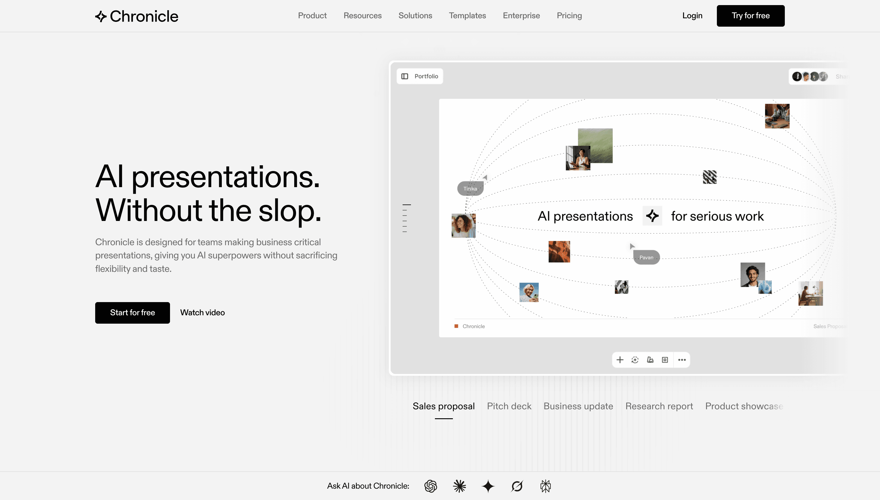
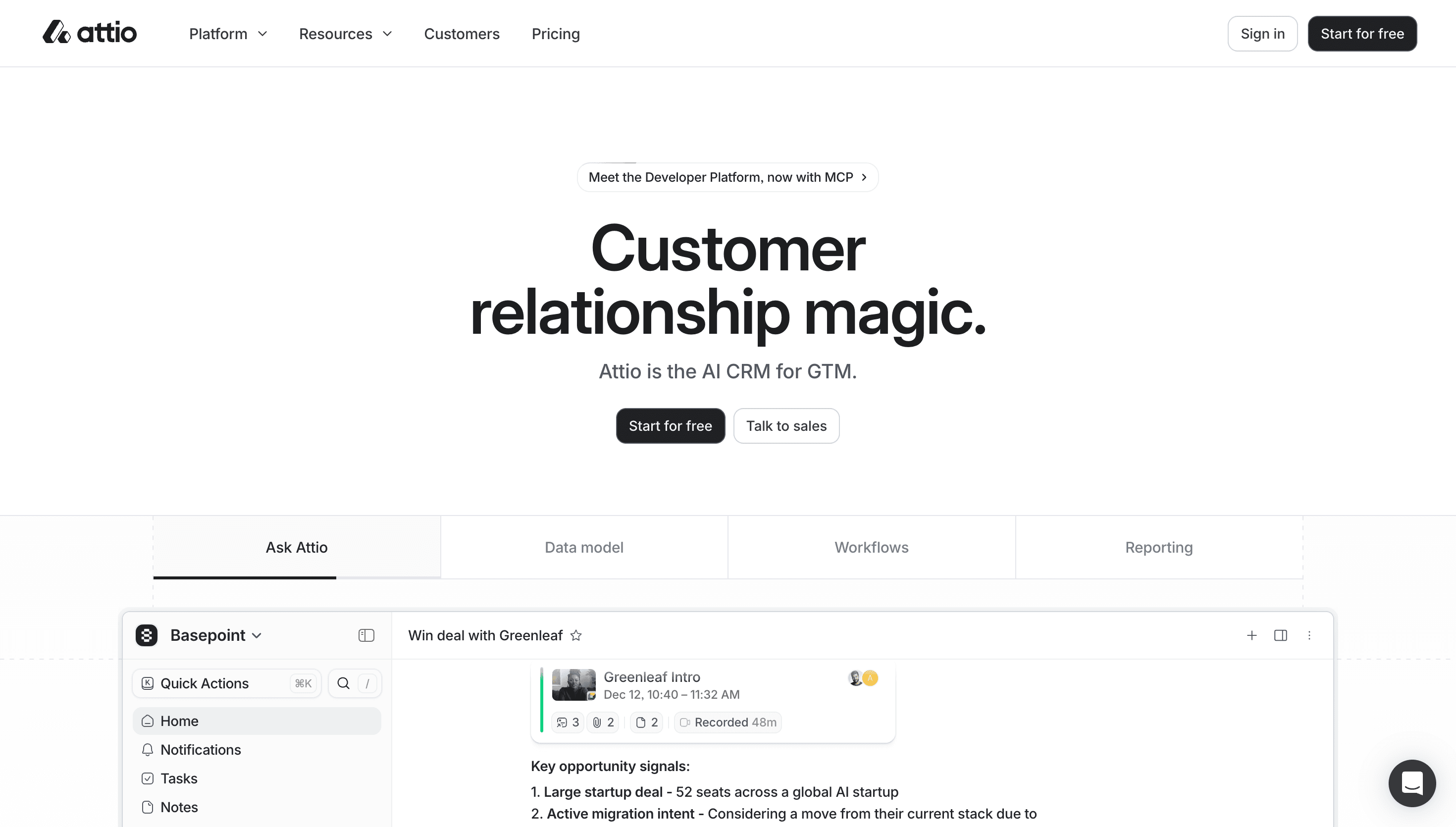
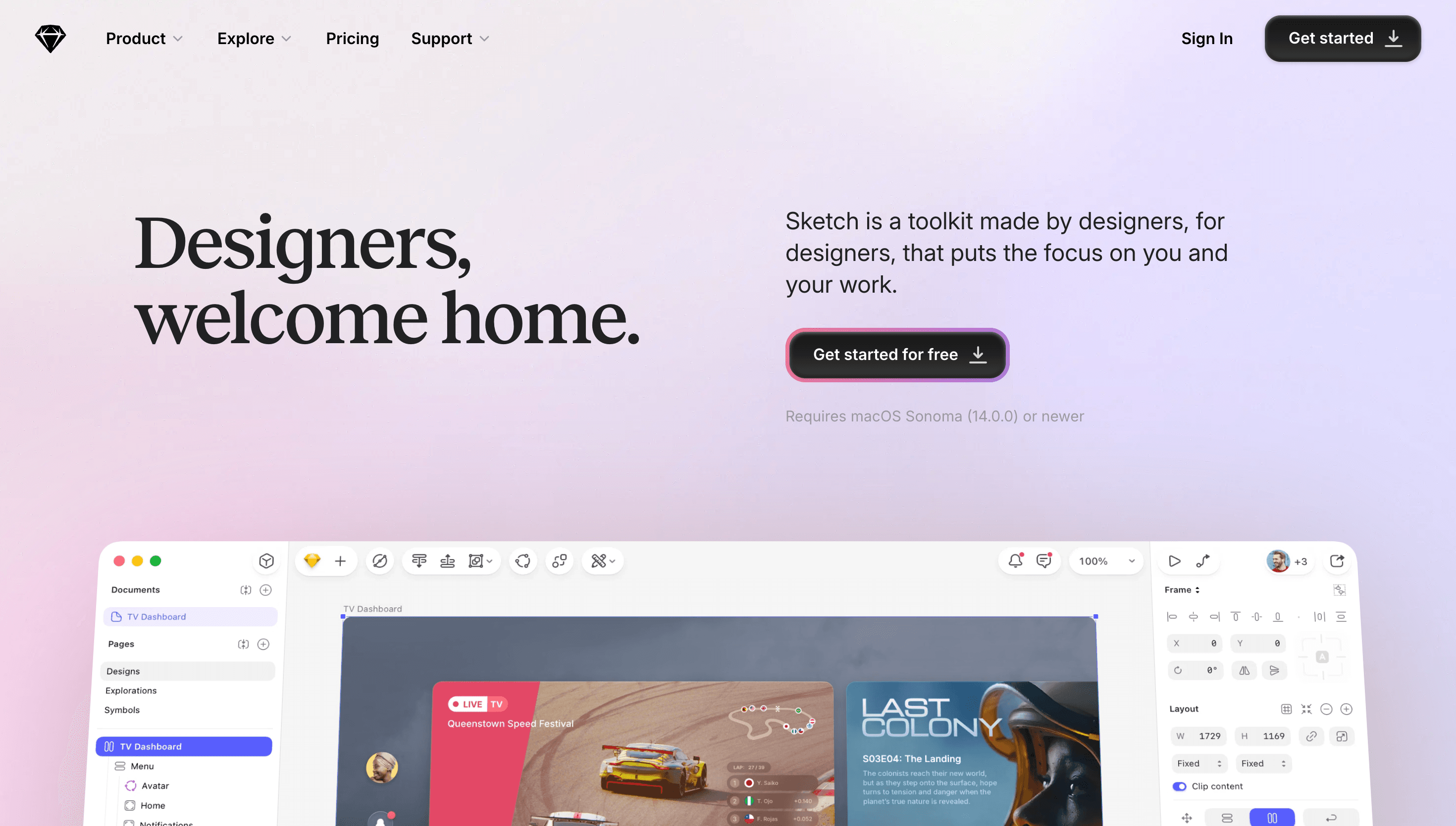
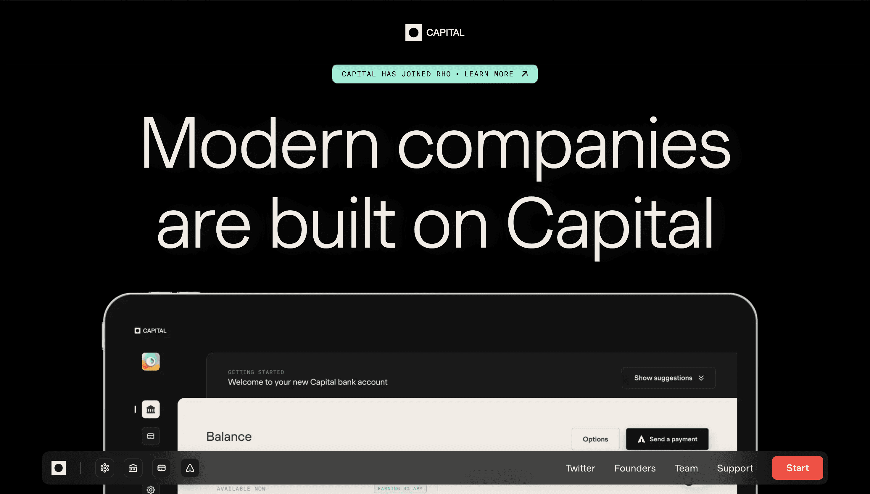
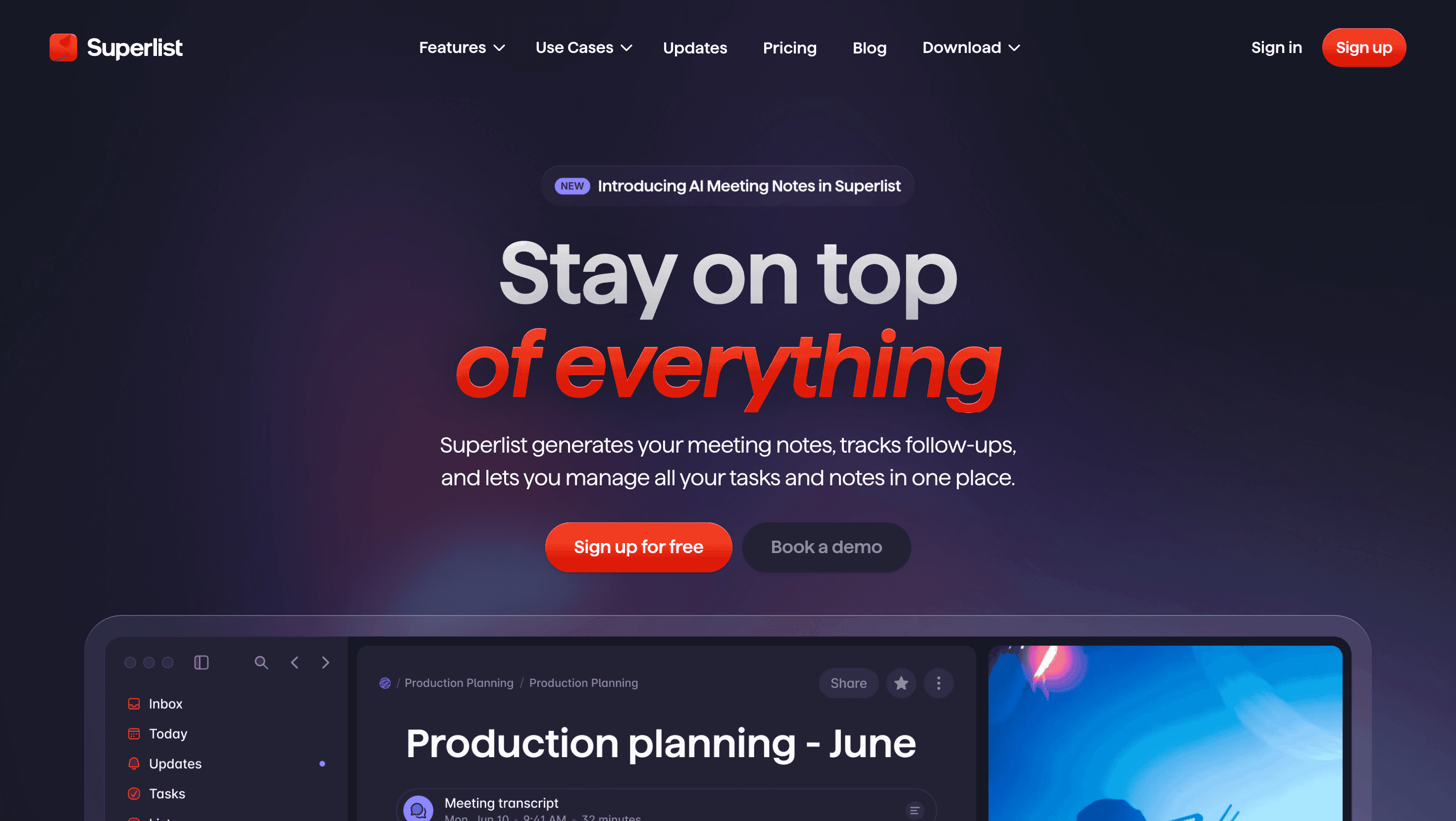
Superlist calls itself “the next-generation productivity app”—a direct sequel to Wunderlist that merges personal tasks and team projects. The site behaves like a product walk-through set on fast-forward: every scroll cue unlocks a new super-power—AI summaries, time-boxed focus mode, Slack-style comments—framing the roadmap as an invitation rather than a feature dump.
Visual Language & Motion
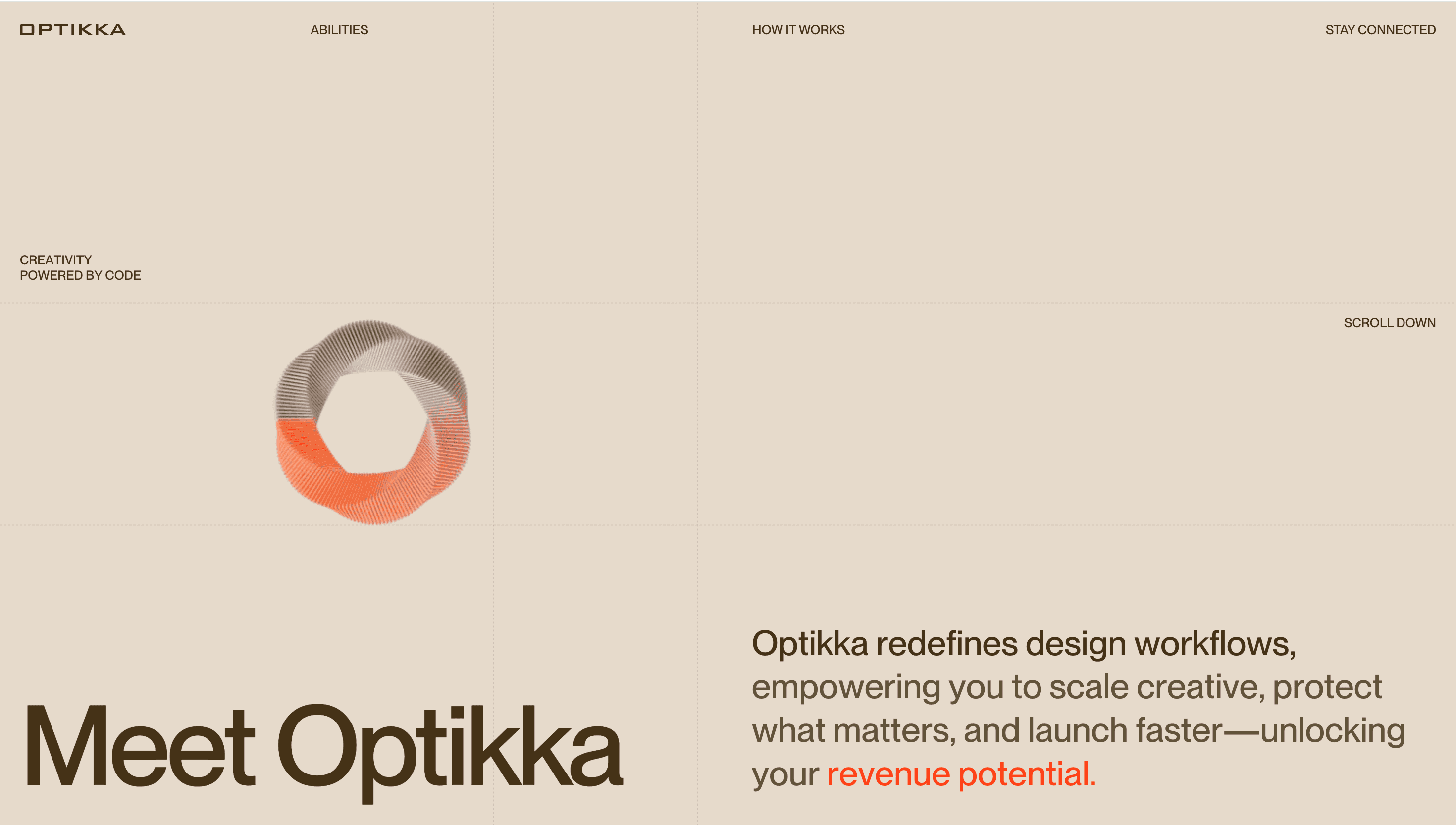
The hero bursts with a prismatic RGB-split gradient that flickers like an analog CRT, hinting at the app’s playful glitch micro-brand. Headings in grotesque XL caps ride a 12-column grid, while pill-shaped buttons glow with inner-shadow neon. Device mock-ups float on parallax z-layers; hover and they tilt, revealing depth without WebGL weight. Pastel violet and electric teal accents echo the in-app theme switcher.
UX & Performance
SVGR-inlined icons and next/image AVIF sources keep LCP ≈ 1.1 s desktop, 1.5 s on 4 G. IntersectionObserver delays autoplay of screen recordings until they are 50 % in view, preventing CPU spikes. Motion-reduced settings swap the hero’s RGB split for a static gradient and disable vignette flicker, preserving vibe while respecting accessibility. A sticky nav transforms into a single “Get Superlist” CTA bar on mobile, minimizing friction to the TestFlight waitlist.
Takeaway
Superlist proves that productivity software can feel as expressive as a music visualiser—bold colour, glitch motion and AI peek-aheads coalesce into a narrative of work that is fast, fun and collaborative rather than dull and solitary.
More Projects


Sponsor
Your ad here