Visit website
TOP: The Open Platform
18 views3mo ago
Concept
TOP positions itself as the command centre of the TON ecosystem. The site reads like a venture deck merged with a developer portal: first it sells the vision—“Telegram-scale distribution”—then it hands you the SDKs, funding form and talent board to make it happen.
Visual Language & Motion
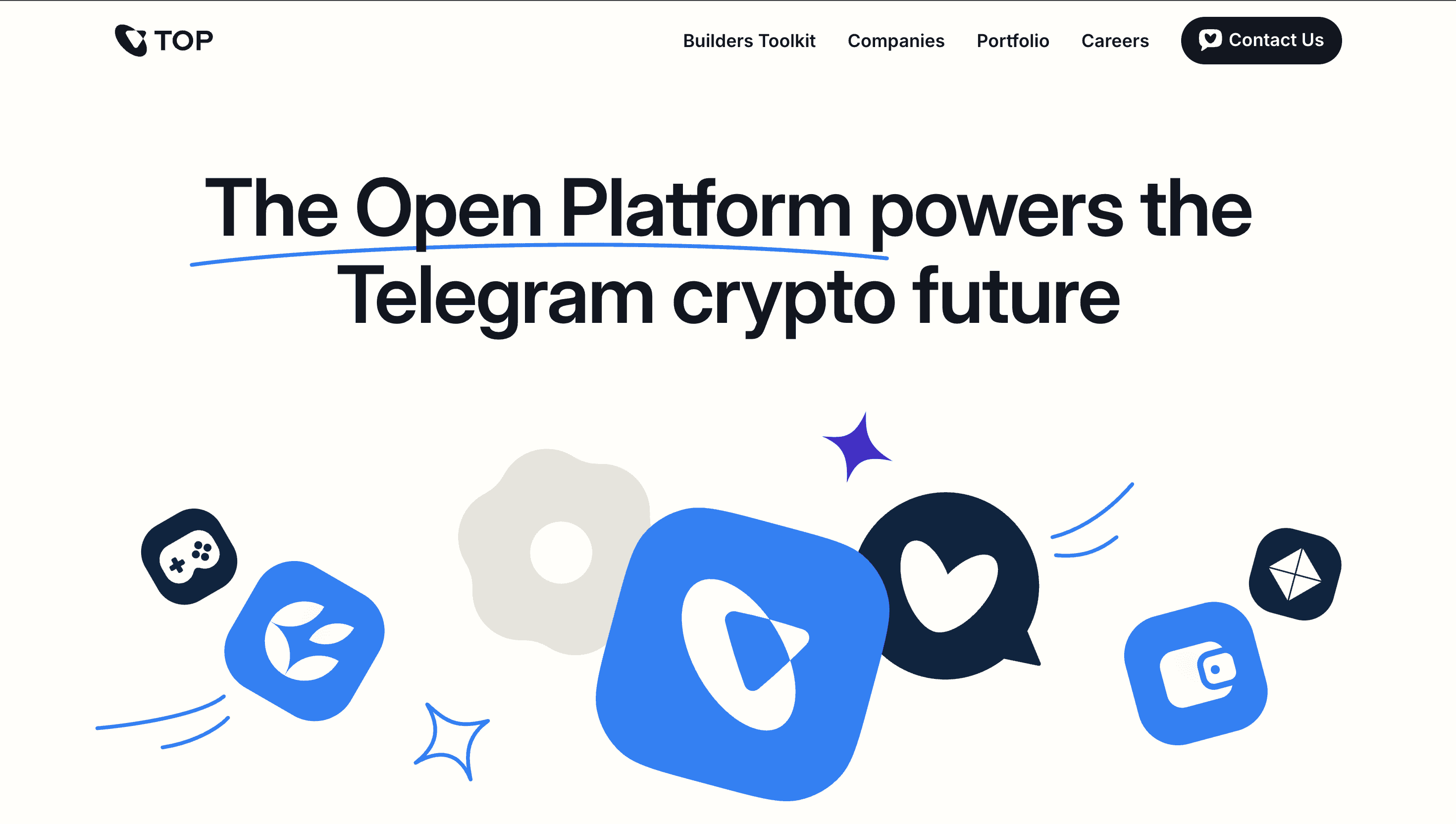
An arctic-white canvas meets pulsating TON-blue gradients. Hero copy (“The Open Platform powers the Telegram crypto future”) lands in bold, monospace caps and is mirrored midway down the page to reinforce the mantra. Scroll-based reveals slide in entire sections—Expertise → Distribution → Investment—like cards being dealt to a founder. Soft-edge blurs behind product tiles feel native to Telegram’s UI, while WebGL stickers of wallets and cubes rotate 2 deg on cursor hover to add touchable depth. Accent lime icons flag portfolio milestones—“100 M+ Wallet users”—injecting data without clutter.
UX & Performance
Despite heavy iconography, AVIF hero images and lazy-loaded SVG sprites keep LCP ≈ 1.2 s desktop, 1.7 s mobile. Navigation fixes top-right after 12 px of scroll, maintaining orientation while leaving the centre stage for storytelling. prefers-reduced-motion swaps slide-ins for fade-ups; all colour pairs sit comfortably above WCAG AA contrast thresholds. A persistent “Apply for investments” button sticks bottom-edge on mobile, shortening funnel friction for founders on the go.
Takeaway
TOP’s site shows how a platform can merge Silicon-Valley polish with Telegram-native friendliness: crisp grid, zero clutter, and a narrative arc that turns infrastructure lists into founder FOMO.