Visit website
Patio
15 views4mo ago
Concept
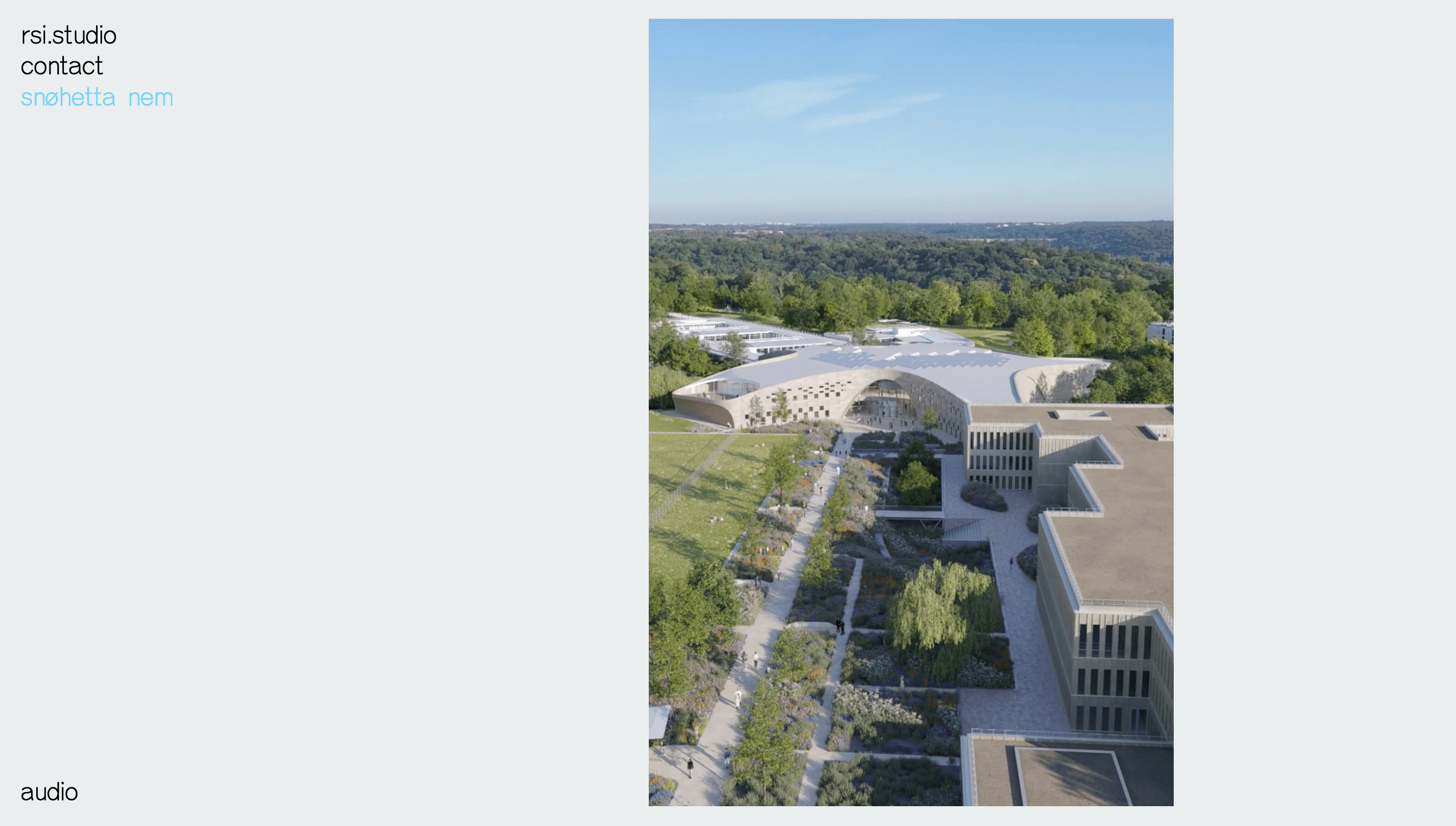
PATIO presents itself as an “image-making studio for future narratives.” Rather than the usual grid of thumbnails, the site behaves like a curated reel in which every scroll stroke stitches a new medium—CGI, AI-generated stills, photographic sets—into a single timeline. The visitor is cast as the art-director sliding through a contact sheet of tomorrow.
Visual Language & Motion
A stark onyx backdrop frames full-bleed renders that drift in on parallax rails, while hairline gridlines hint at 35 mm film splices. Hover and the cursor blossoms into a soft-edged spotlight, revealing hidden layers—wireframes, raw prompts, lighting passes—so process is celebrated, not concealed. Headings in spacey mono type oscillate between 10 vw and 2 vw via clamp(), maintaining drama from phone to 4 K. Subtle grain overlays and chromatic aberration give otherwise clinical CGI a tactile, analogue soul.
UX & Performance
Draco-compressed meshes and AVIF hero stills hold LCP near 1 s desktop, 1.5 s mobile. IntersectionObserver fetches media only when a section nears, and prefers-reduced-motion swaps parallax for fade-ins to respect motion-sensitive users. Sticky side rail doubles as both progress bar and context menu, ensuring you never feel lost inside the endless canvas.
Takeaway
PATIO proves a studio portfolio can be as experimental as the work it sells: minimal UI, maximal craft, and an open-source attitude—pulling back the curtain so the making-of becomes part of the spectacle.