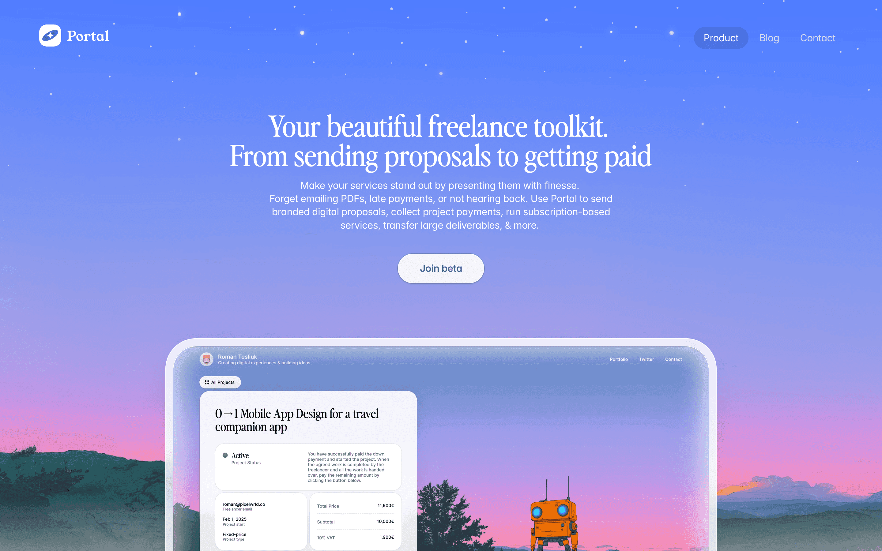
Visit website
Portal — The Fastest Way Into Your Apps
24 views4mo ago
Concept
Portal reimagines the classic app launcher as a command center for your Mac.
Instead of digging through folders or juggling keyboard shortcuts, you open Portal and type—apps, files, URLs, commands, workspace presets all appear instantly. The product sits at the intersection of Spotlight, Raycast, and a minimal launcher: fast, distraction-free, and intentionally simple.
The core idea: reduce the gap between intention and action.
Visual Language & Motion
The design is striking in its restraint. A dark, translucent panel centers on the screen, with crisp sans-serif typography and fluid blurring that feels natively macOS. Search results stack neatly with smooth fade-ins; icons glide in with quiet spring easing.
Color is used sparingly—a cobalt accent highlights the active command, while result categories use soft grays to keep focus on speed. Everything is built around clarity and instant recognition.
UX & Performance
Portal prioritizes raw efficiency:
- search feels immediate, even across large app lists
- keyboard-first interactions minimize friction
- categories like Apps, Settings, Web, and Files show up contextually
- “Quick Actions” allow opening apps, toggling system settings, or triggering custom workflows instantly
The interface is lightweight, responsive, and honors macOS accessibility settings: reduced motion simplifies transitions, and high-contrast mode increases legibility.
Takeaway
Portal proves that simplicity can be a productivity superpower. By stripping away noise and focusing on speed, clarity, and tight macOS integration, it becomes an elegant companion for users who want to get things done with minimal friction.